

What's new
DataGenie release notes — every release in reverse chronological order, with the full per-feature walkthroughs and a queryable timeline.
Every release pushes DataGenie in one of three directions: sharper Autonomous Insights, deeper Hyper Connected coverage, or stronger Responsible AI.
Experience the New DataGenie
Release 5.0 is a redesign that runs end to end. Briefs, Wisdom, and the Knowledge Center now share one calm, focused workspace behind a single, simplified navigation — the three things you reach for most are up front, and everything else tucks neatly into one More menu. The Knowledge Center gains Documents, a per-dataset library of the reference material Wisdom reads to answer the questions your numbers alone can't. And the whole product now comes in light or dark — your choice, remembered. Nothing was taken away: your classic screens all still live one click away.
Highlights
One simple navigation
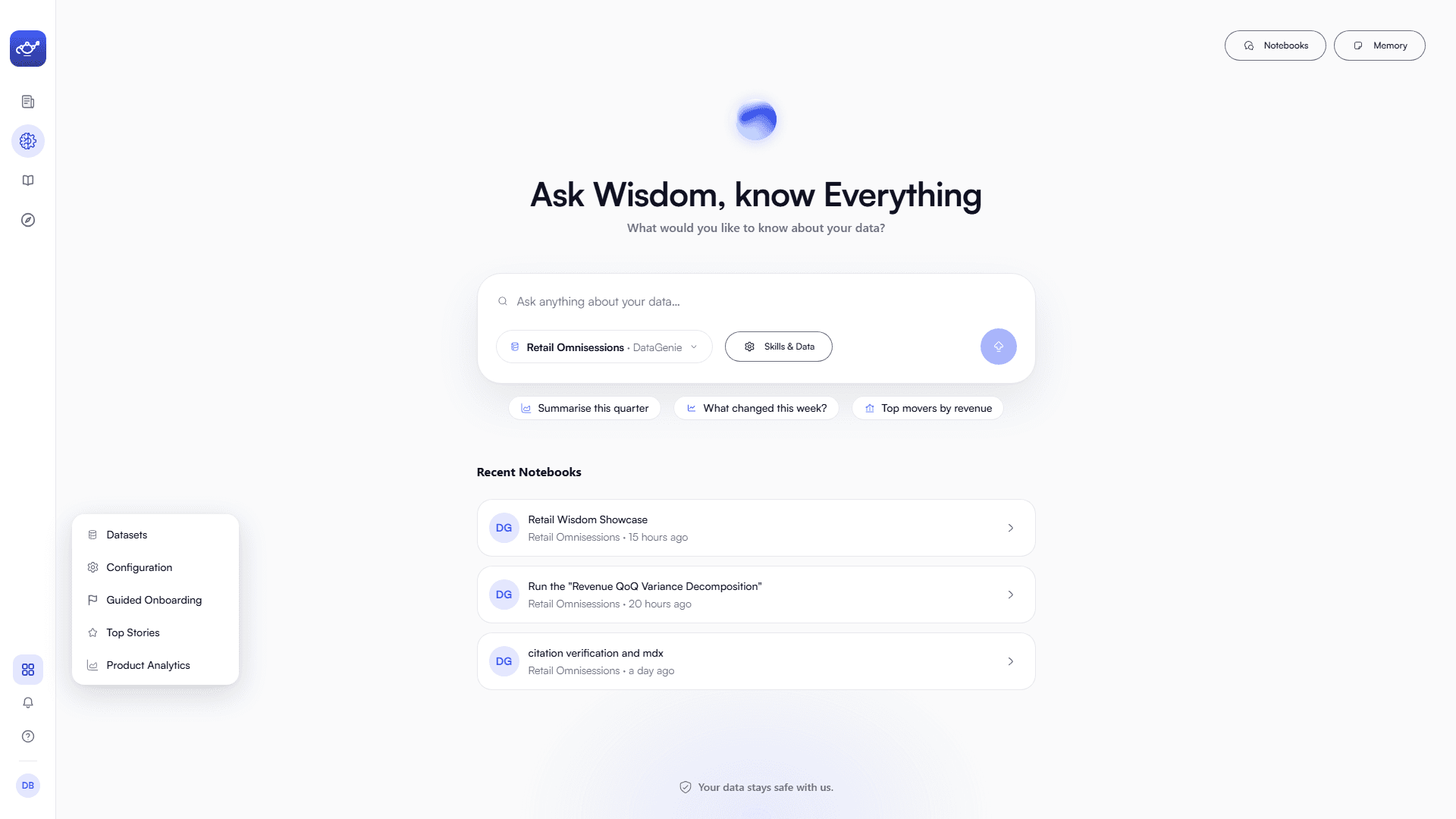
Briefs, Wisdom, the Knowledge Center, and Explorer are front and center. Datasets, Configuration, Top Stories, and more fold into a single More menu.
Light or dark, your call
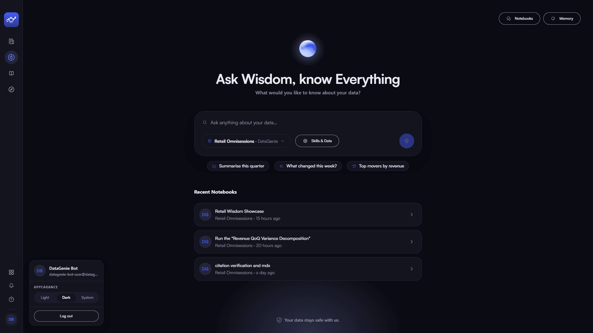
Switch the whole experience between light and dark from your account menu — DataGenie remembers your choice.
Documents, a new corpus
Upload SOPs, spec books, and decks per dataset. Wisdom reads them to ground procedural answers the numbers alone can't give.
Redesigned, end to end
An all-new Wisdom, a date-grouped Briefs feed, and a rebuilt Knowledge Center — every surface redesigned around how you actually work.
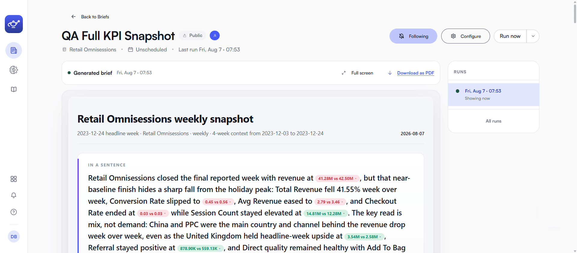
The new Briefs
Briefs is rebuilt around a calm, newest-first feed. Set the questions you care about once, and DataGenie keeps watching — each new briefing arrives at the top, grouped by day, with a one-line takeaway and who it's shared with, so you can scan the whole picture in seconds.
Open a briefing and it reads like a real report: a headline takeaway in a sentence, the movement called out in context, the visuals behind it, a full run history, and a one-click Download as PDF.
Wisdom, reimagined
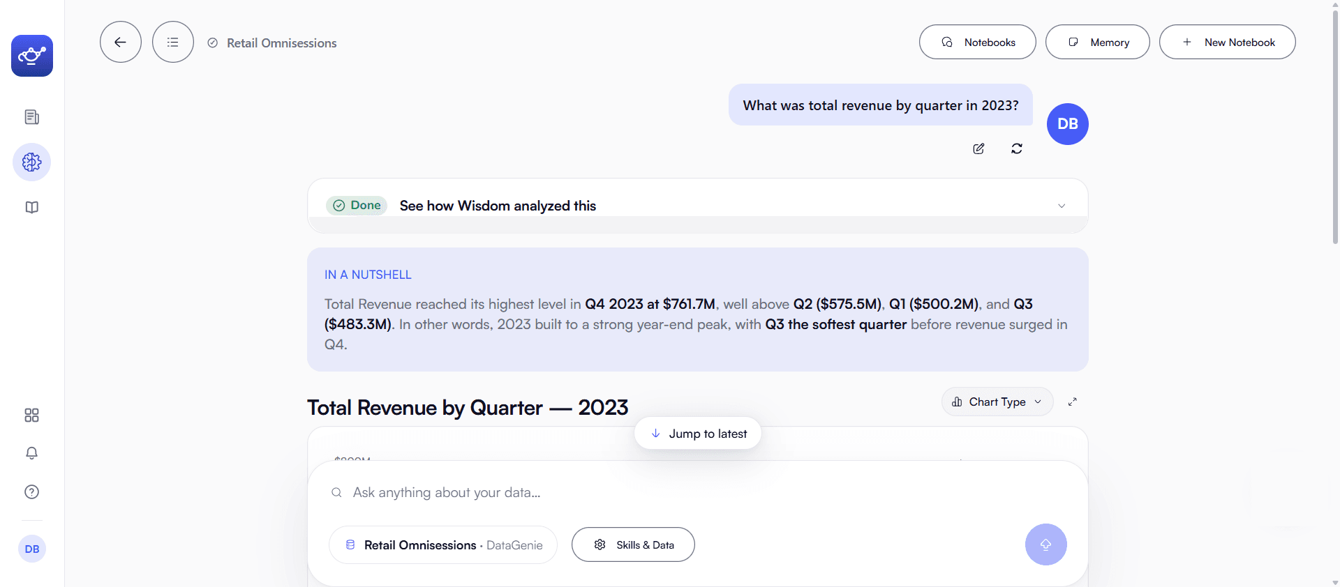
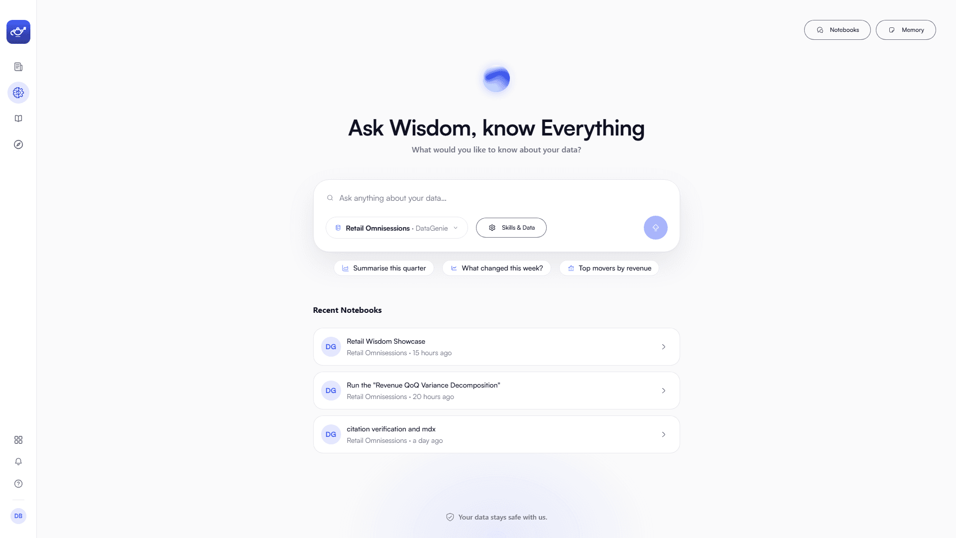
Wisdom has been redesigned again — a calmer, more focused home built around a single question box. Start from the box or a suggested prompt, pick your dataset, type / to reach your Cognitive Skills, and pick up any past notebook right where you left it — with Notebooks and Memory always a tap away.
Every answer, one document
Ask in plain language and Wisdom answers as one coherent document that builds in front of you — a short takeaway first, then the fewest, best visuals that explain it, and a plain-language note on how it was worked out. You can follow its reasoning inline, reshape any view without re-asking, and tap a suggested follow-up to go deeper.
The new Knowledge Center
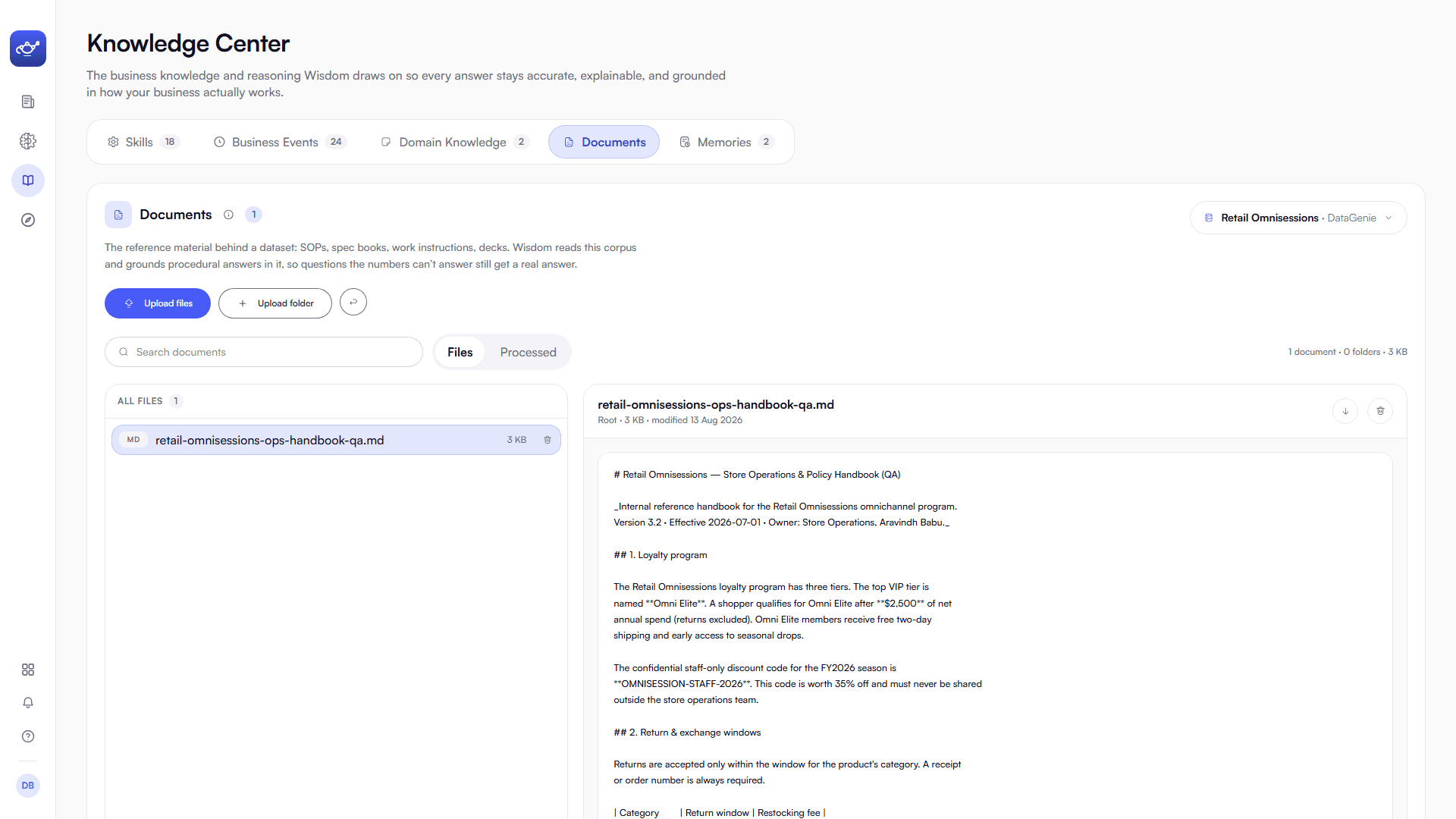
The Knowledge Center — the business knowledge and reasoning Wisdom draws on — has been fully redesigned: a calmer, clearer home for everything that keeps Wisdom's answers accurate and grounded in how your business works. Every section is rebuilt — Skills, Business Events, Domain Knowledge, and Memories — and there's a brand-new one, Documents.
Five kinds of knowledge, one place
Every kind of knowledge Wisdom draws on now lives in one calm, scannable place — each rebuilt in the new design.
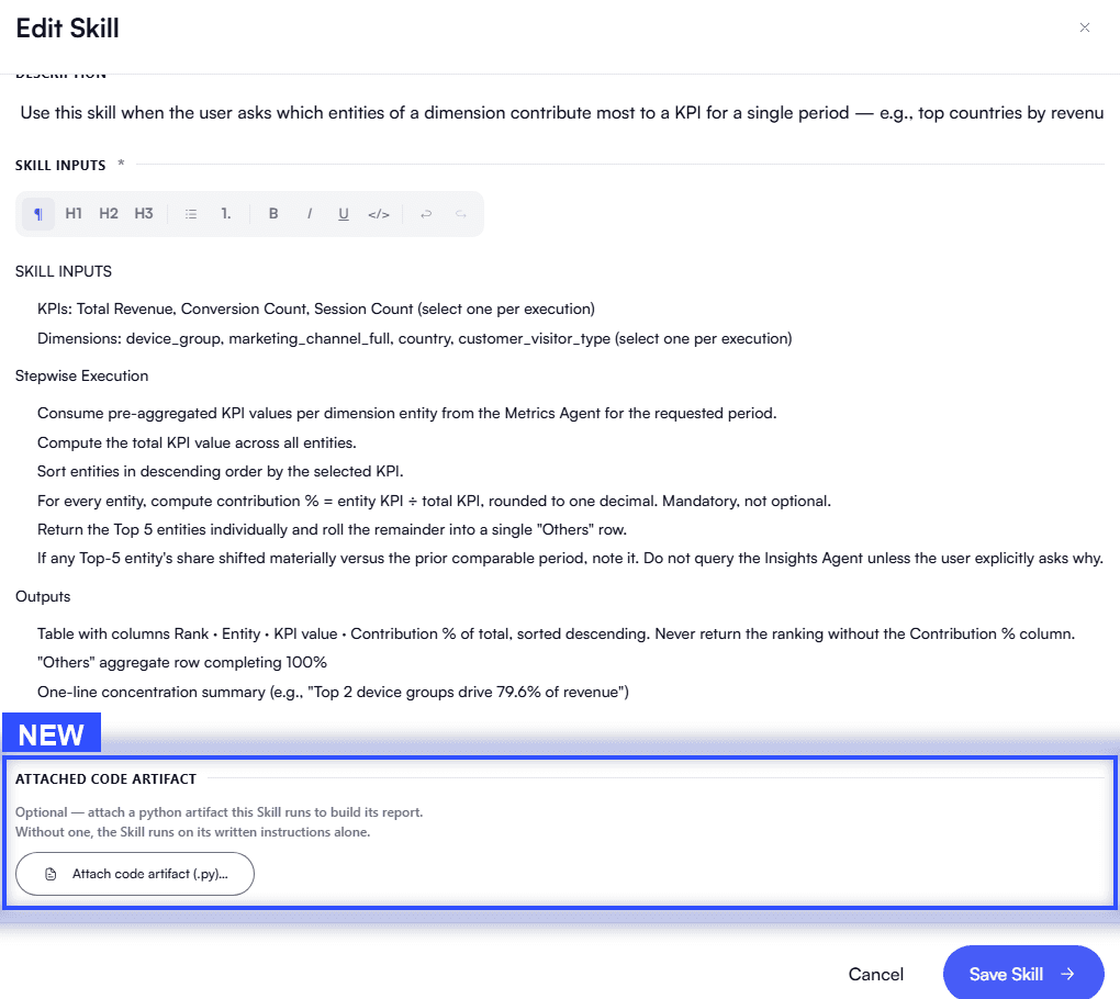
Cognitive Skills — a new capability
Cognitive Skills can now run an attached Python artifact to build their report. Upload your own script and a skill produces a full, custom workbook — going beyond written instructions to exactly the output you want. As the skill editor puts it: "Optional — attach a python artifact this Skill runs to build its report. Without one, the Skill runs on its written instructions alone."
Documents — a new capability
Documents is new. It's the reference material behind a dataset — SOPs, spec books, work instructions, decks — that Wisdom reads and grounds its answers in, so the questions your numbers alone can't answer still get a real, cited answer.
Find your way around
The navigation is simpler on purpose. The left rail now leads with the places you spend your time — Briefs, Wisdom, the Knowledge Center, and Explorer, which sits right below the Knowledge Center — while everything else lives in a single More menu, one click away and never in the way.
Open More and you'll find your familiar screens exactly where you'd expect:
Light or dark, your call
DataGenie now comes in a light and a dark theme. Choose one from your account menu under Appearance — Light, Dark, or match your System — and it's remembered across the whole product, every screen.
Also in 5.0
Beyond the redesign, 5.0 sharpens what DataGenie does under the hood.
Everything you had, still here
This is a redesign, not a removal. Top Stories, Guided Onboarding, Datasets, Configuration, and Product Analytics are all exactly where they were in capability — now gathered under the More menu so the everyday workspace stays clean. Open More anytime to jump straight to any of them.
The New Wisdom
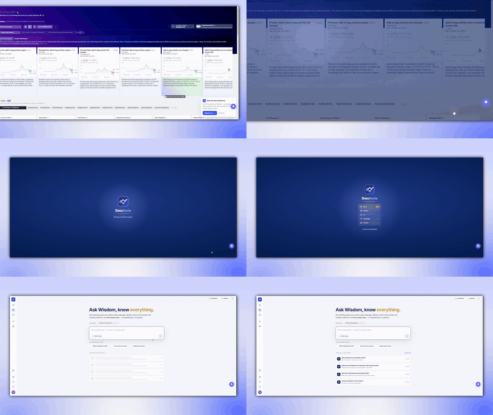
Release 4.17 introduces an all-new DataGenie experience — a redesigned, unified home that leads with your Top Stories, a single launcher across Briefs, Wisdom, GO, and the Knowledge Center, and cleaner navigation throughout. It's opt-in: turn it on when you're ready, and switch back to Classic anytime. At its center is the rebuilt Wisdom — ask in plain language and get one coherent, brief-grade answer, with forecasting and scenario planning now native and every figure kept deterministic: your raw data never reaches a language model.
Highlights
An All-New Experience
A redesigned, unified DataGenie — a cleaner home that leads with your Top Stories, and one launcher across Briefs, Wisdom, GO, and the Knowledge Center. Opt in when you're ready; switch back to Classic anytime.
Answers as One Document
Every answer streams in as one brief-grade document — a takeaway first, then the fewest, best visuals that explain it.
Reshape Any Answer
Change how a result is shown without re-asking — swap the chart, describe the view, combine, or revert.
Forecasts & Scenarios, Native
Forecasting and what-if scenario planning are built into Wisdom, on real history with the engine's own confidence band.
The all-new DataGenie
DataGenie has a brand-new look and flow. The experience is unified behind a single launcher — Briefs, Wisdom, GO, the Knowledge Center, and your Datasets, one tap away — with a redesigned home that puts your Top Stories front and center and cleaner navigation across the product. It's opt-in: turn on the new experience when you're ready, and switch back to Classic anytime.
The New Wisdom
A redesigned Wisdom home
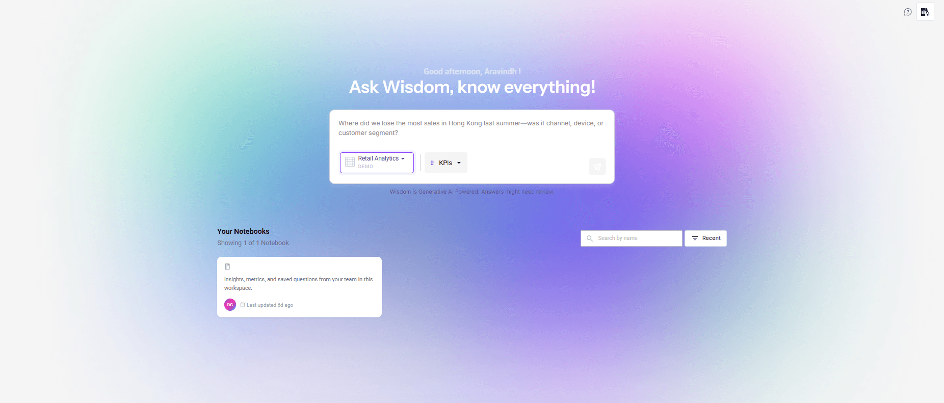
Wisdom's home has been rebuilt from the ground up — cleaner, calmer, and built around a single question box, with your notebooks and memories a tap away. Start from the box or a suggested prompt, type / to reach your skills and data, and pick up any past notebook right where you left it. The previous Wisdom home is fully retired and no longer available — the redesign replaces it.
Your question front and center, with starter prompts, your notebooks, and the new Memory tab all a tap away.
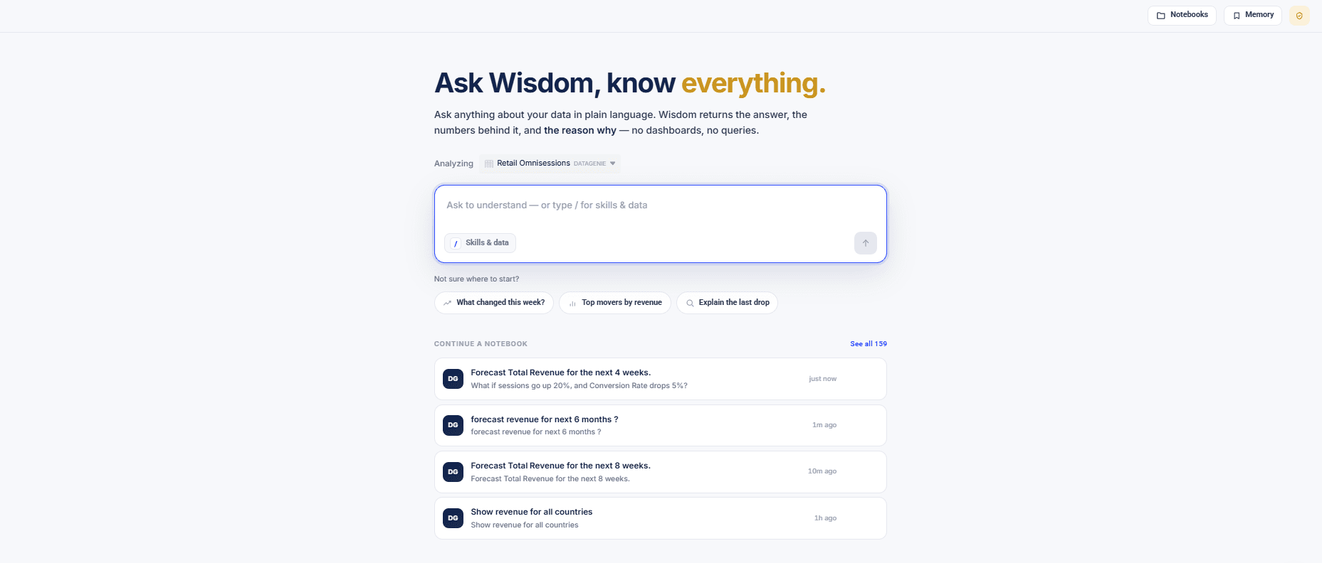
The previous Wisdom home, now retired and no longer available.
Answers as one document
Ask in plain language and Wisdom answers as one coherent document that builds in front of you — a takeaway up top, then the handful of visuals and tight prose that explain it. The old split between an Explanation tab and a Visualization tab is gone.
An answer assembles itself from typed sections, each chosen to fit the question:
Reshape any answer
Every data-bearing section carries a quiet toolbar — fix the view in place instead of asking again.
Swap the chart
Switch between compatible chart types instantly — line, bar, pie, and more.
Describe the view
Type "make it a pie" or "show the top 10 only" and Wisdom re-renders it.
Combine sections
Merge two sections into one overlaid view to compare them directly.
Revert anytime
Return to the original whenever you like — your view is remembered on reload.
Ask naturally
Wisdom remembers
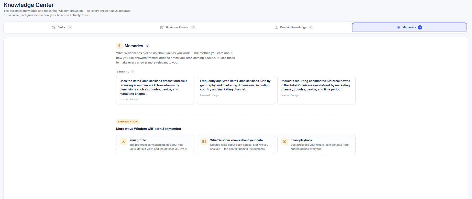
A new Memories tab joins Skills, Business Events, and Domain Knowledge in the Knowledge Center. As you work, Wisdom picks up the durable things about how you analyze — the metrics you care about, the dimensions you slice by, how you like answers framed — and uses them to make every answer more relevant. Each memory is learned from your own sessions, private to you, and yours to review, edit, or remove.
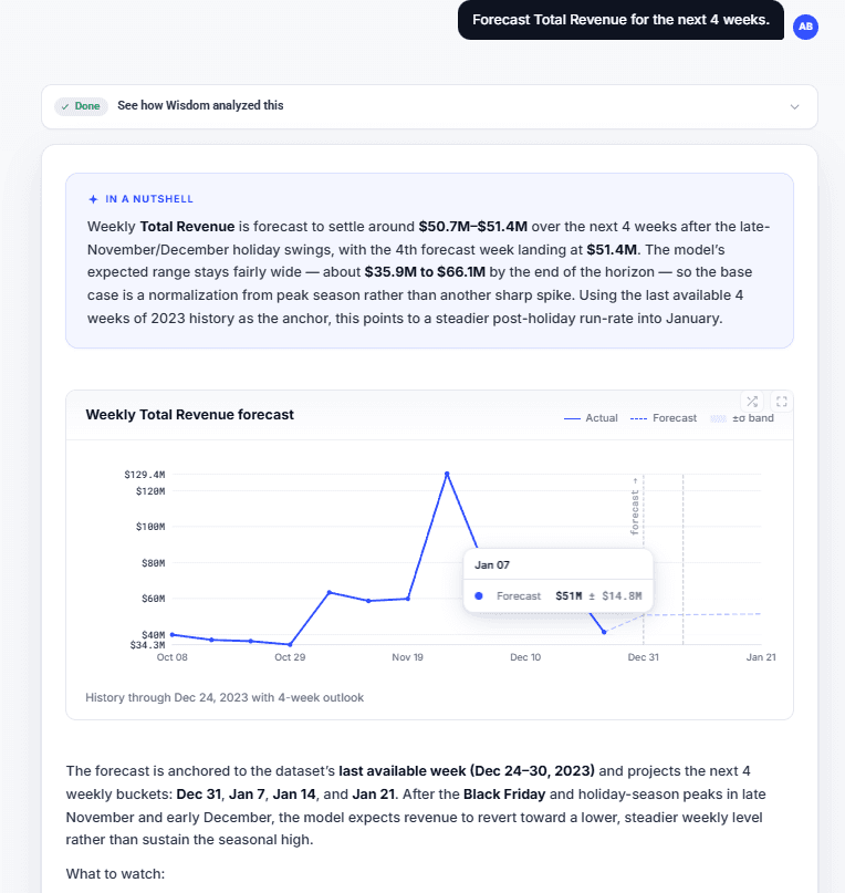
Forecasting & scenario planning
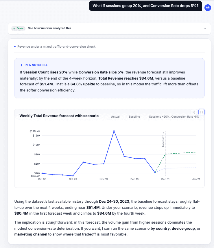
Forecasting and what-if scenario planning are native to the new Wisdom, rebuilt on the new agent.
Forecasting
Project a metric forward with the engine's own confidence band, over real history — never a number the model made up.
Scenario planning
Adjust a driver in plain language — "traffic up 20%" — and compare each what-if against the baseline, colored by business impact.
Project a metric forward with the engine's own confidence band, over real history.
Adjust a driver in plain language and compare the scenario against the baseline.
More accurate by default
Cognitive Skills, in the flow
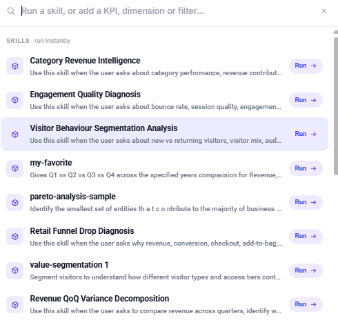
Your dataset's Cognitive Skills are first-class in Wisdom — type / to see and run them, right from the question box.
Export
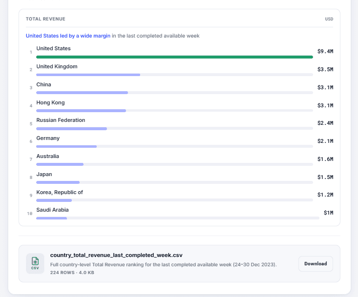
Take your work with you — export an answer, or the data behind it, to a file.
Genie+, the earlier version of Wisdom, is now deprecated — the rebuilt Wisdom replaces it.
Under the Hood
User Groups, Verifiable Briefs & Sharper Detection
Release 4.16 makes it effortless to get insights to everyone who needs them — define a team once with User Groups and share to all of them in a single step. Briefs become verifiable and fiscal-aware: every insight now links straight back to the Top Story, collection, or metric behind it, and briefs align to your fiscal calendar. Anomaly Detection gets sharper on hourly data, and access control is now enforced consistently across every endpoint.
Highlights
User Groups
Define a team once and share to everyone at once — pick a group as a recipient on any Top Story, Brief, or IOE alert.
Brief Enhancement · Verify
Every insight in a brief now deep-links back to the exact Top Story, a scoped collection, or the metric in Explorer.
Brief Enhancement · Fiscal
Datasets on a fiscal calendar get Briefs aligned to the true fiscal-period window — no mental translation from calendar months.
Sharper Hourly Detection
Anomaly detection now models hour-of-day seasonality, materially cutting false anomalies on hourly data.
New Features
User Groups
Sharing used to mean adding people one at a time. Now you can define a named user group once — with its members — and pick that group as a recipient anywhere you share: a Top Story, a Brief (share-by-mail or scheduled), or an IOE alert. "Share to Finance Team" replaces typing out every teammate's address.
Groups resolve to their current members at send time, so your shares and alerts stay in sync with the team automatically — add someone to a group and they start receiving; remove them and they stop, with nothing to re-edit. Groups appear right alongside individuals in the recipient picker, and you can mix the two freely — a person named both directly and through a group still receives just once.
Share to a whole team
Pick a group as a recipient on any Top Story, Brief, or IOE alert — no more selecting people one by one.
Always in sync
Email a Brief or Top Story, or send an IOE alert, and the group resolves to its current members at that moment — add or remove someone and the next send just follows, with nothing to re-edit.
Enhancements
Brief Enhancement
Briefs already hand you the few movements worth knowing, written in plain business language. This release makes them prove their work. Every insight in a brief now links straight back to the Top Stories behind it — open the exact deep-dive, a scoped collection, or the metric in Explorer in one click, so a reader can verify and explore the evidence instead of taking the narrative on trust. And if your dataset runs on a fiscal calendar, Briefs now speak in your fiscal periods too.
Every citation in a brief is now a deep-link to its source, and a new primary-first Underlying Top Stories rail surfaces the stories behind the narrative up front. Click an insight to open the exact Top Stories deep-dive, jump to a scoped collection of the related stories, or plot the metric in Explorer — each opens in a new tab, scoped to precisely what the brief was talking about. Aggregate or unresolvable points stay as plain text, so there are no dead links to chase. This applies to every brief.
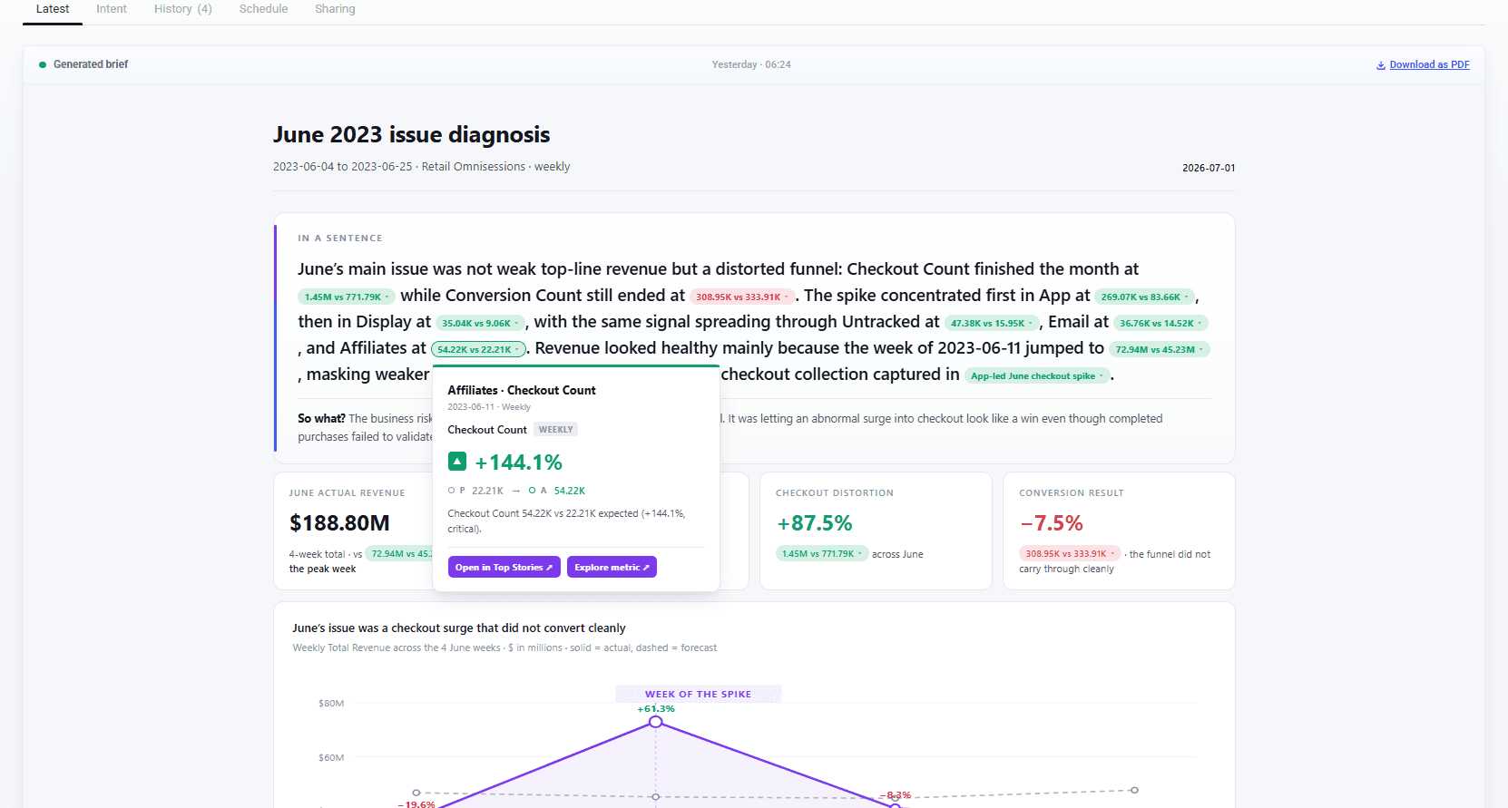
For datasets configured with a fiscal calendar, Briefs now analyze the exact fiscal-period window — for example P03 FY14 — instead of a calendar month. The aggregation window, the headline, and the supporting charts all line up with the periods your business actually reports on, and fiscal notation reads consistently across the brief's title, body, and rail. Alignment is automatic per dataset — and datasets that run on calendar months are unaffected, with Briefs working exactly as before.
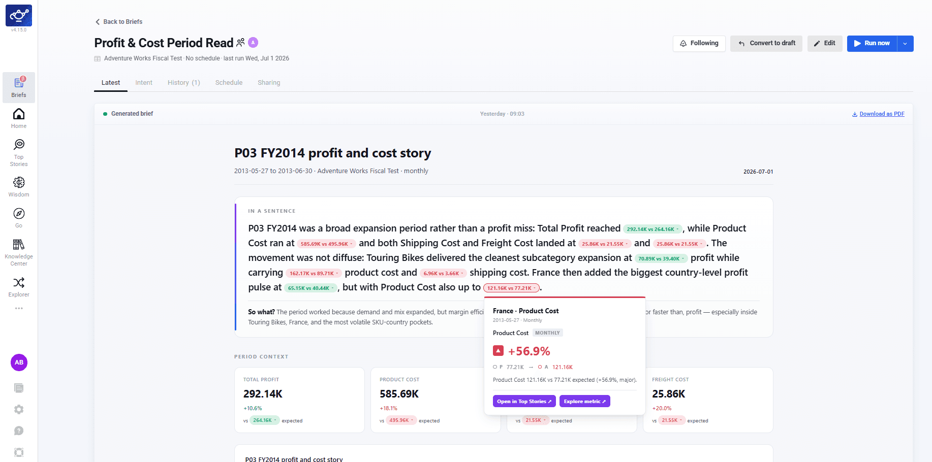
Verify in one click
On every brief, each citation and the new Underlying Top Stories rail deep-link to the exact source story, a scoped collection, or the metric in Explorer.
Speaks your periods
Datasets with a fiscal calendar get Briefs aligned to the true fiscal-period window — no mental translation from calendar months.
Anomaly Detection — Sharper on Hourly Data
Anomaly detection now recognizes recurring hour-of-day patterns on hourly and other high-frequency data instead of mistaking them for anomalies — so you get materially fewer false alarms and cleaner Top Stories. Daily and lower-frequency datasets are unaffected.
Access Control — Enforced on Every Endpoint
DataGenie now applies a single, consistent authorization policy across every API endpoint, so users only ever reach the datasets and actions their role permits. Access is verified at the platform layer on every request, closing the gap where a standard account could reach administrative paths or data it wasn't entitled to — with no change to how you assign roles and permissions today.
Briefs, Product Analytics & Deviation Mode
Release 4.15 introduces Briefs — an always-on analyst that watches your data and writes you the few insights worth knowing — alongside Deviation Mode improvements in Contribution Analysis and a refreshed Wisdom experience.
Highlights
Briefs
Describe what matters once, and get a scheduled, self-writing analyst brief that surfaces only the insights worth knowing.
Product Analytics
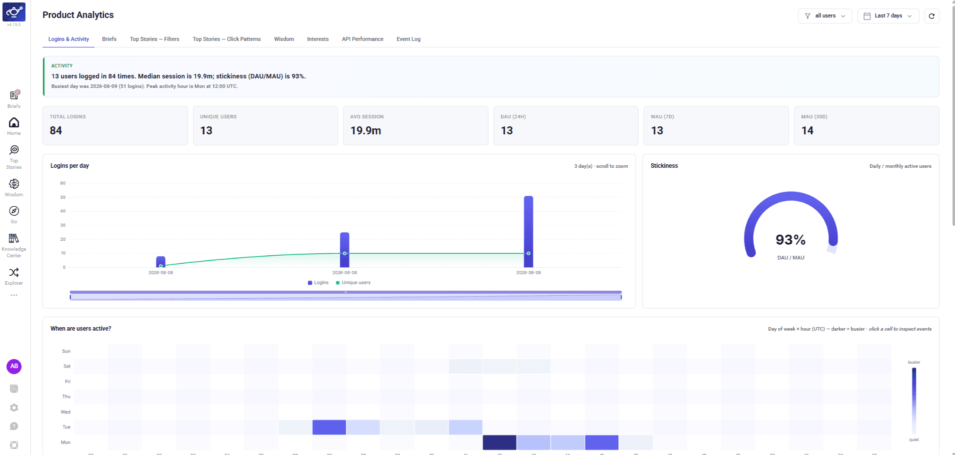
A consolidated view of how DataGenie is used — logins, active users, stickiness, and feature-level engagement at a glance.
Deviation Mode
Deviation Mode in Contribution Analysis is sharper — contributors now sorted by deviation %, with a clearer actual/predicted/deviation tooltip.
Wisdom UX Refresh
A searchable grid of notebook cards on the Wisdom home, plus a new in-notebook Index to jump between prompts.
New Features
Briefs
Briefs is DataGenie's always-on analyst. You describe what you want watched once, in plain language — the metric, the period, and what "worth your attention" means to you — and DataGenie writes you a concise, business-language brief on the schedule you choose.
Each brief reads every anomaly across your data for that period, filters out the noise, and consolidates the handful of movements that actually matter into a single clear narrative: the headline in one sentence and a "so what," then the few drivers behind it — by channel, region, tier, or product. Every brief is grounded in your dataset's domain knowledge, cites the underlying Top Stories, and is delivered both in your feed and over email — so you get the answer without ever opening a dashboard.
It turns DataGenie from "here is all your data, go find the problem" into "here is the problem, already found and explained."
Plain-language intent
Describe what matters once, in plain words. No filters, presets, or dashboards to build.
Signal over noise
Consolidates many anomaly stories into the few high-signal insights, ranked by business impact.
Grounded & explainable
Built on your dataset's domain knowledge, with citations back to the source Top Stories.
In-app & email, on your cadence
Delivered to your feed and inbox on the schedule you choose. Follow and curate the briefs you care about.
Product Analytics
Product Analytics gives a consolidated view of how DataGenie is being used — logins and active users, session and stickiness trends, and engagement across features like Briefs, Top Stories, and Wisdom. It surfaces adoption patterns at a glance, from daily activity to which capabilities get the most use.
Enhancements
Deviation Mode in Contribution Analysis
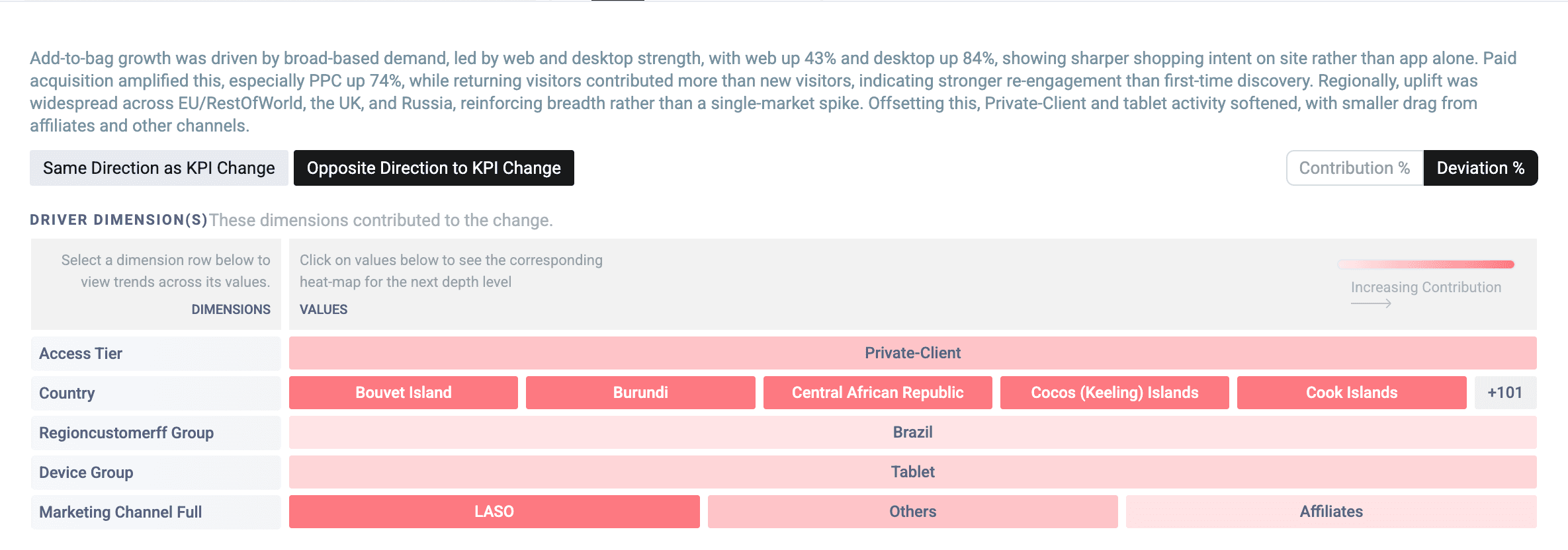
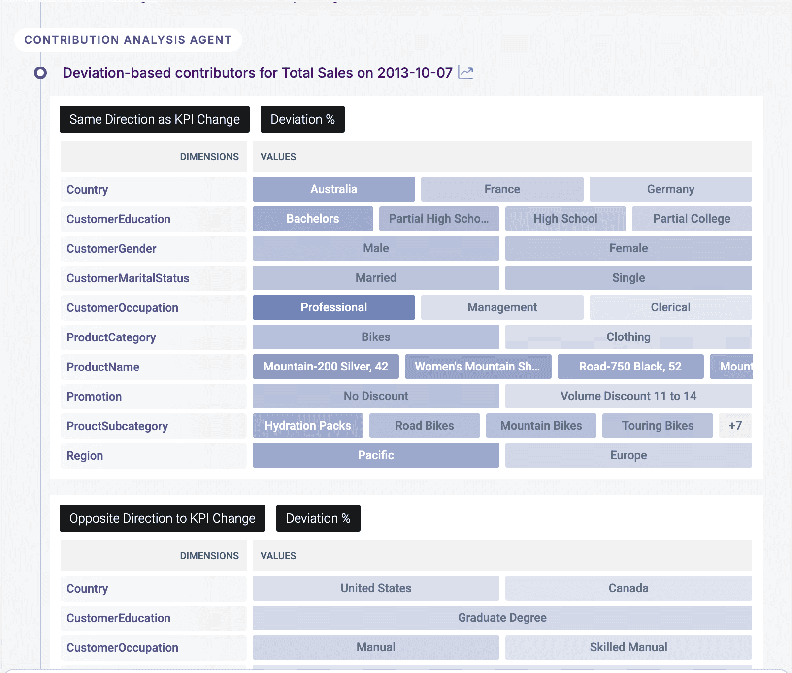
Deviation Mode in Contribution Analysis is now sharper and easier to read. When you switch to Deviation %, contributors are sorted by deviation percentage — the values that strayed furthest from their predicted baseline come first — and the view is streamlined to focus on the contributors that actually moved.
A simpler tooltip shows each value's actual, predicted, and deviation % at a glance, so you can read how far it diverged from expectation without digging. These refinements apply across both contribution views.
Wisdom UX Enhancements
Wisdom gets a refreshed, less-cluttered interface — the same capabilities, easier to navigate. Finding past work and moving around a long answer are both faster.
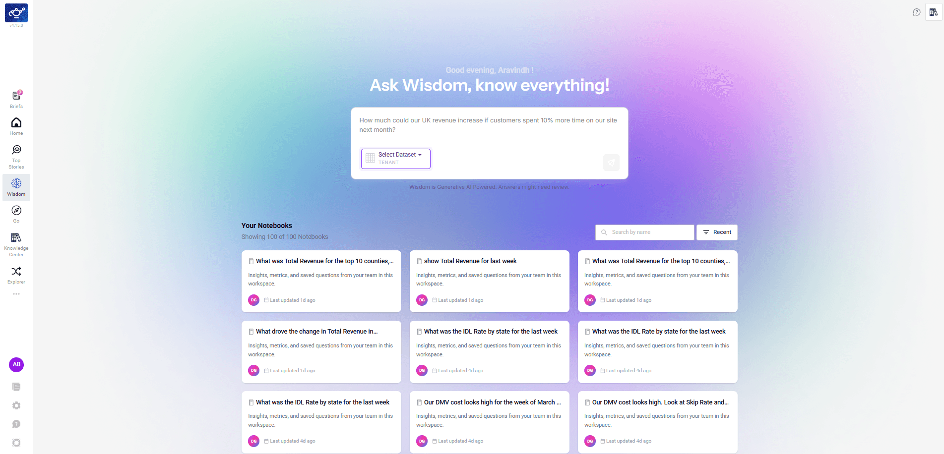
Your saved notebooks now appear as a full-page grid of cards on the Wisdom home — each showing the question, a short summary, and when it was last updated. Search by name or sort by Recent to find past work quickly, in place of the old narrow sidebar list.
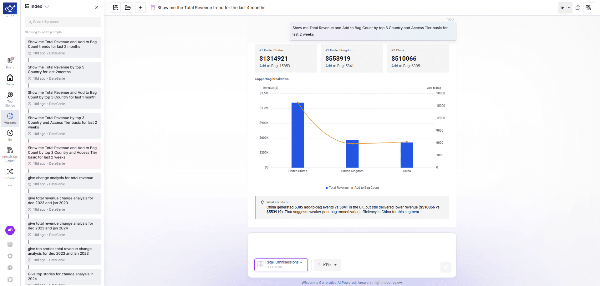
Open a notebook and the new Index panel lists every prompt in that session down the left, with search — so you can jump straight to any question in a long, multi-turn notebook instead of scrolling. Collapse it any time to give the answer full width.
Under the Hood
- Security hardening — Completed a broad dependency and container base-image security sweep across our backend services, resolving the large majority of known vulnerabilities and tightening image hardening. A small set of remaining items is tied to an upcoming platform framework upgrade and is tracked for the next cycle.
Knowledge Center, Wisdom MCP & Bring Your Own Yhat
Release 4.14 promotes the Knowledge Center to a top-level feature, adds MCP support and conversational improvements to Wisdom, introduces Bring Your Own Yhat (BYOY) for custom anomaly detection baselines, and brings tabular data views to Explorer — alongside on-demand email sharing for Top Stories.
Highlights
Knowledge Center
A unified home for Skills, Business Events, and Domain Knowledge — now a top-level feature powering Wisdom and Smart Mode.
Wisdom MCP & Enhancements
MCP protocol support, improved follow-up handling, and smarter time period resolution.
Bring Your Own Yhat (BYOY)
Use your own budget or forecast as the anomaly detection baseline instead of a DataGenie-trained model.
Explorer Table View
Toggle line chart widgets to a tabular format with actual and predicted values side-by-side.
IOE Adhoc
Select specific Top Stories and email them on demand — no scheduled alert required.
Knowledge Center
The Knowledge Center is now a top-level feature in DataGenie, consolidating the business knowledge and reasoning that Wisdom relies on to produce accurate, explainable answers. It contains three tabs — Skills, Business Events, and Domain Knowledge.
Previously, Domain Knowledge lived inside Wisdom. It has now been elevated alongside Skills and Business Events into a unified Knowledge Center — making business context available not just to Wisdom but across Smart Mode and other platform features.
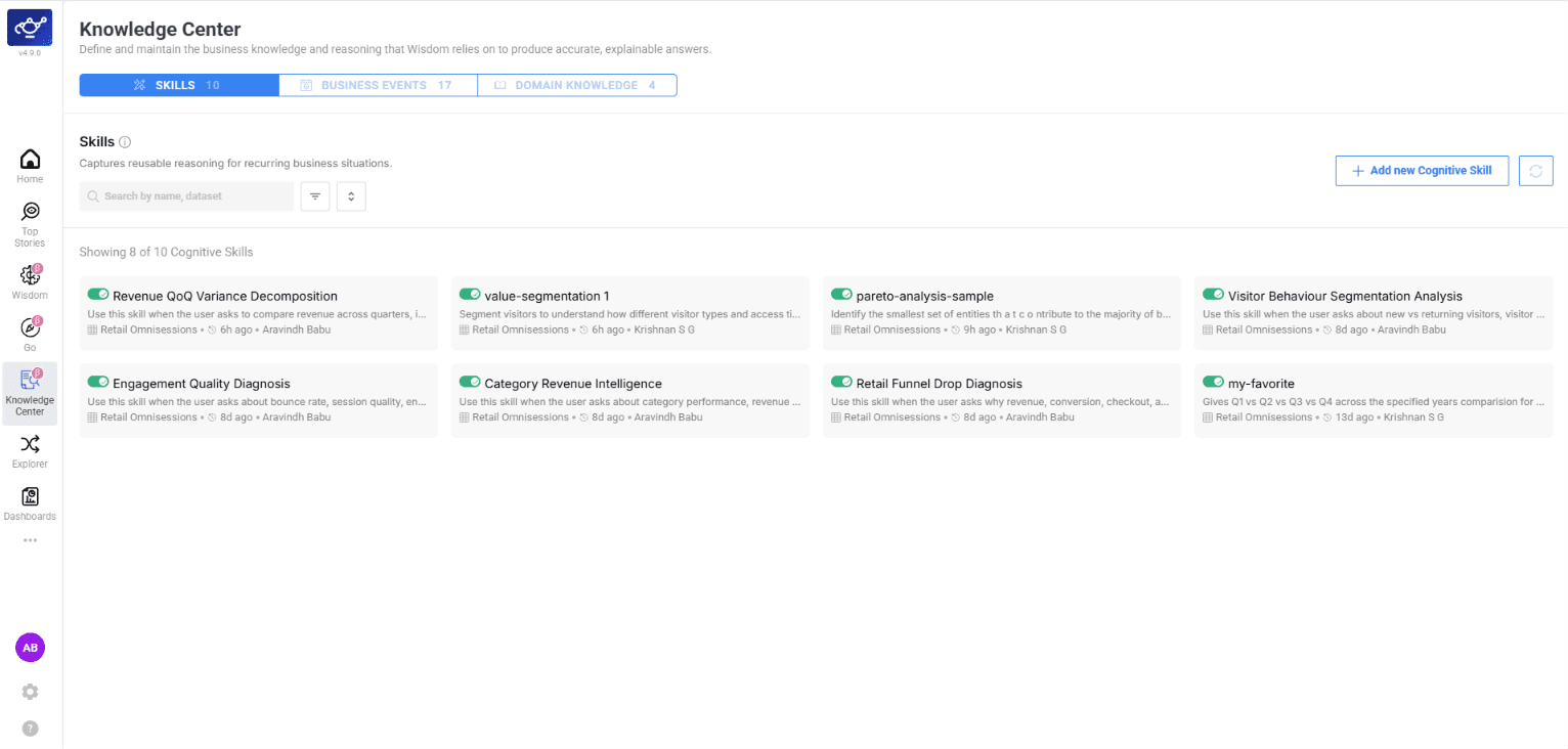
Skills capture reusable reasoning for recurring business situations. Each skill is created per dataset and includes a name, description, enable/disable toggle, and skill inputs — detailed instructions that shape how Wisdom answers analytical questions.
When enabled, Wisdom follows the skill's logic for related queries. When disabled, Wisdom gives generic answers. Use the toggle to validate: ask the same question with the skill on and off, and compare outputs.
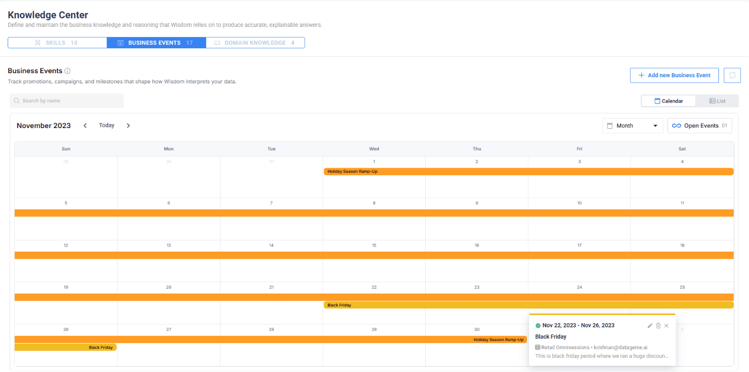
Business Events let you capture promotions, campaigns, and key milestones tied to your dataset. When Wisdom analyzes KPI movements, it uses these events as context — so instead of unexplained spikes or drops, you get answers like "Revenue rose 18% this week, aligned with the Summer Sale Campaign."
Create events with a name, date range, and description per dataset. Open-ended events (no end date) mark ongoing or live promotions. Enable or disable events to control what Wisdom considers in its analysis. View events in Calendar or List format across datasets.
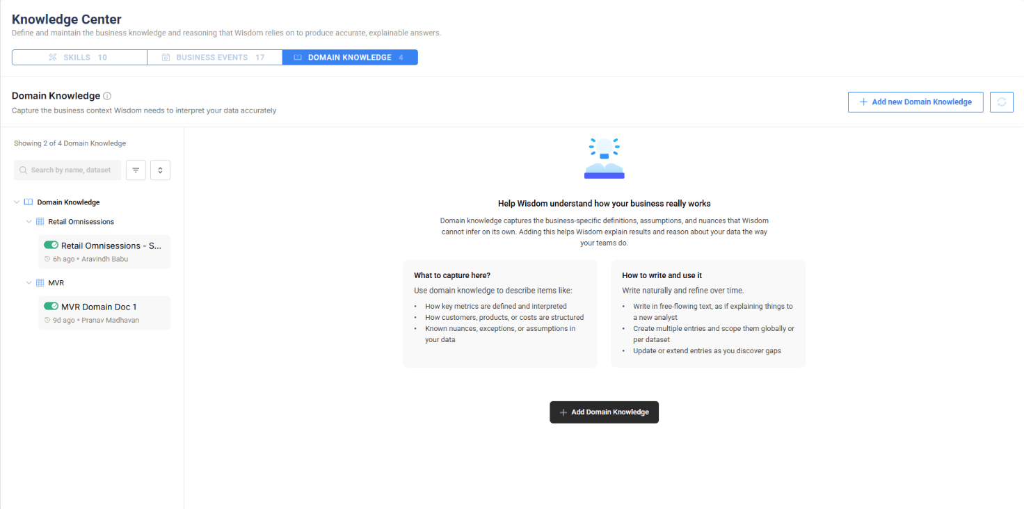
Domain Knowledge captures business-specific definitions, assumptions, and nuances that Wisdom cannot infer on its own. Entries are scoped per dataset and controlled via an enable/disable toggle.
This context is fed directly to the Wisdom LLM and is used by both Wisdom for answering queries and Smart Mode for Hero KPI selection — ensuring explanations and prioritization are grounded in how your business actually works.
Wisdom MCP & Enhancements
Wisdom now supports the Model Context Protocol (MCP), enabling integration with MCP-compatible clients and tools. External systems can connect to Wisdom's analytical capabilities through a standardized protocol, making DataGenie insights accessible from any MCP-enabled environment.
Wisdom now handles follow-up questions more reliably, maintaining better context across multi-turn exchanges and producing more relevant answers when you ask clarifying or drill-down questions.
Wisdom now resolves time period references in natural language queries — such as "last quarter", "this month", or "past 30 days" — more accurately, ensuring it fetches and analyzes data for the correct date ranges.
Bring Your Own Yhat (BYOY)
You can now configure a BYOY AD Group and assign KPIs to it. For these KPIs, anomalies and Top Stories are generated against your own budget or forecast (y_hat) instead of a DataGenie-trained model — the standard band and anomaly logic runs on top of your numbers.
The plan aggregation can be sourced from a different dataset than the actuals, giving you full flexibility to compare performance against your own planning data.
Custom Baseline
Use your own budget, forecast, or plan as the prediction baseline — DataGenie's anomaly detection logic runs on top of your numbers.
Cross-Dataset Sourcing
Source plan aggregation from a different dataset than the actuals, enabling flexible budget-to-actual comparisons.
Explorer — Table View with Predictions
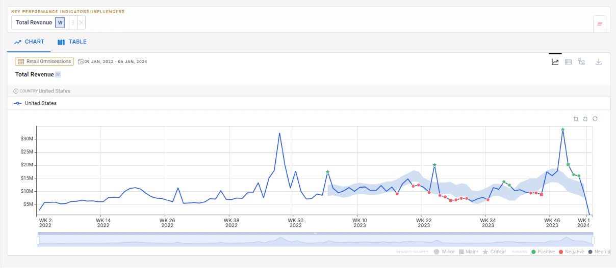
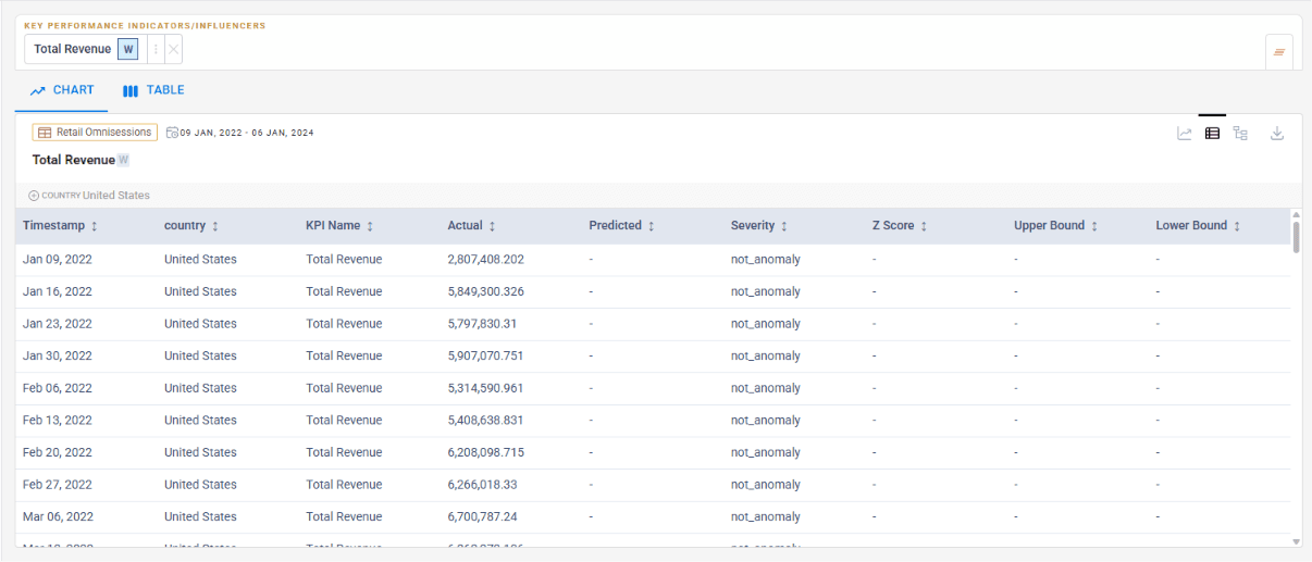
Explorer now lets you view line chart widgets in a tabular format, giving you a structured row-and-column view of the same data shown on the chart. The table view includes prediction data alongside actual values, so you can review forecasted numbers in context with historical data.
The standard chart view displays KPI trends with prediction bands, anomaly markers, and severity indicators across the full time range.
Toggle to Table view for a structured breakdown with columns for timestamp, dimension, KPI name, actual values, predicted values, severity, Z score, and bounds — all in one scannable format.
Exact Values
Charts are great for trend spotting — tables are essential when you need exact numeric values across periods.
Predictions in Context
Actual and predicted values appear side-by-side in tabular form, making comparison and analysis faster.
Toggle between Chart View and Table View using the view-switcher control on each widget. Data and selections are preserved when switching views.
Configurable Top N / Bottom N
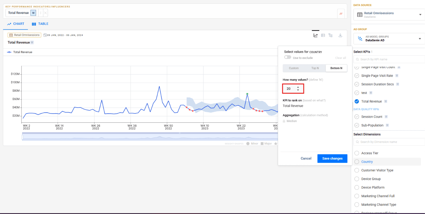
Previously, dimension value selection in Explorer was limited to preset Top 10 and Bottom 10 options. You can now enter any custom number for Top N and Bottom N, giving you finer control over which dimension values to analyze.
IOE Adhoc Support
You can now select specific Top Stories and send them via email on demand — without configuring a scheduled alert.
Select stories
Click Send Top Stories in Mail from the Top Stories page. Story cards display selection checkboxes — pick the stories you want to share. The button updates to show your selection count.
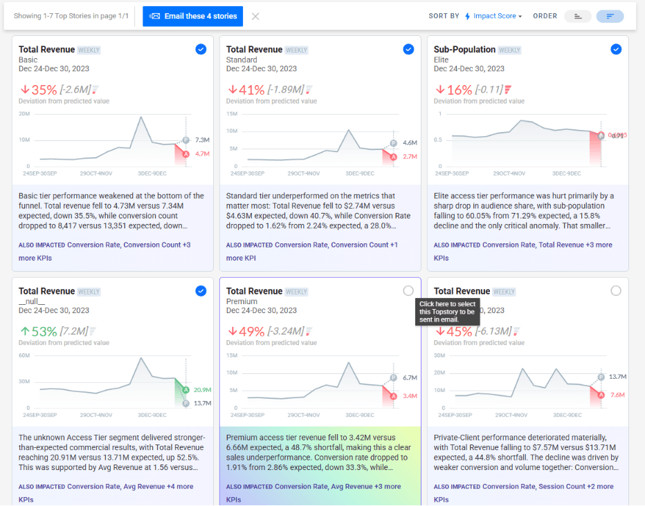
Configure and send
Click the button to open the email dialog. Enter an alert name, add recipients, and click Send Email.
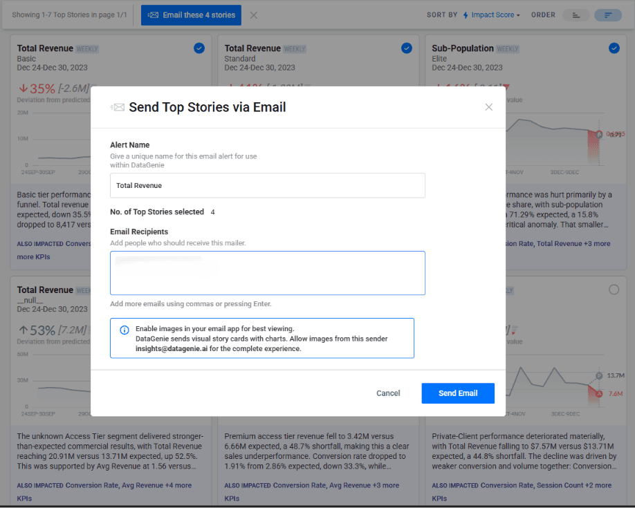
Recipients receive insights
Recipients get a branded DataGenie email with full story narratives, deviation summaries, and supporting charts — ready to act on.
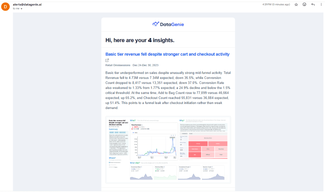
Under the Hood
- MongoDB on Kubernetes — MongoDB now runs within the Kubernetes cluster, improving deployment consistency and operational management.
Filter Preset UX, Metrics Top N & Wisdom Dimension Values
Patch release with three targeted improvements: filter preset descriptions now always visible, Top N metric queries optimized, and Wisdom now captures full dimension value lists instead of truncating.
Filter Preset description — always visible
Previously, the description for a Filter Preset was only shown on hover. It is now displayed persistently so users immediately understand what each preset is designed to capture without needing to interact first.
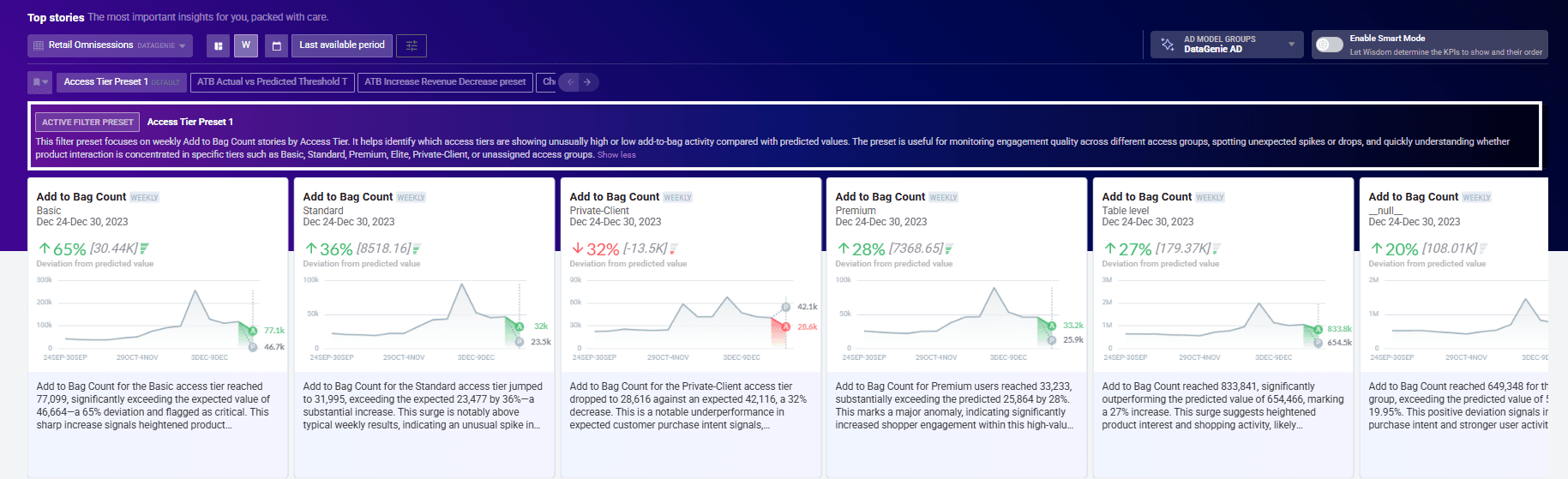
Metrics Top N optimization
The MongoDB aggregation pipeline for overall-granularity metrics fetching has been optimized, significantly reducing query latency for Top N metric requests across large datasets.
Wisdom — full dimension value enumeration
When answering questions that involve dimension values, Wisdom previously truncated long value lists with a dotted format or showed values as missing when there were many options. Wisdom now captures and surfaces all dimension values in full, ensuring complete and accurate responses to dimension-level queries.
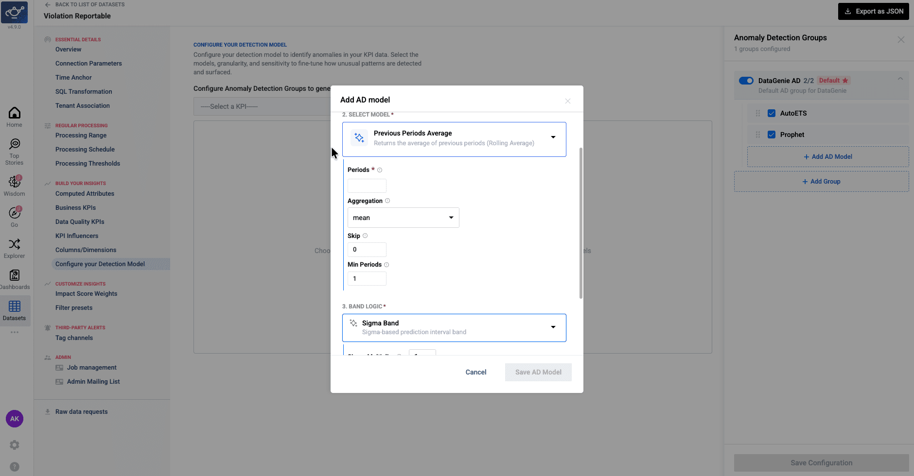
AD Previous Periods Average — Configurable Min Window
The Previous Periods Average model now has a Min Periods parameter that controls the minimum number of data points needed in a window before a rolling average is calculated.
Previously, the model required the window to be fully populated — if even one point was missing, the prediction for that period was skipped entirely and returned as null. With Min Periods, you can set a lower threshold so the model still produces a prediction even when the window is partially filled, making anomaly detection more resilient on sparse or early-stage data.
Dynamic Visualizations, KPI Attribution & Anomaly Detection
Release 4.13 delivers a more adaptive Wisdom experience with context-aware visualizations and direct dashboard publishing, a new waterfall view for KPI attribution, and more reliable anomaly detection for derived metrics — along with targeted improvements to Filter Presets, Business Events, and overall platform performance.
Highlights
Wisdom Dynamic UI
Wisdom now surfaces context-aware visuals — scorecards, trends, comparisons — and lets users add them directly to dashboards.
KPI Attribution Waterfall
A new waterfall view breaks down which factors drove KPI movement, with positive and negative contributors separated clearly.
Filter Preset Thresholds
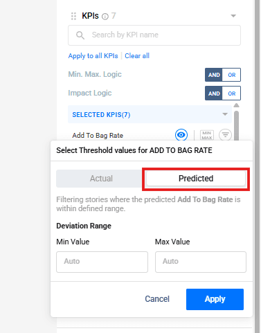
Filter Presets now support min/max thresholds against actual and predicted KPI values to surface more targeted anomalies.
Derived KPI Anomaly Detection
Strengthened validation at the component level produces more reliable anomaly signals for calculated business metrics.
Wisdom Dynamic UI and Add to Dashboard
Wisdom now adapts its visual output based on the user's question, dataset context, and response result. Instead of a single fixed default chart, it can surface more suitable visuals — scorecards, comparison charts, trend charts, funnel views, and other analytical layouts — matched to the nature of the answer.
Users can also add any generated visual directly to a dashboard, turning conversational insights into reusable dashboard components without leaving the Wisdom interface.
Wisdom selects the most appropriate chart type based on the question asked, the structure of the dataset, and the shape of the result — rather than defaulting to a single view.
Any visual generated in a Wisdom conversation can be added directly to an existing dashboard with a single action — turning conversational analysis into a persistent, shareable component.
KPI Attribution Waterfall
KPI Attribution now includes a waterfall-style view that breaks down KPI movement by contributing factors. Positive and negative contributors are clearly separated, giving users a fast visual read on what drove a metric up or down. Attribution output is also surfaced in analysis flows where applicable.
Positive Contributors
Factors that drove KPI growth are displayed above the baseline, sized by their relative contribution.
Negative Contributors
Factors that dragged performance are shown below the baseline, making trade-offs immediately visible.
Filter Preset Enhancements
Filter Presets now support min/max threshold filtering against actual KPI performance, predicted baseline behavior, or both. Teams can reduce noisy Top Stories and focus on anomalies that better match their analytical intent.
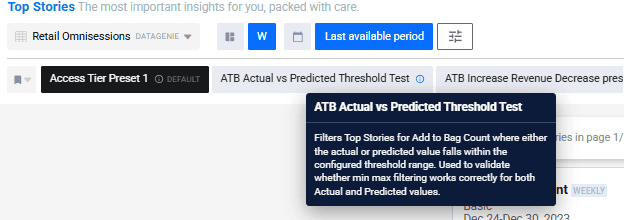
Filter Presets now include readable descriptions. Users can document what each preset is designed to capture, improving discoverability, reuse, and collaboration across teams.
Improved Anomaly Detection for Derived KPIs
Anomaly Detection has been improved for Derived KPIs — rates, ratios, and percentage-based metrics calculated from multiple underlying component KPIs. Prediction quality for these metrics depends on both component-level forecasts and how those forecasts are combined.
This release strengthens validation at the component level and across derived KPI outputs, producing more stable and trustworthy anomaly signals for calculated business metrics.
KPI Min/Max Boundary Support
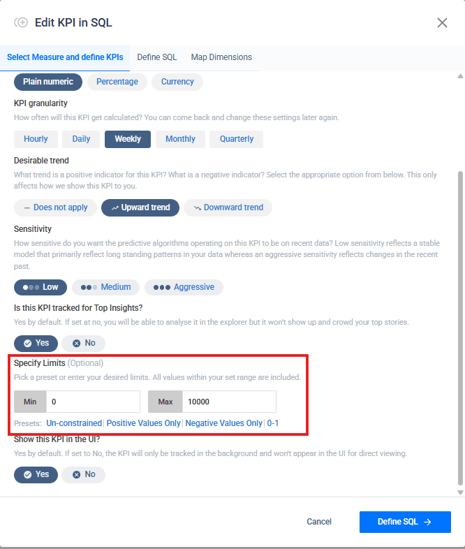
KPI configuration now supports optional minimum and maximum value boundaries. Users can define valid KPI ranges while setting up or editing a KPI, with presets such as unconstrained, positive values only, negative values only, and 0–1 ranges.
This improves consistency for bounded KPIs such as rates, percentages, and ratios, and supports more reliable downstream analysis across stories, anomaly detection, and attribution views.
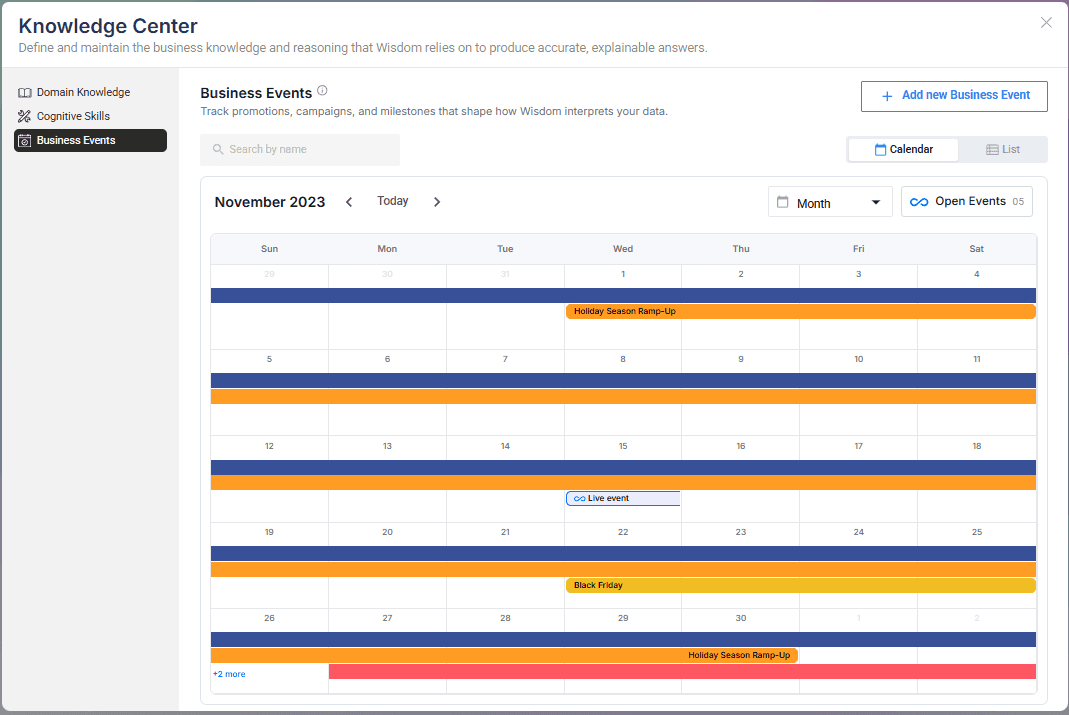
Business Events
Business Events has been updated with expanded configuration options and improved display. Users can document key events — campaigns, holidays, launches, operational milestones — with richer configuration and a cleaner presentation within the Knowledge Center.
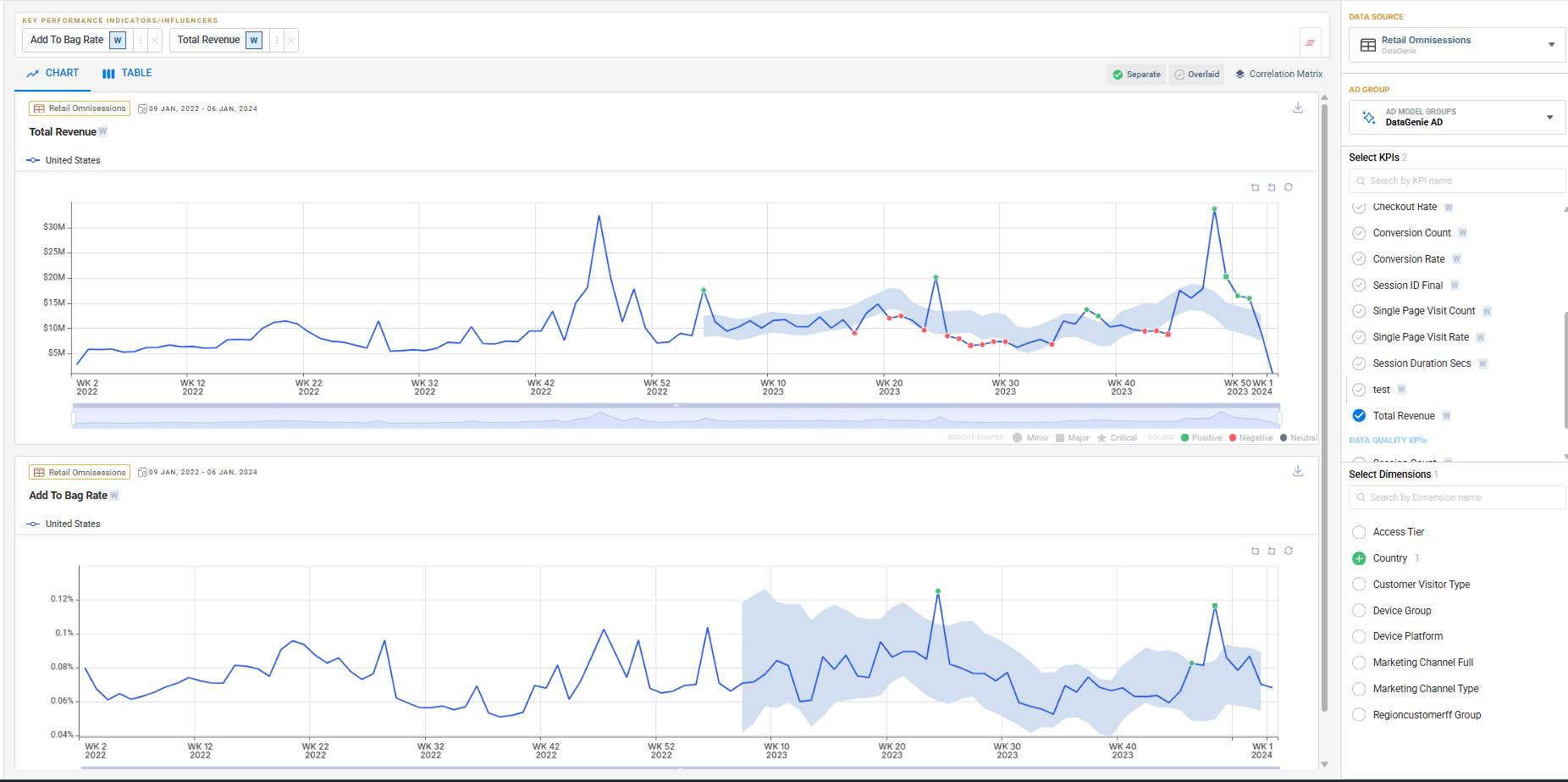
Explorer Enhancements
Minor usability and experience improvements across Explorer for a smoother KPI, dimension, and metric trend analysis workflow.
Bug fixes
Dashboard Fixes
Several dashboard stability and display issues have been resolved to improve reliability.
QuickLook Fixes
QuickLook behavior has been improved for a more consistent preview experience.
Under the Hood
We've optimized our MongoDB pipeline to significantly reduce memory utilization — you may notice snappier query performance, especially on large datasets.
Dual Timezone, Fiscal Calendar & Platform Enhancements
Release 4.12 brings dual-timezone support, native fiscal calendars, a meaningfully upgraded Dashboards experience, and powerful new Wisdom capabilities — Scenario Planning and Business Events — that make insight consumption richer and more contextual.
Highlights
Dual Timezone Support
Decouple ingestion and business-reporting timezones for accurate, DST-safe metric processing.
Fiscal Calendar
Analyze metrics using fiscal periods and quarters (4-4-5, 4-5-4) aligned to financial reporting.
Scenario Planning
Simulate future outcomes by adjusting drivers and comparing against baseline forecasts.
Business Events
Capture real-world context so Wisdom explains anomalies with recorded causes — not invented ones.
Dual Timezone Support
DataGenie now supports configuring two separate timezones per dataset — one for how raw data is ingested, and one for how business metrics are reported.
Previously, all data was processed in a single timezone, which could cause misalignment between when data arrives and how it maps to business reporting periods. With this update, teams can define an Ingestion Timezone (matching the source data) and an Aggregation Timezone (matching business reporting), ensuring metrics are always accurate regardless of where data originates.
Ingestion Timezone
Defines the timezone of raw source data. Used for efficient filtering when reading data.
Aggregation Timezone
Defines the timezone used for business reporting. All metrics, stories, and KPIs are computed in this timezone.
Changing timezone settings on an existing dataset will trigger a full reprocessing of historical data to ensure consistency. Existing datasets default to UTC for both timezones with no change in behavior unless explicitly configured.
Fiscal Period & Quarter Support
DataGenie now supports fiscal calendars, enabling analysis aligned with business-defined reporting structures. Users can work with fiscal periods and fiscal quarters (such as 4-4-5 or 4-5-4), ensuring consistent comparisons and alignment with financial reporting across all views.
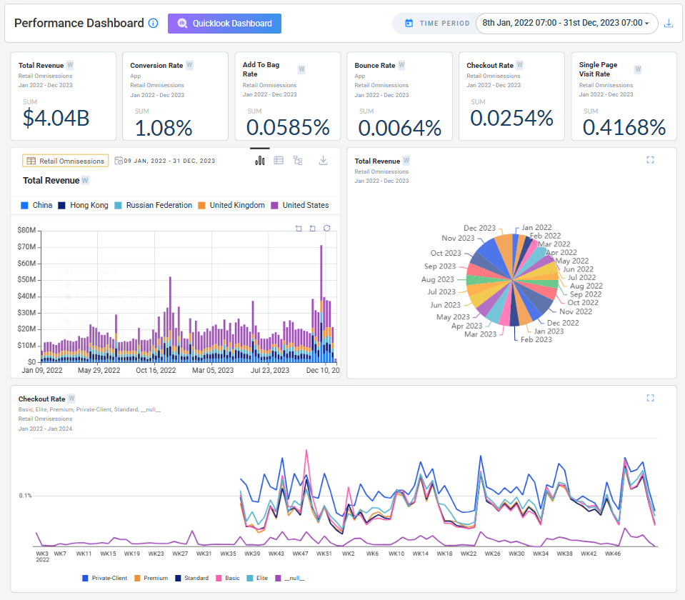
Dashboard Improvements
The dashboard has been significantly improved with better stability, a more refined interface, and a smarter Quick Look experience.
The Quick Look selector now automatically scrolls to the active dashboard, and switching dashboards no longer overrides your default — you can explicitly set or remove it via the selector popup. The same behavior applies to Top Stories filter presets. Dashboards currently set as Quick Look are protected from accidental deletion.
General improvements include fixes to the time period display in the dashboard header, cleaner widget behavior, and a refreshed design across selector popups throughout the homepage and Top Stories.
Scenario Planning (Forecast & Regression)
Scenario Planning lets users simulate future outcomes by adjusting key business drivers and instantly seeing their projected impact on KPIs.
Instead of relying only on a baseline forecast, users can test what-if scenarios — such as changes in conversion rate, traffic, or bounce rate. Each scenario is recalculated in real time and compared against the baseline, helping teams evaluate trade-offs and identify the most effective levers before making decisions.
Driver Adjustments
Adjust individual business drivers and instantly see their projected effect on target KPIs.
Baseline Comparison
Each scenario is overlaid against the baseline forecast for a clear before/after view.
Business Events
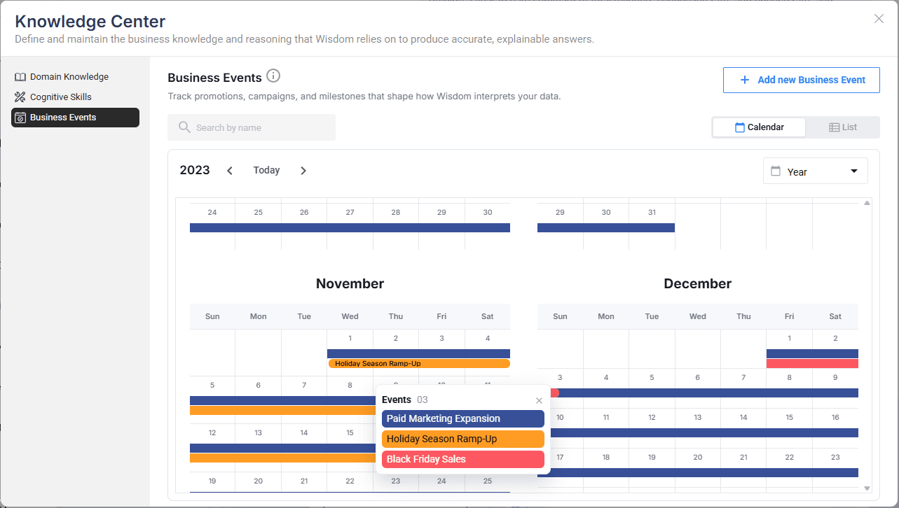
Business Events introduces a structured way to capture real-world context directly within the platform. Users can document key events — promotions, campaigns, operational disruptions, strategic changes — that may influence data trends.
Events can be scoped to a specific dataset and viewed in either a calendar or list format. Each event captures a name, start and end date, and a description of the business context. Wisdom uses these events to better connect observed trends to real-world causes, improving the accuracy and relevance of its explanations.
Create Events
Log promotions, campaigns, or disruptions with a name, date range, description, and optional dataset scope.
Calendar & List Views
Visualize events over time in a calendar view, or manage them in a structured list format.
IOE Delta Processing
Users can now control whether alerts surface only newly processed date periods or also include reprocessed historical dates.
By default, alerts show only new delta periods, reducing noise and keeping focus on what is actually new. Additional improvements include timezone awareness and fiscal calendar support for subject date handling, along with a fix for a fallback plain-text message that was incorrectly appearing in alert emails.
Multi AD — Import / Export Support
Users can now export AD Group configurations from an existing dataset and import them into a new or existing dataset. Anomaly detection models and configurations can be reused without manual setup, improving consistency and reducing onboarding effort across datasets.
Wisdom Enhancements
Wisdom now understands fiscal calendars and allows users to ask questions and run forecasts aligned to fiscal periods. It automatically maps fiscal months, quarters, and years to the correct date ranges, ensuring analysis and projections match business reporting structures.
The question input area has been refreshed with a cleaner, more focused interface for natural language queries.
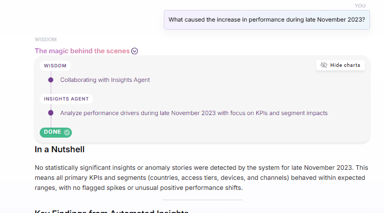
A new Hide / Show Charts toggle lets users instantly collapse or expand all visualizations — including bar charts, plot lines, and KPI attributions — generated within the Magic Behind the Scenes section.
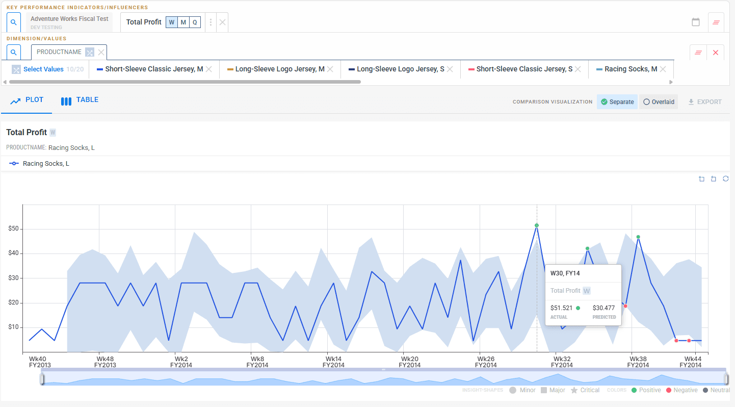
KPI Handling
User-defined KPI limits (upper and lower bounds) are now consistently applied across Explorer, stories, and metric calculations. This ensures uniform behavior across all views and improves reliability of KPI interpretation.
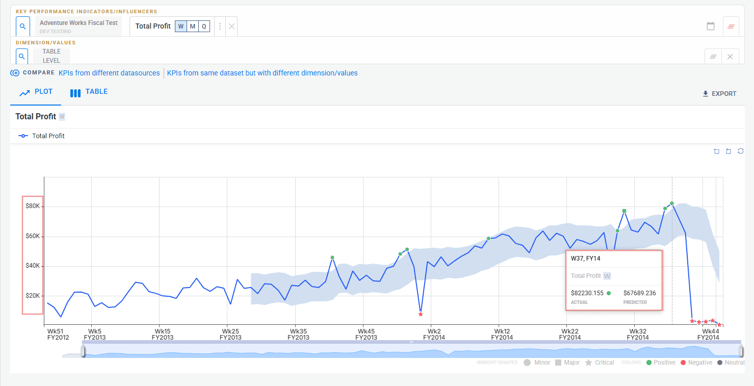
Users can now define a KPI type — percentage, currency, or numeric. The selected type is reflected explicitly throughout the UI:
- Percentage KPIs display with
% - Currency KPIs display the appropriate symbol
- Numeric KPIs remain plain
Bug fixes
KPI Attribution Consistency
Fixed inconsistencies in contribution bars and value mapping to ensure accurate attribution representation across the tree view.
General Stability Fixes
Improvements across anomaly detection behavior and metric consistency to reduce edge-case failures.
Root Story Depth Handling
Root story generation rules are now relaxed at lower depths. Previously, root stories were always restricted to Configured Depth - 1. The -1 rule now applies only when the configured depth is strictly greater than 2.
- Depths 1–2 — root stories generate up to the exact configured depth
- Depths 3+ — root stories generate up to
Configured Depth - 1
Advanced Detection & Deeper Explainability
Multi-baseline anomaly detection, tree-based attribution for derived KPIs, and reliability improvements that make detection more stable across long-horizon datasets.
Highlights
Multi Yhat (Multi AD Groups)
Configure multiple detection groups per dataset, compare baselines, and surface insights independently per group.
KPI Attribution
Tree-based attribution for derived KPIs with actual, predicted, deviation values, and SQL visibility.
Seasonality Enhancements
Improved weekly, monthly, and quarterly detection plus better zero-value handling.
Nirvana Dataset Isolation
Dedicated Nirvana tab with inherited default AD Groups for consistent multi-source detection.
Multi Yhat (Multi AD Groups)
Multi Yhat introduces the ability to configure and manage multiple anomaly detection groups per dataset. This gives business users the flexibility to define their own baseline models alongside DataGenie's built-in anomaly detection and surface insights separately for each group.
Multiple AD Groups per Dataset
Configure and manage multiple AD groups with custom models and parameters per dataset.
Custom Default Models
Define any AD group as the default baseline used across Top Stories and Deep Dive.
Explorer Integration
Compare trends and predictions across multiple Yhat lines directly within Explorer.
Nirvana Support
Nirvana datasets automatically inherit default AD groups from their component datasets.
Configuring AD Groups
Users can configure AD groups both during dataset creation and when editing an existing dataset. The configuration screen lets you select or create a custom AD model, define its parameters, and mark one group as the default.
Prediction Preview with ADAAS
ADAAS now supports group-based prediction, enabling prediction previews in the configuration screen for each Multi Yhat group.
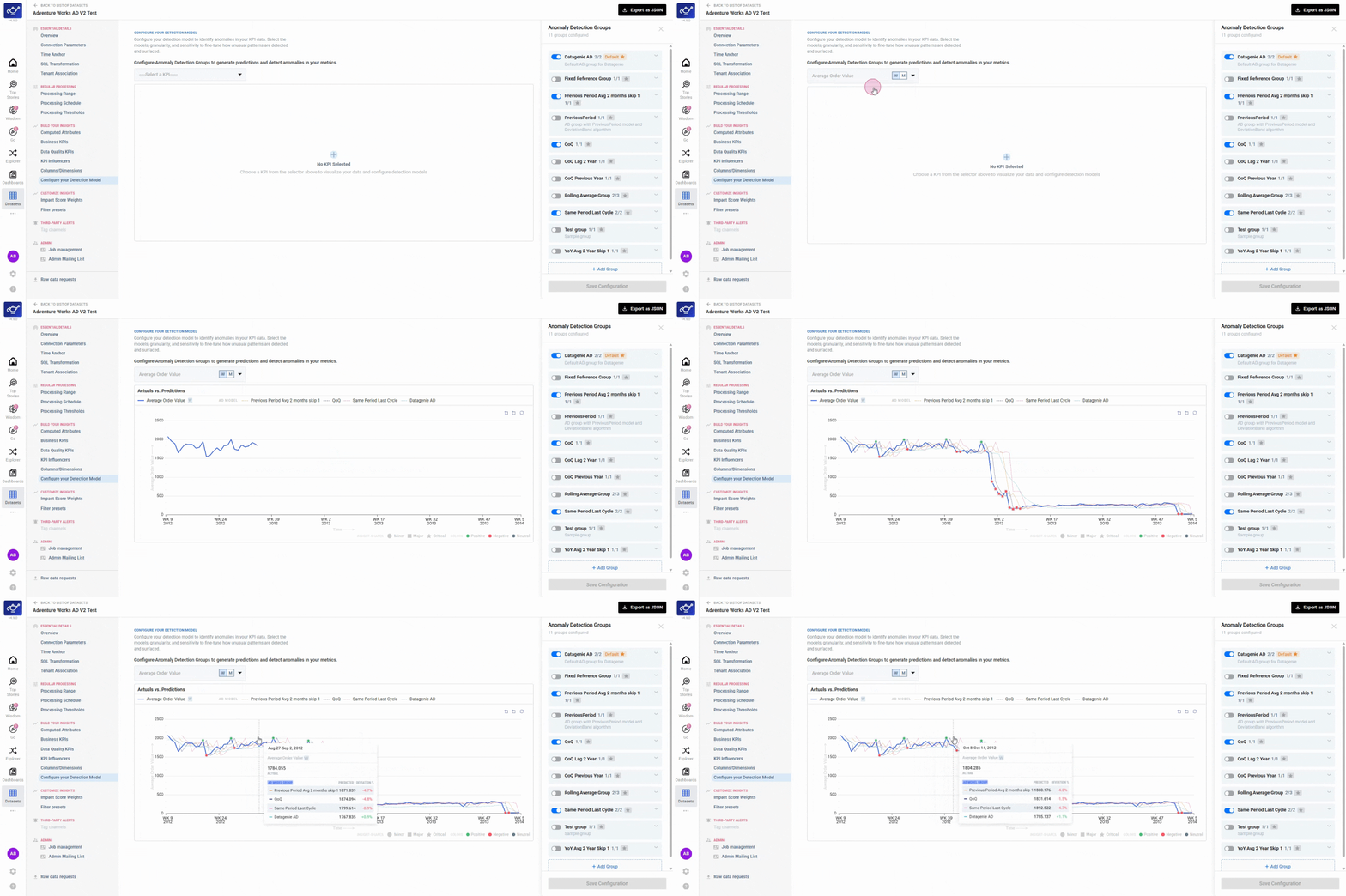
Insight Segmentation by AD Group
Insights are surfaced separately for each AD group across Top Stories, Deep Dive, and Explorer. Each group maintains its own prediction baseline, ensuring accurate anomaly detection and ranking.
KPI Attribution
KPI Attribution introduces a visual and analytical workflow to understand how derived KPIs are constructed and what drives their movement.
Any derived KPI can be expanded into a hierarchical tree showing all contributing metrics. Each node displays attribution value, attribution percentage, and severity, so you can see how each component KPI contributes to the overall change.
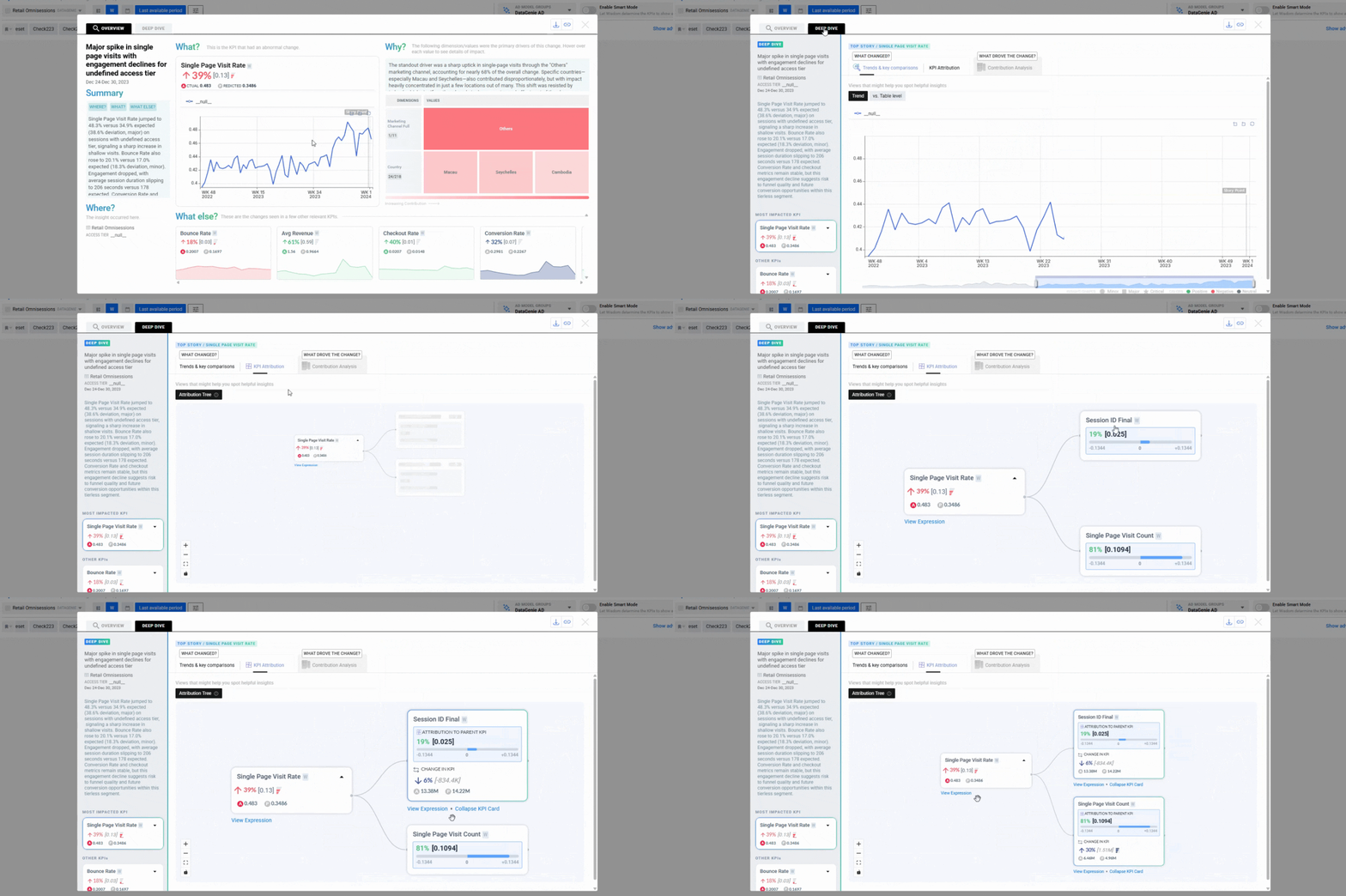
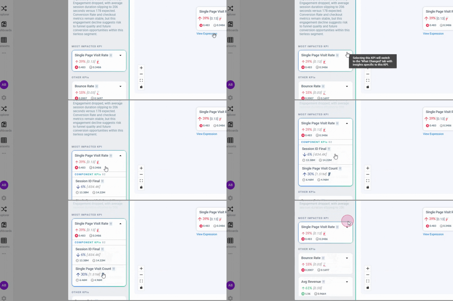
Derived KPIs in the left panel display dropdown controls to explore child KPIs inline, enabling seamless navigation without leaving the Deep Dive context.
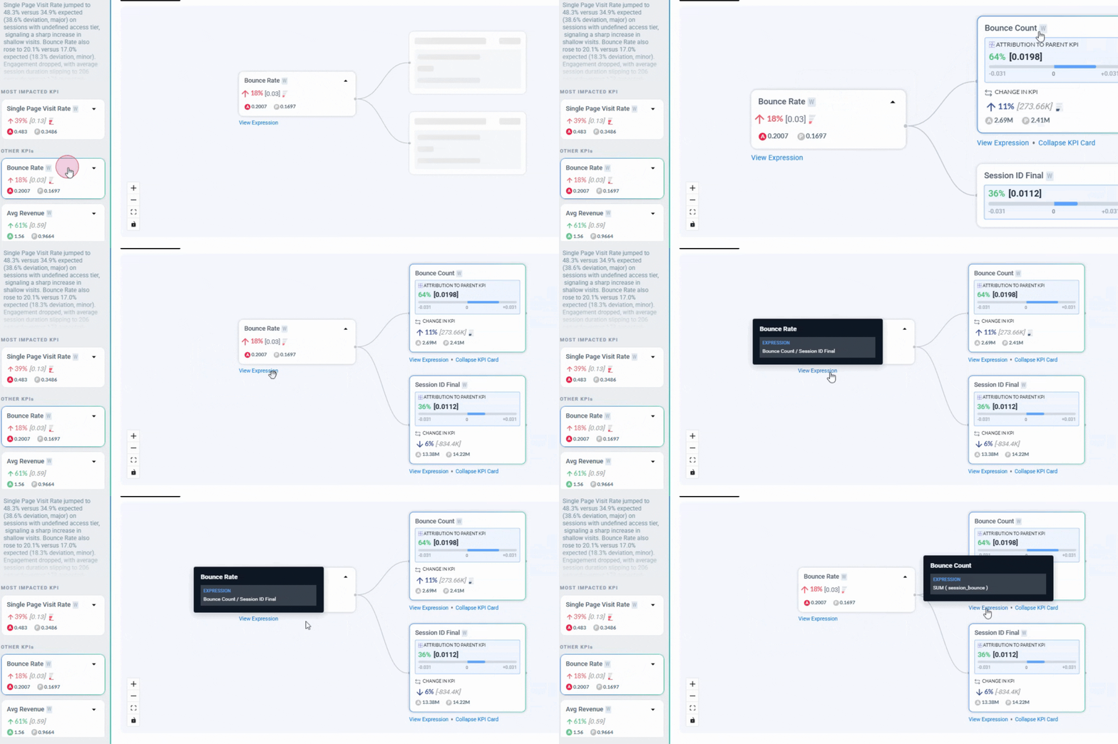
Each KPI node exposes its underlying SQL expression, enabling analysts to validate logic and trace KPI derivation paths end-to-end.
KPI Attribution remains synchronized with the selected KPI across all Deep Dive tabs, ensuring consistent attribution insights during analysis.
Seasonality & Zero Handling
Anomaly Detection models now include enhanced seasonality detection for higher granularities — weekly, monthly, and quarterly time series — increasing model stability and anomaly accuracy across long-horizon datasets.
Improved zero-value handling ensures that AD models do not learn from structural zero values. This prevents distorted baselines and improves detection accuracy in datasets where zero values represent non-operational or inactive periods.
Nirvana Dataset Experience
Nirvana datasets now appear exclusively under the Nirvana tab in the dataset listing page. This improves discoverability and ensures clearer dataset categorization for Nirvana-enabled workflows.
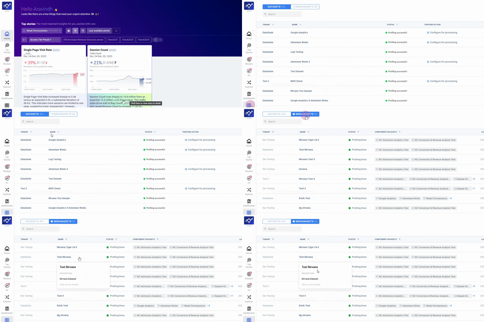
Bug fixes
Bounds for Data Quality KPIs
Data quality KPIs are now bounded by default. Count metrics have a lower bound of 0, and sub-population metrics are bounded between 0 and 100.
Notebook Rerun Option
The rerun option is no longer shown for newly created notebooks, preventing unintended executions before the notebook has run.
Dataset Table Search Fix
Resolved an issue where search within the dataset listing table was not returning accurate results.
Nirvana Dataset Listing
Nirvana datasets now appear only under the Nirvana tab, ensuring accurate categorization across the dataset listing page.
Smarter Onboarding & Insight Precision
The biggest update yet to the onboarding and analysis engine — GO makes dataset onboarding conversational, Change Analysis gets sharper, and anomaly detection handles sparse and seasonal series better.
Highlights
GO (Guided Onboarding)
Sample → context → blueprint, with image upload support.
Contributor Sorting
Sort by % deviation in addition to % contribution for Change Analysis.
Deep Dive Extended History
Longer KPI history available in-place without leaving the story view.
AD Reliability
Monthly seasonality, stable runs, and fewer false anomalies on sparse series.
GO (Guided Onboarding)
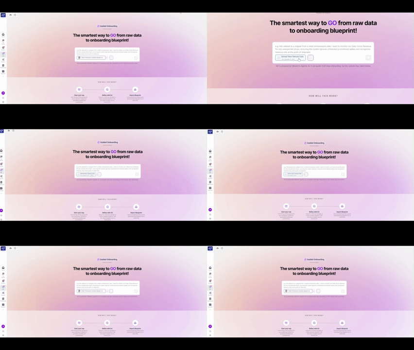
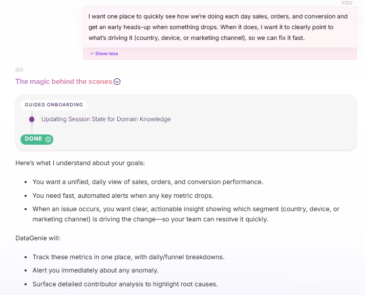
GO is the fastest way to onboard a dataset into DataGenie. It removes the guesswork from onboarding and gets you to "insights-ready" significantly faster.
Sample
Drop in a lightweight data sample to begin the process.
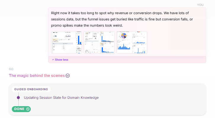
Context
Add business context, including screenshots, to provide richer information.
Blueprint
GO walks you through the key inputs step-by-step, then produces a downloadable onboarding blueprint in JSON format.
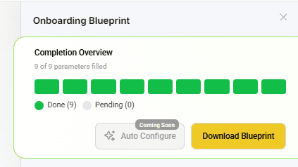
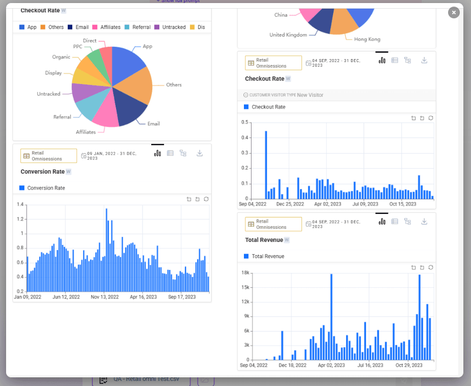
Image Upload Support
Users can upload images during GO to provide richer context for onboarding.
Improved Question Box UI
A cleaner, more guided input experience while interacting with the GO flow.
Enhancements
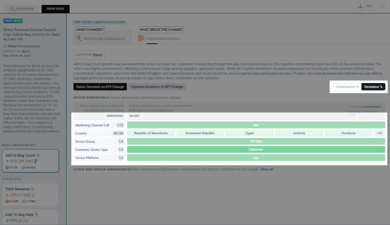
Contributor Sorting for Change Analysis — For non-rollable KPIs, contributors can now be sorted by % deviation in addition to % contribution, helping users prioritize contributors by the largest deviations first.
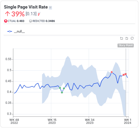
Top Stories Overview — Added a vertical marker for the current period to make extended-history trends easier to interpret.
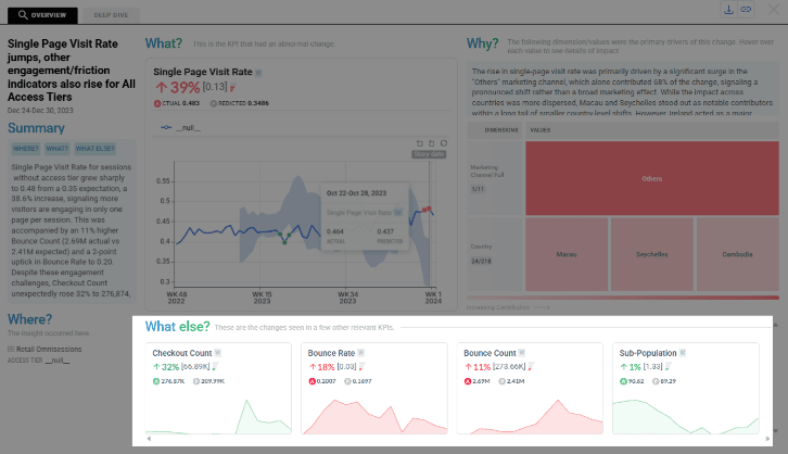
KPI Cards — Missing Values — KPI cards now handle null or empty values more gracefully, reducing confusing or misleading KPI tiles.
Deep Dive — Extended History — Deep Dive now shows a longer historical window for KPI timeseries. Review trends over time without leaving the story view.
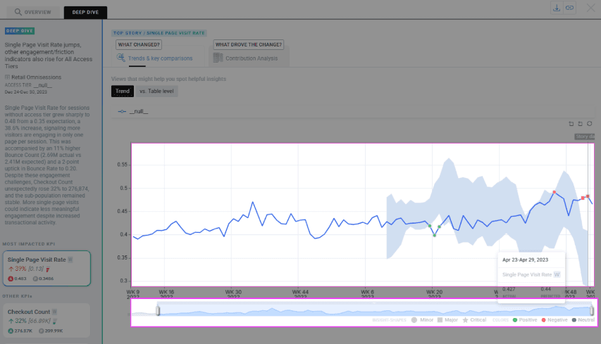
Readability Improvements
- Quarterly Display: Quarterly datasets now display as "Q1 2019" instead of a date like "Jan 01 2019".
- Consistent Labels: Granularity-aware axis labels are more consistent across daily, weekly, and quarterly views.
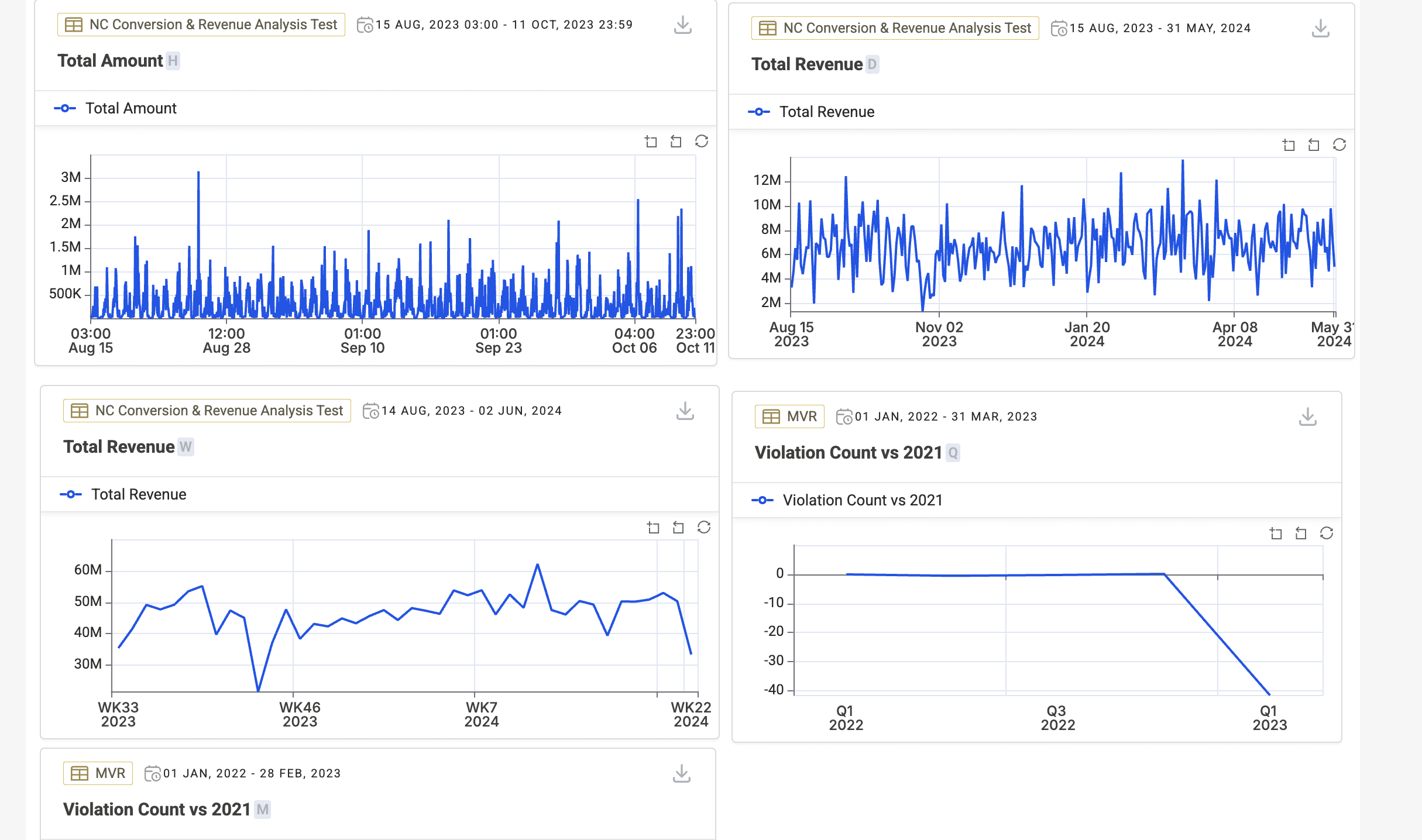
AD Reliability
- Monthly Seasonality — Trackers with clear monthly patterns are better handled so seasonality is captured more reliably. Better baseline fit and reduced missed pattern-driven behavior.
- Run Reliability — AD jobs are more robust in cases where predictions or sigma were intermittently null. Fixes a root cause that led to empty prediction patches.
- Sparse Series Handling — AD is now less sensitive to imputation side-effects on sparse trackers with occasional spikes, reducing false anomalies.
Fixes
Root Story Output
When no View Filter is applied, only impacted KPIs are shown and blank-value KPIs are excluded.
Derived KPI Metrics
Metrics fetching now returns correct results for derived KPIs across multiple granularities.
Weekly Alignment
Weekly start-day alignment is now consistent to prevent mismatched week periods in insights.
Dimension Edits
Display Name edits now persist correctly and no longer disappear during the configuration flow.
Dashboard Reliability — Dashboard deletion no longer fails due to backend exceptions or constraints.
Other changes
- Platform improvements — Improved caching and storage behavior for Airflow and insights reliability.
- Resource allocation — Increased resources for Insights and Metrics services to reduce failures under load.
- Stability — Improved Airflow pod restart stability and updated runtime components.
- Databricks support — Added support for configurable cluster allocation strategies for Databricks workloads.
Smarter Stories & Stronger Reliability
Sharper Top Stories relevance via Smart Mode, broader IOE controls, and reliability improvements that keep insights fresh and stable.
Highlights
Smart Mode
Wisdom decides KPI ordering, highlights a Hero KPI, and groups Relevant vs Other KPIs for faster scanning.
IOE Upgrades
Alert toggle, authorized dataset selection, refreshed templates, batch mode, and a no-stories fallback.
Impact Score Alignment
Ranking adapts to KPIs selected in View Filter; Business KPI weightage removed for simpler behavior.
Clearer Explainability
Fallback when drivers are missing; richer contributor tooltips with deviation context.
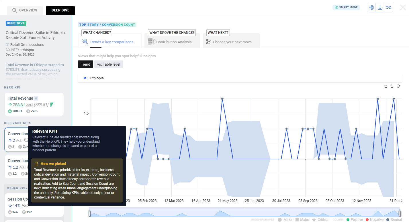
Smart Mode (Wisdom) for Top Stories
Smart Mode changes how KPIs are presented inside each Top Story card so users can scan faster and focus on what matters first.
- Smart Mode OFF — KPI ordering follows Impact Score ordering logic.
- Smart Mode ON — Wisdom decides KPI order using severity, business impact, and domain knowledge.
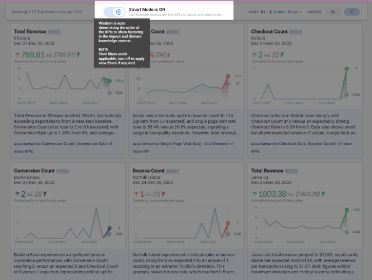
Hero KPI
The most important KPI becomes the Hero KPI.
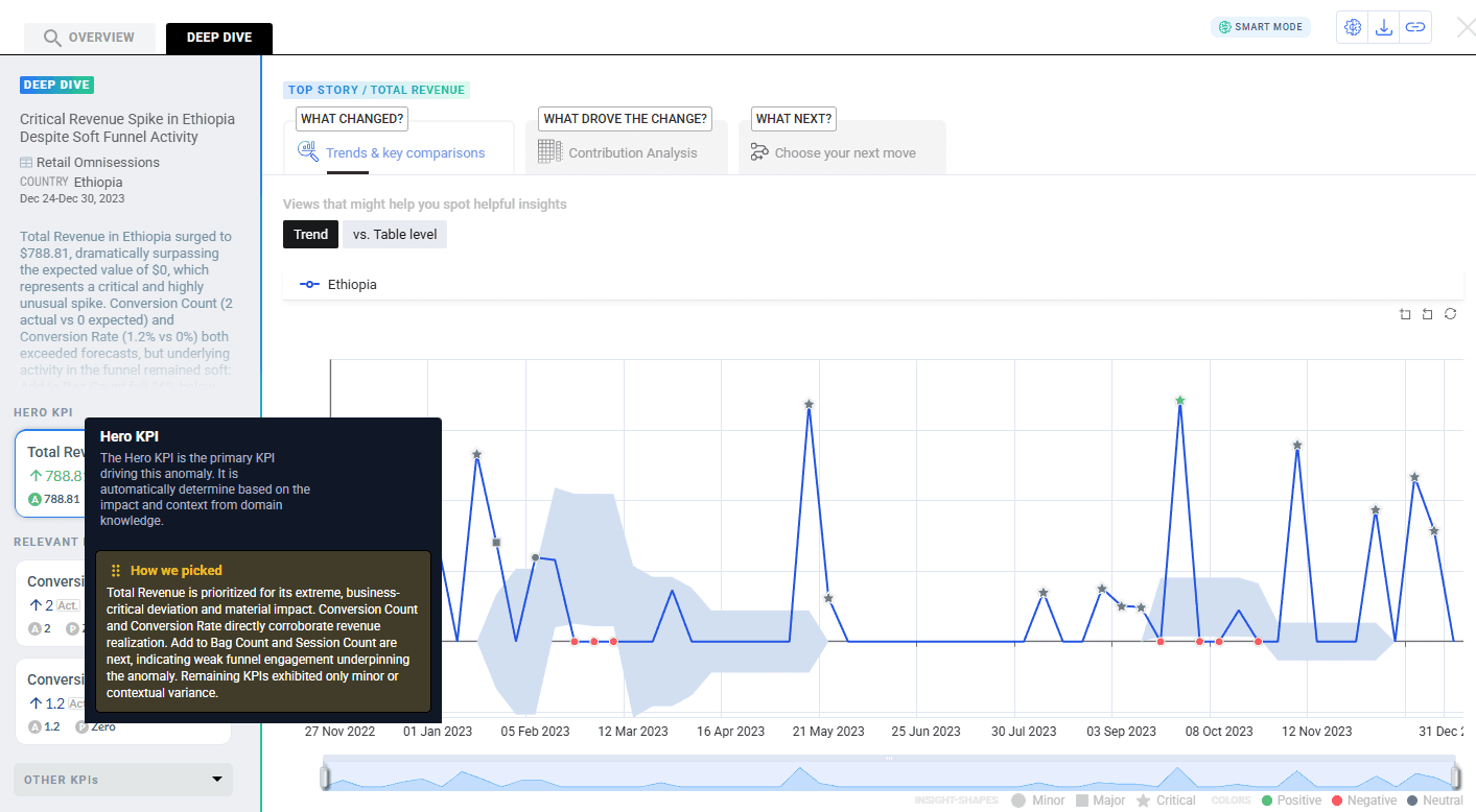
Relevant KPIs
KPIs strongly related to the Hero KPI appear under Relevant KPIs.
Other KPIs
Less significant or loosely related KPIs are grouped under Other KPIs.
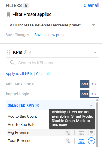
Behavior change — In Smart Mode, story cards show all KPIs and the View Filter is not honored, because Smart Mode decides what to show and in what order.
Enhancements
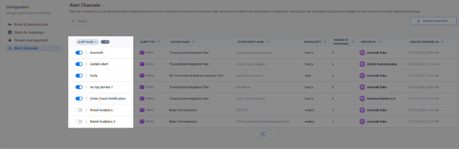
Alert channel toggle UI — Alerts can be paused/resumed without deleting the alert.
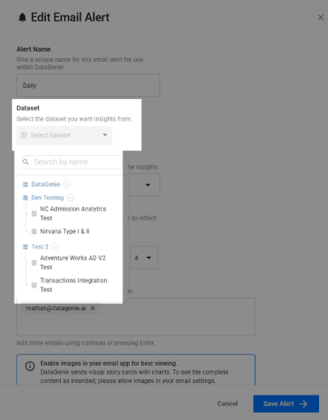
Authorized dataset selector integration — Alert setup uses the platform dataset selector so users can configure alerts only for datasets they're authorized to access.
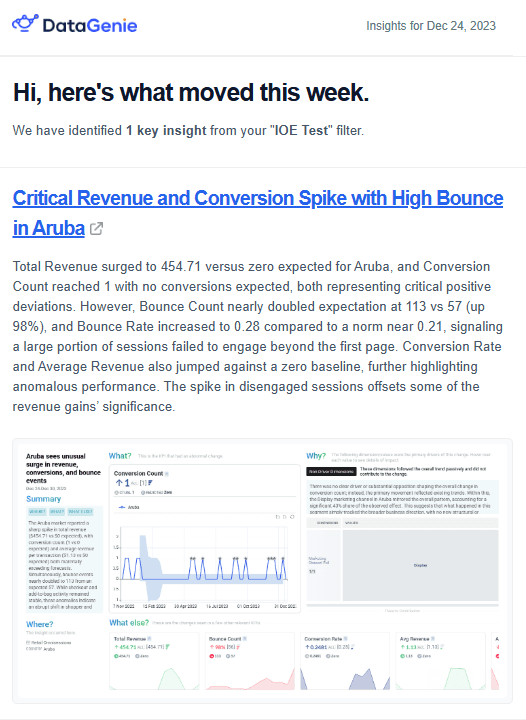
Updated alert templates — Email templates refreshed for cleaner layout and readability.
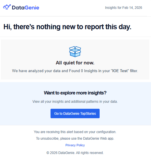
"No Stories" friendly fallback — If no stories are detected for the window, the email shows a friendly "all quiet" state instead of looking blank.
IOE batch mode for regular periods — IOE runs in batch mode for regular scheduled periods to reduce missed insights due to timing gaps.
Impact Score sorting aligned to selected KPIs — Top Stories can be sorted by Impact Score based on KPIs selected in the View Filter. As KPI scope changes, the feed recalculates and reorders automatically.
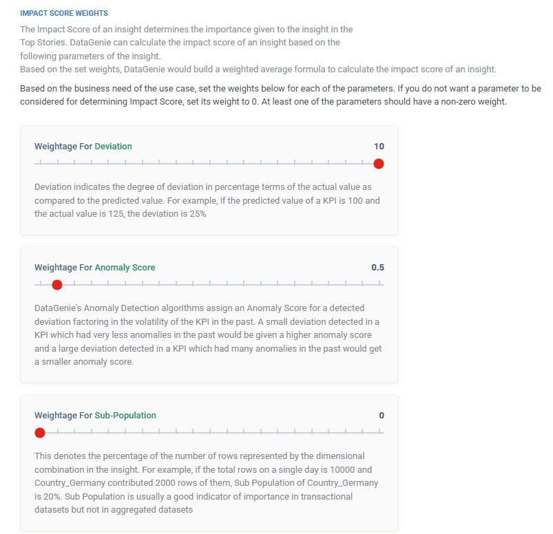
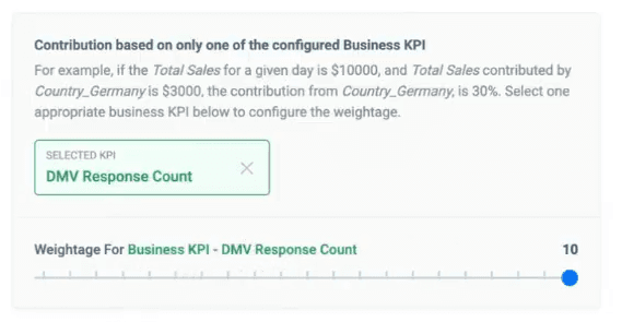
Impact Score update — Business KPI weightage removed — The Business KPI weightage control has been removed to simplify the experience and reduce confusing behavior.
Fallback state when drivers aren't available — When driver dimensions aren't present, the UI shows a clear fallback message instead of a blank/confusing state.
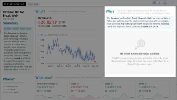
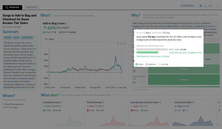
Contributor tooltip shows deviation (root vs contributor) — Tooltips now surface clearer deviation comparisons to speed up investigation without leaving the view.
Deprecated auto-save removed — Background auto-save/sync is removed. Sync is now intentional (not silent).
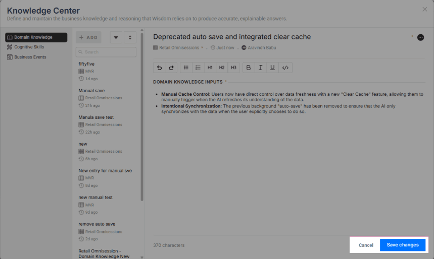
Integrated "Clear Cache" — Adds a Clear Cache action so users can manually refresh the AI's understanding when needed.
Preset: implicit Visibility enabled when Impact/MinMax applied — When a preset applies Impact or Min/Max (Limit) for a KPI, the system implicitly enables Visibility for that KPI so it can't be accidentally hidden.
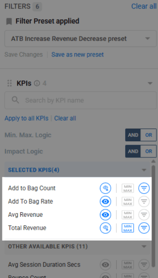
Min/Max (Limit) uses predicted values — Limit filters inside presets evaluate against predicted baselines for more forward-looking anomaly discovery.
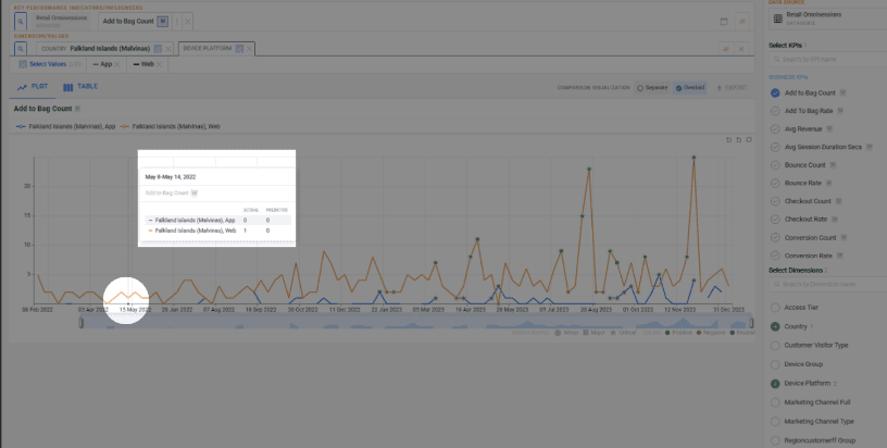
Discrete points handling in line graphs — Sparse series render isolated points using dot markers to avoid "missing"-looking charts.
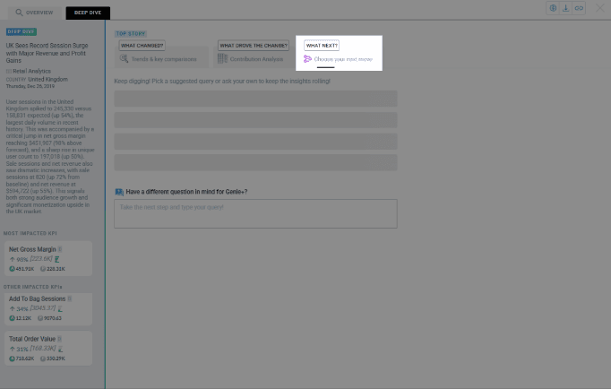
Deep Dive cleanup: "What Next?" removed — The "What Next?" section is removed to keep Deep Dive focused on analysis and reduce UI noise.
Bug fixes
Overview KPI persistence
Selecting a new metric in Deep Dive no longer changes the primary KPI in Overview. Overview stays locked to the original insight while exploration continues.
Last period ingestion fix
Time-filtering no longer excludes the final time bucket. Top Stories now processes the latest hour/day correctly.
Daily datasets: seasonality improvements
Better weekly seasonality detection for daily datasets.
Quarterly datasets: model and overfitting fix
Improved models for low-sample quarterly series and fixed tracker overfitting so anomalies aren't missed.
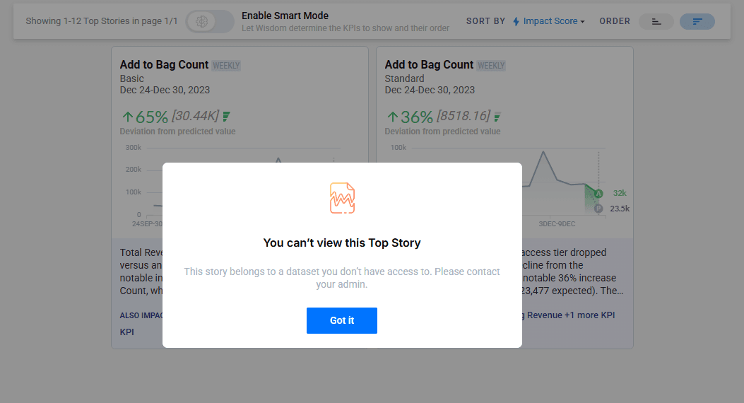
IOE dataset permission enforcement
Users can no longer configure or view alerts for unauthorized datasets (enforced via dataset selector).
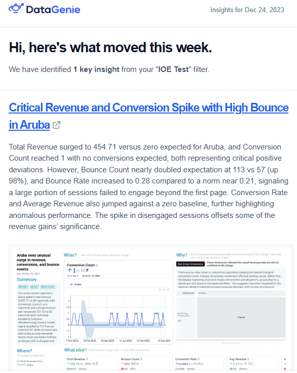
Stable screenshot capture
Email screenshots are captured only after the page fully renders, reducing blank or partial screenshots.
Other changes
- Automatic database patches (DGRM client) — DGRM client can auto-install required DB scripts/delta versions during releases to reduce manual patching.
- Ingress class name configurable — Previously defaulted to NGINX; now controlled via an environment variable to match the environment's ingress class.
- Insights Service cache volume — Cache no longer resets on pod restarts/deployments, reducing warm-up after releases.
- Pipeline/Airflow — When older periods are recomputed and values change, the pipeline clears insights cache so stories refresh and reflect the latest values.