Jump to a release
v4.15 · June 8, 2026
Briefs + Product Analytics + Deviation Mode
v4.14 · May 20, 2026
Knowledge Center + Wisdom MCP + BYOY
v4.13.2 · May 5, 2026
Filter Preset UX + Wisdom Dimension Values
v4.13.1 · May 4, 2026
AD Previous Periods Average fix
v4.13 · Apr 2026
Dynamic Visualizations + KPI Attribution
v4.12 · Apr 2026
Dual Timezone + Fiscal Calendar
v4.11.1 · Mar 27, 2026
Root Story depth handling
v4.11 · Mar 18, 2026
Multi Yhat + KPI Attribution
v4.10 · Mar 4, 2026
GO Onboarding + Deep Dive
v4.9 · Feb 2026
Smart Mode + IOE upgrades
v4.15
BriefsProduct AnalyticsContribution AnalysisWisdomDeep Dive
June 8, 2026 · Briefs, Product Analytics & Deviation Mode Improvements
Briefs, Product Analytics & Deviation Mode Improvements
Release 4.15 introduces Briefs — an always-on analyst that watches your data and writes you the few insights worth knowing — alongside Deviation Mode improvements in Contribution Analysis and a refreshed Wisdom experience.Highlights
Briefs
Describe what matters once, and get a scheduled, self-writing analyst brief that surfaces only the insights worth knowing.
Product Analytics
A consolidated view of how DataGenie is used — logins, active users, stickiness, and feature-level engagement at a glance.
Deviation Mode
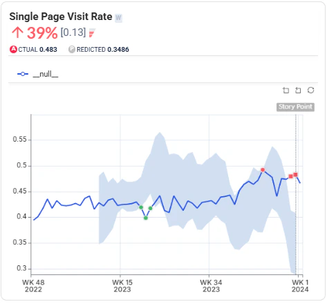
Deviation Mode in Contribution Analysis is sharper — contributors now sorted by deviation %, with a clearer actual/predicted/deviation tooltip.
Wisdom UX Refresh
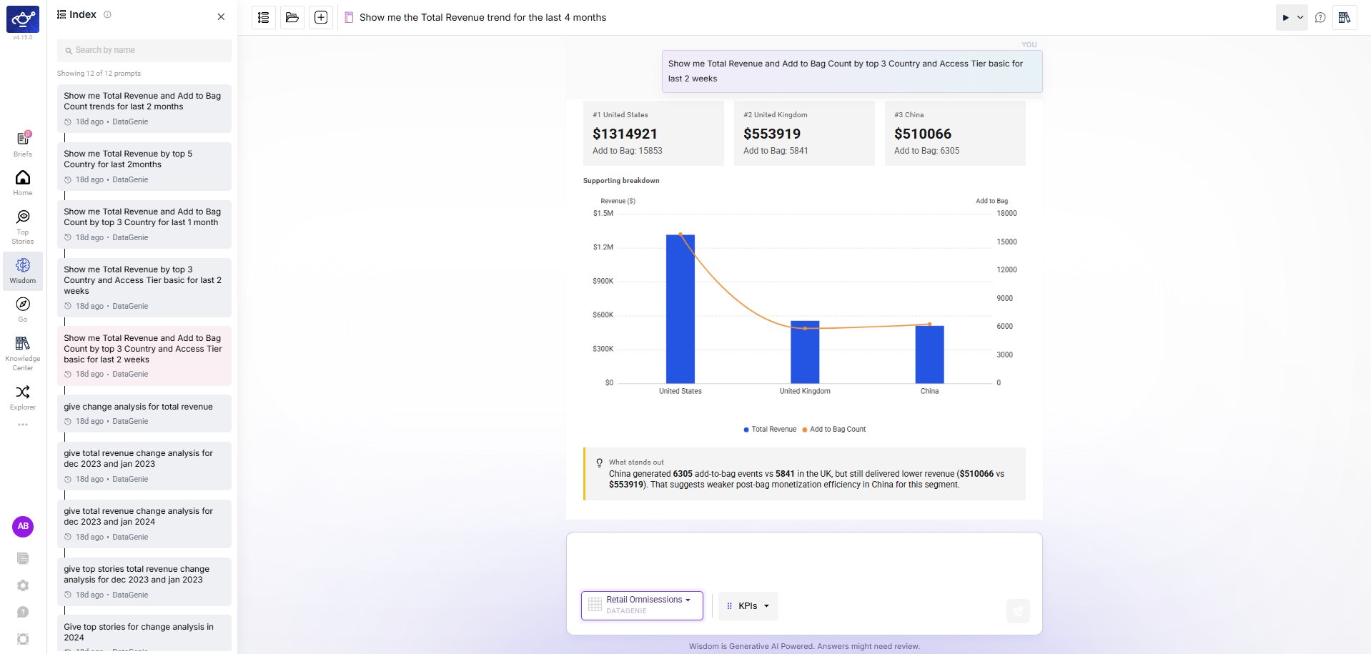
A searchable grid of notebook cards on the Wisdom home, plus a new in-notebook Index to jump between prompts.
New Features
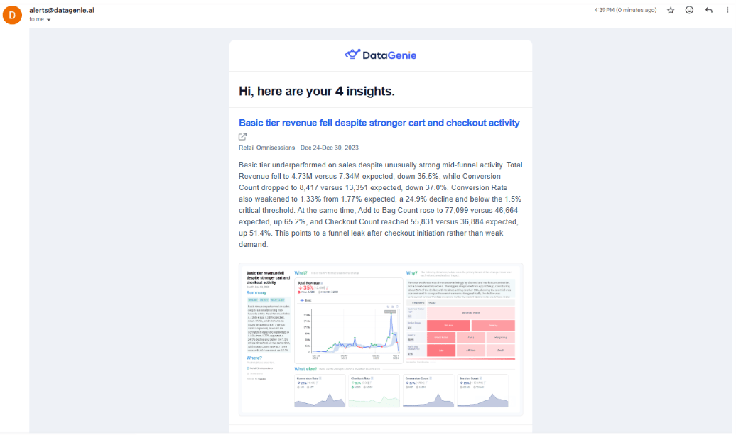
Briefs
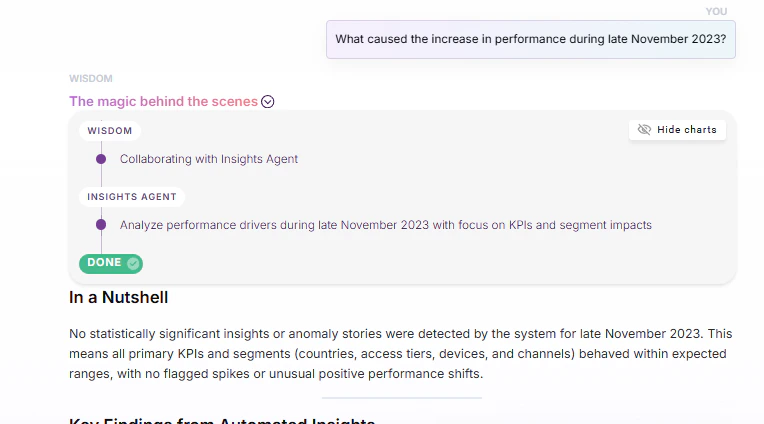
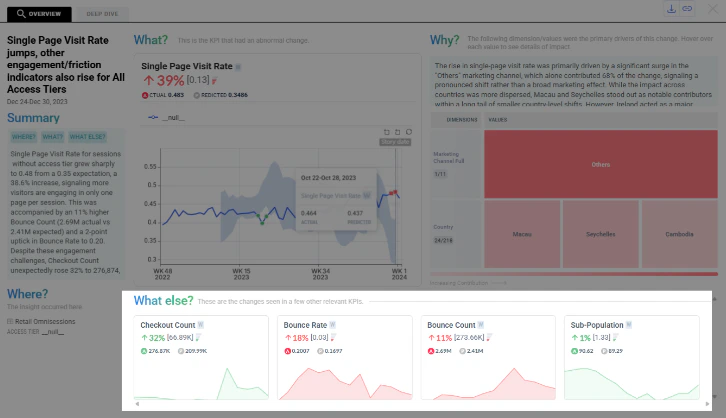
Briefs is DataGenie’s always-on analyst. You describe what you want watched once, in plain language — the metric, the period, and what “worth your attention” means to you — and DataGenie writes you a concise, business-language brief on the schedule you choose.Each brief reads every anomaly across your data for that period, filters out the noise, and consolidates the handful of movements that actually matter into a single clear narrative: the headline in one sentence and a “so what,” then the few drivers behind it — by channel, region, tier, or product. Every brief is grounded in your dataset’s domain knowledge, cites the underlying Top Stories, and is delivered both in your feed and over email — so you get the answer without ever opening a dashboard.It turns DataGenie from “here is all your data, go find the problem” into “here is the problem, already found and explained.”Plain-language intent
Describe what matters once, in plain words. No filters, presets, or dashboards to build.
Signal over noise
Consolidates many anomaly stories into the few high-signal insights, ranked by business impact.
Grounded & explainable
Built on your dataset’s domain knowledge, with citations back to the source Top Stories.
In-app & email, on your cadence
Delivered to your feed and inbox on the schedule you choose. Follow and curate the briefs you care about.
Product Analytics
Product Analytics gives a consolidated view of how DataGenie is being used — logins and active users, session and stickiness trends, and engagement across features like Briefs, Top Stories, and Wisdom. It surfaces adoption patterns at a glance, from daily activity to which capabilities get the most use.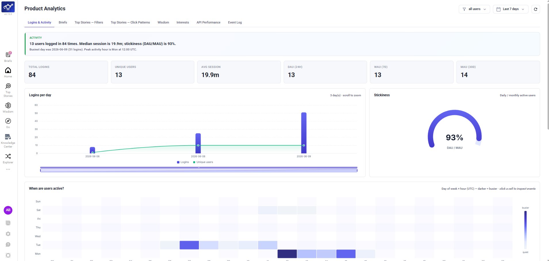
Enhancements
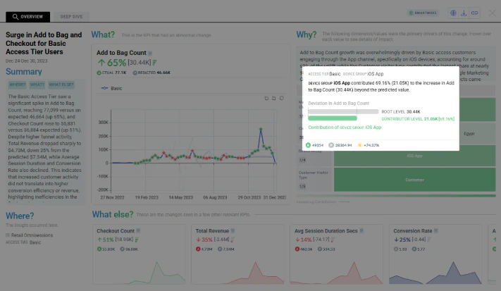
Deviation Mode in Contribution Analysis
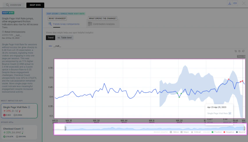
Deviation Mode in Contribution Analysis is now sharper and easier to read. When you switch to Deviation %, contributors are sorted by deviation percentage — the values that strayed furthest from their predicted baseline come first — and the view is streamlined to focus on the contributors that actually moved.A simpler tooltip shows each value’s actual, predicted, and deviation % at a glance, so you can read how far it diverged from expectation without digging. These refinements apply across both contribution views.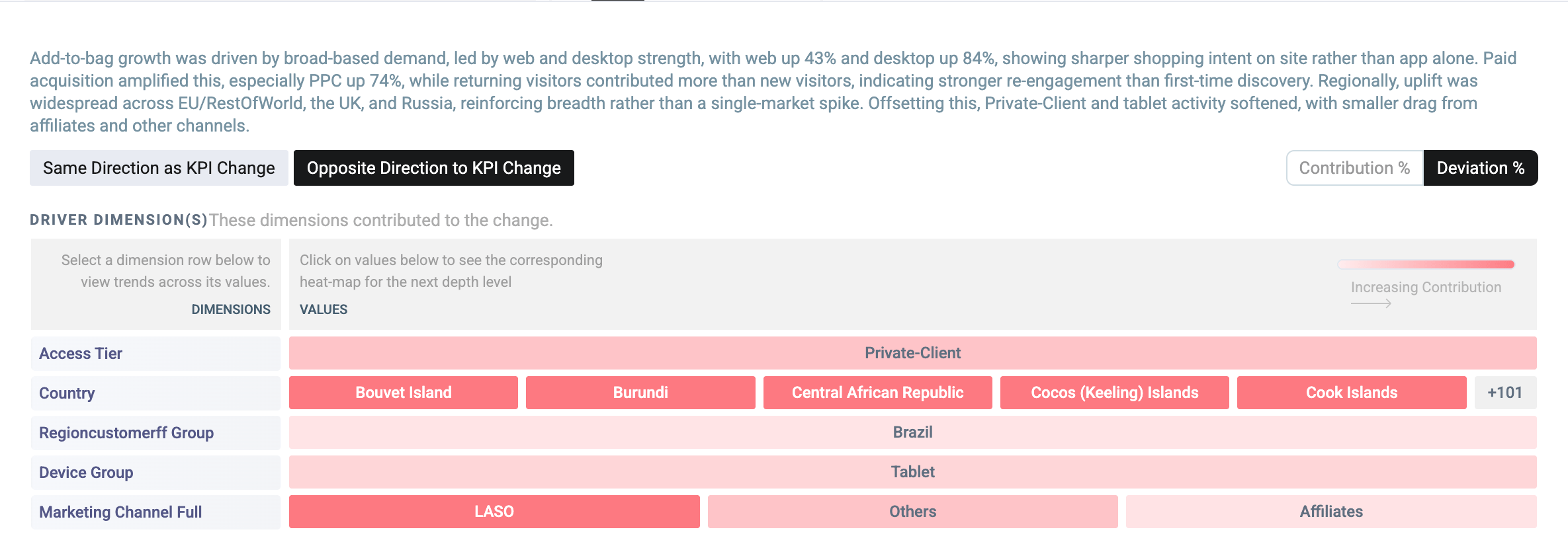
Wisdom UX Enhancements
Wisdom gets a refreshed, less-cluttered interface — the same capabilities, easier to navigate. Finding past work and moving around a long answer are both faster.- Notebooks Home
- Notebook Index
Your saved notebooks now appear as a full-page grid of cards on the Wisdom home — each showing the question, a short summary, and when it was last updated. Search by name or sort by Recent to find past work quickly, in place of the old narrow sidebar list.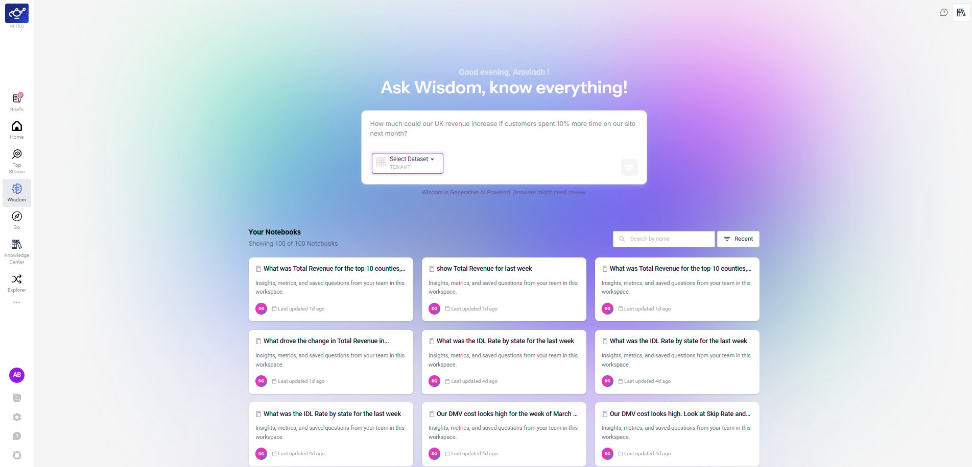
Under the Hood
- Security hardening — Completed a broad dependency and container base-image security sweep across our backend services, resolving the large majority of known vulnerabilities and tightening image hardening. A small set of remaining items is tied to an upcoming platform framework upgrade and is tracked for the next cycle.
v4.14
WisdomKnowledge CenterExplorerIOEAnomaly DetectionReliability
May 20, 2026 · Knowledge Center, Wisdom MCP & Bring Your Own Yhat
Knowledge Center, Wisdom MCP & Bring Your Own Yhat
Release 4.14 promotes the Knowledge Center to a top-level feature, adds MCP support and conversational improvements to Wisdom, introduces Bring Your Own Yhat (BYOY) for custom anomaly detection baselines, and brings tabular data views to Explorer — alongside on-demand email sharing for Top Stories.Highlights
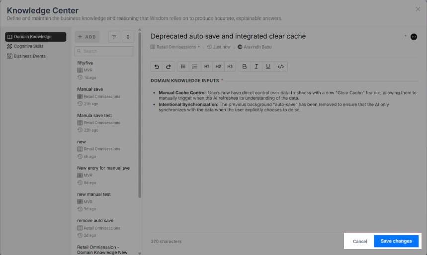
Knowledge Center
A unified home for Skills, Business Events, and Domain Knowledge — now a top-level feature powering Wisdom and Smart Mode.
Wisdom MCP & Enhancements
MCP protocol support, improved follow-up handling, and smarter time period resolution.
Bring Your Own Yhat (BYOY)
Use your own budget or forecast as the anomaly detection baseline instead of a DataGenie-trained model.
Explorer Table View
Toggle line chart widgets to a tabular format with actual and predicted values side-by-side.
IOE Adhoc
Select specific Top Stories and email them on demand — no scheduled alert required.
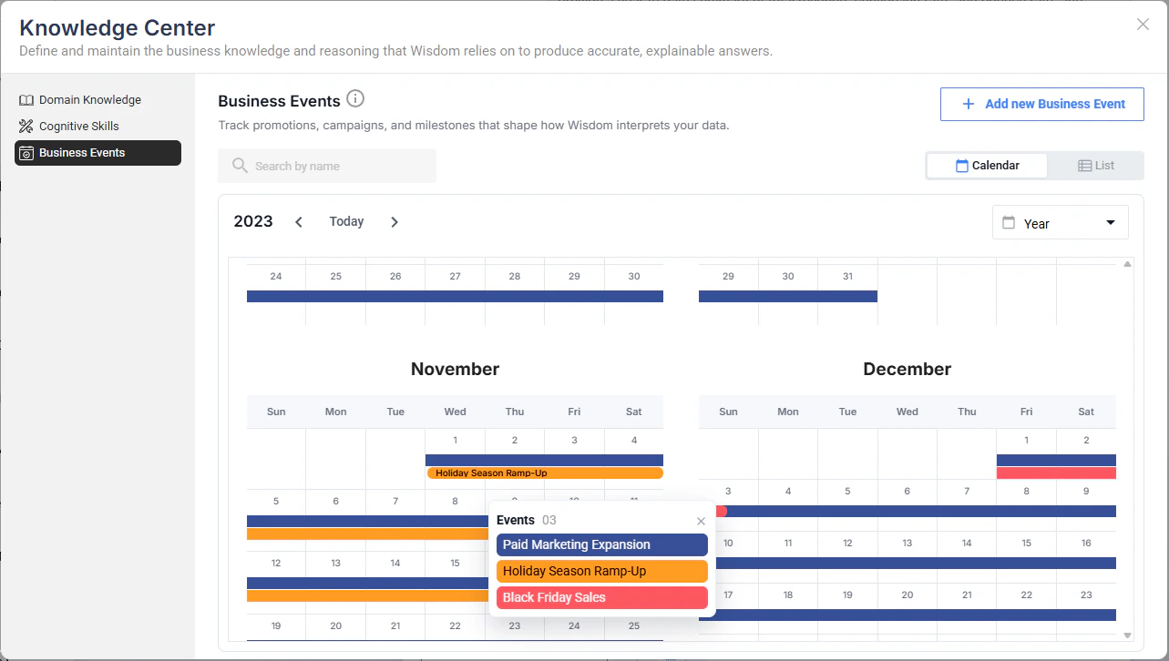
Knowledge Center
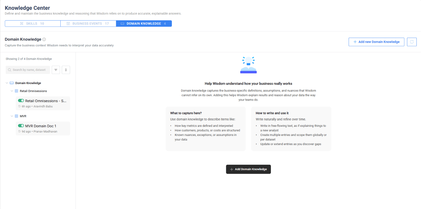
The Knowledge Center is now a top-level feature in DataGenie, consolidating the business knowledge and reasoning that Wisdom relies on to produce accurate, explainable answers. It contains three tabs — Skills, Business Events, and Domain Knowledge.Previously, Domain Knowledge lived inside Wisdom. It has now been elevated alongside Skills and Business Events into a unified Knowledge Center — making business context available not just to Wisdom but across Smart Mode and other platform features.- Skills
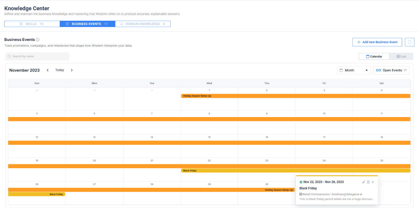
- Business Events
- Domain Knowledge
Skills capture reusable reasoning for recurring business situations. Each skill is created per dataset and includes a name, description, enable/disable toggle, and skill inputs — detailed instructions that shape how Wisdom answers analytical questions.When enabled, Wisdom follows the skill’s logic for related queries. When disabled, Wisdom gives generic answers. Use the toggle to validate: ask the same question with the skill on and off, and compare outputs.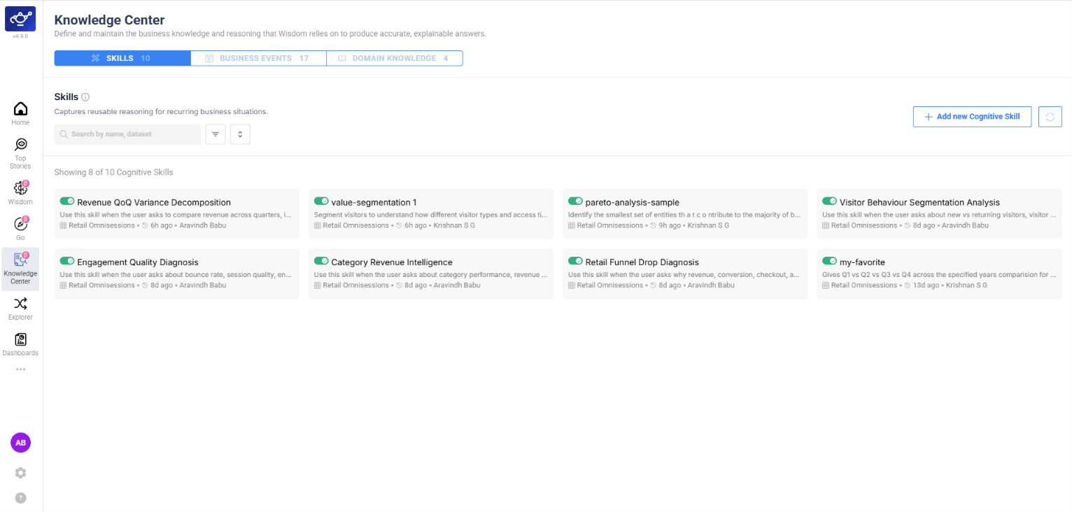
Wisdom MCP & Enhancements
- MCP Support
- Follow-up Handling
- Time Period Resolution
Wisdom now supports the Model Context Protocol (MCP), enabling integration with MCP-compatible clients and tools. External systems can connect to Wisdom’s analytical capabilities through a standardized protocol, making DataGenie insights accessible from any MCP-enabled environment.
Bring Your Own Yhat (BYOY)
You can now configure a BYOY AD Group and assign KPIs to it. For these KPIs, anomalies and Top Stories are generated against your own budget or forecast (y_hat) instead of a DataGenie-trained model — the standard band and anomaly logic runs on top of your numbers.The plan aggregation can be sourced from a different dataset than the actuals, giving you full flexibility to compare performance against your own planning data.Custom Baseline
Use your own budget, forecast, or plan as the prediction baseline — DataGenie’s anomaly detection logic runs on top of your numbers.
Cross-Dataset Sourcing
Source plan aggregation from a different dataset than the actuals, enabling flexible budget-to-actual comparisons.
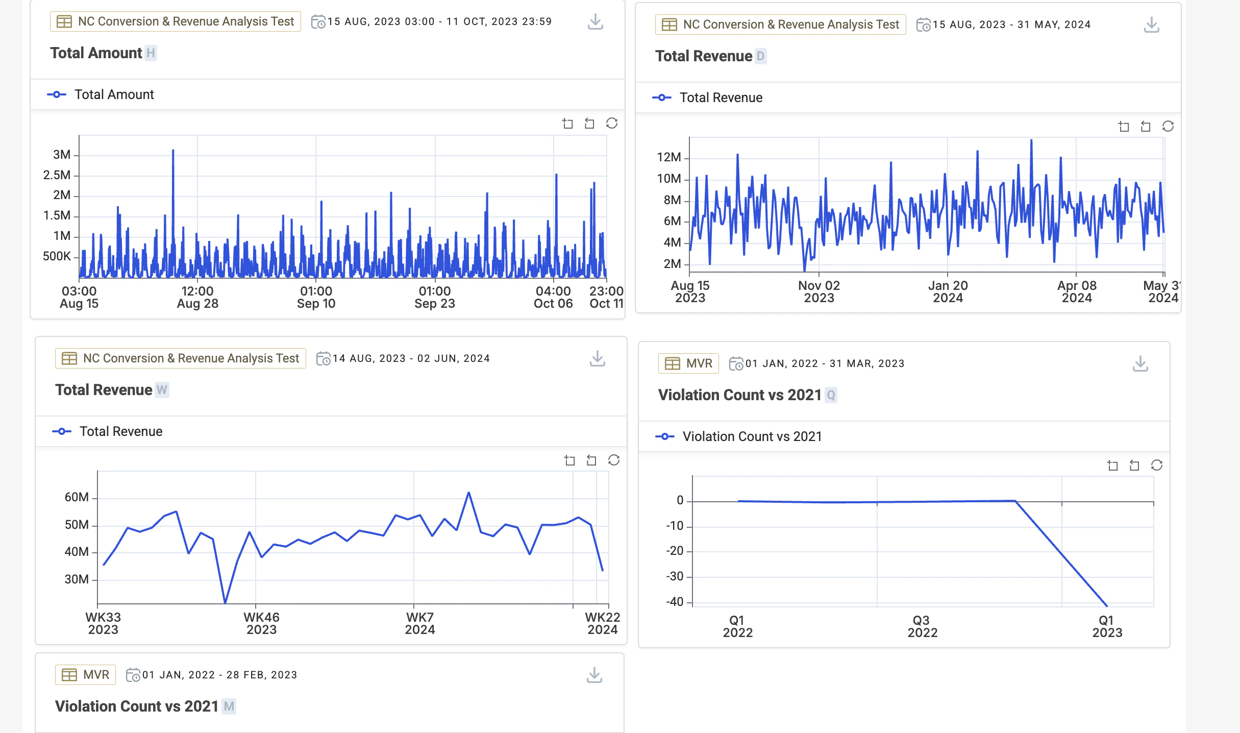
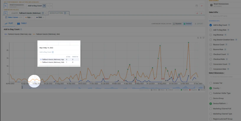
Explorer — Table View with Predictions
Explorer now lets you view line chart widgets in a tabular format, giving you a structured row-and-column view of the same data shown on the chart. The table view includes prediction data alongside actual values, so you can review forecasted numbers in context with historical data.- Chart View
- Table View
The standard chart view displays KPI trends with prediction bands, anomaly markers, and severity indicators across the full time range.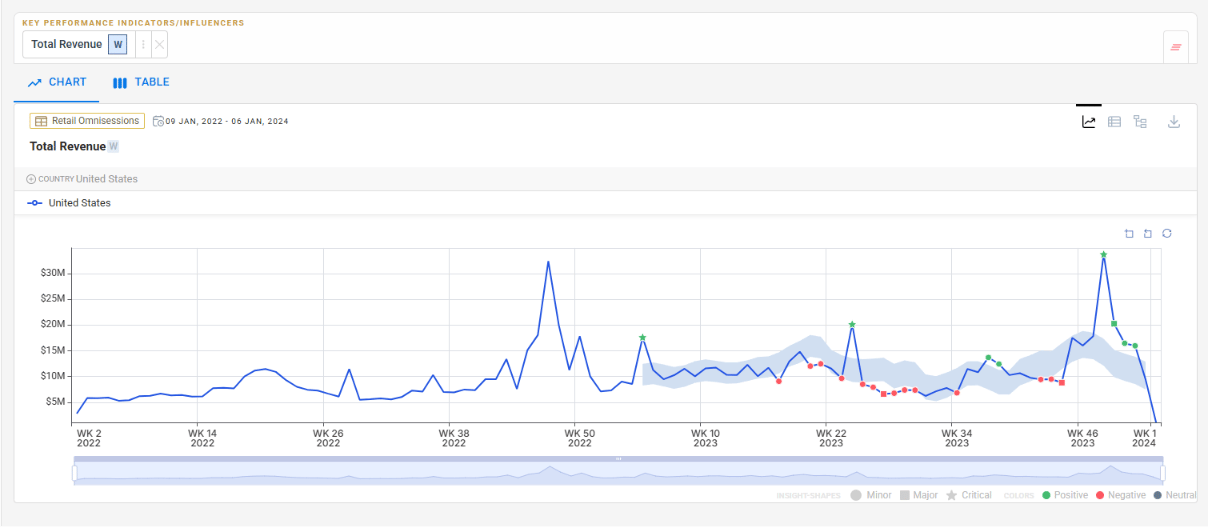
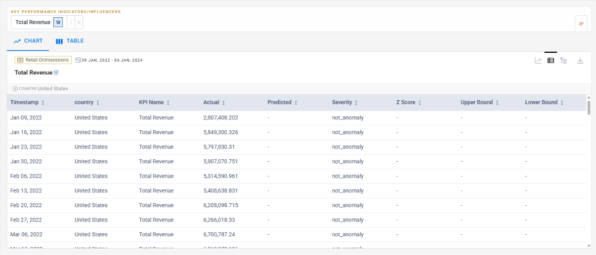
Exact Values
Charts are great for trend spotting — tables are essential when you need exact numeric values across periods.
Predictions in Context
Actual and predicted values appear side-by-side in tabular form, making comparison and analysis faster.
Configurable Top N / Bottom N
Previously, dimension value selection in Explorer was limited to preset Top 10 and Bottom 10 options. You can now enter any custom number for Top N and Bottom N, giving you finer control over which dimension values to analyze.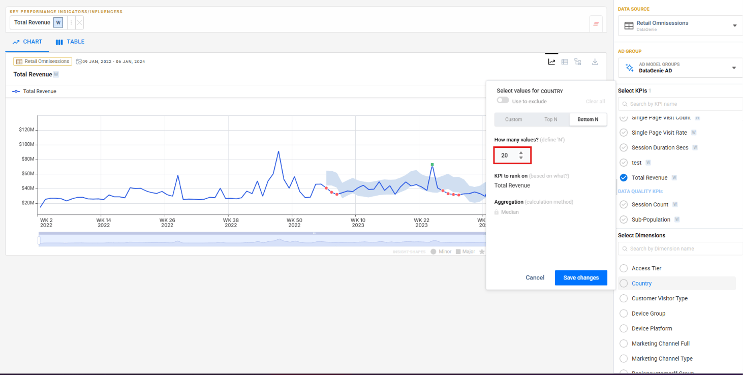
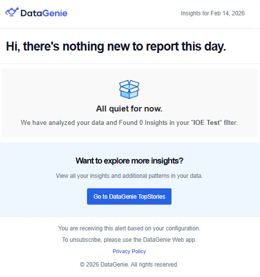
IOE Adhoc Support
You can now select specific Top Stories and send them via email on demand — without configuring a scheduled alert.Select stories
Click Send Top Stories in Mail from the Top Stories page. Story cards display selection checkboxes — pick the stories you want to share. The button updates to show your selection count.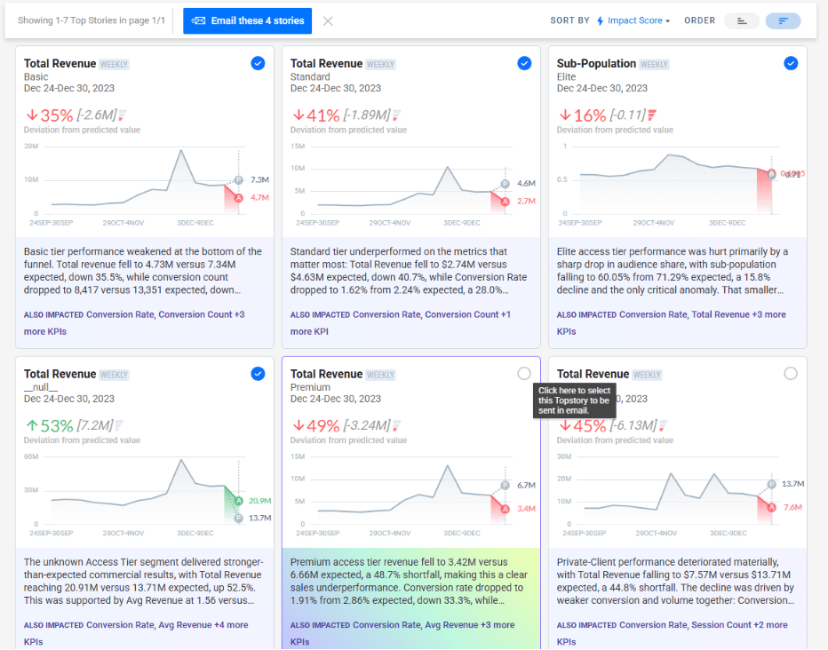
Configure and send
Click the button to open the email dialog. Enter an alert name, add recipients, and click Send Email.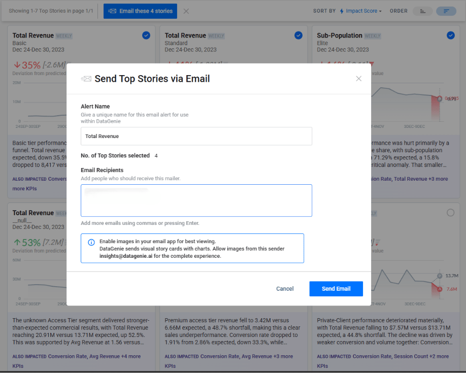
Under the Hood
- MongoDB on Kubernetes — MongoDB now runs within the Kubernetes cluster, improving deployment consistency and operational management.
v4.13.2
Filter PresetsTop StoriesWisdom
May 5, 2026 · Filter Preset UX, Metrics Top N & Wisdom Dimension Values
Filter Preset UX, Metrics Top N & Wisdom Dimension Values
Patch release with three targeted improvements: filter preset descriptions now always visible, Top N metric queries optimized, and Wisdom now captures full dimension value lists instead of truncating.Filter Preset description — always visible
Previously, the description for a Filter Preset was only shown on hover. It is now displayed persistently so users immediately understand what each preset is designed to capture without needing to interact first.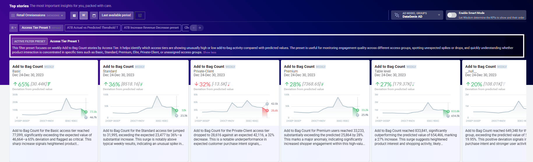
Metrics Top N optimization
The MongoDB aggregation pipeline for overall-granularity metrics fetching has been optimized, significantly reducing query latency for Top N metric requests across large datasets.Wisdom — full dimension value enumeration
When answering questions that involve dimension values, Wisdom previously truncated long value lists with a dotted format or showed values as missing when there were many options. Wisdom now captures and surfaces all dimension values in full, ensuring complete and accurate responses to dimension-level queries.v4.13.1
Anomaly DetectionReliability
May 4, 2026 · AD Previous Periods Average — Configurable Min Window
AD Fix — Previous Periods Average: Min Periods
The Previous Periods Average model now has a Min Periods parameter that controls the minimum number of data points needed in a window before a rolling average is calculated.Previously, the model required the window to be fully populated — if even one point was missing, the prediction for that period was skipped entirely and returned as null. With Min Periods, you can set a lower threshold so the model still produces a prediction even when the window is partially filled, making anomaly detection more resilient on sparse or early-stage data.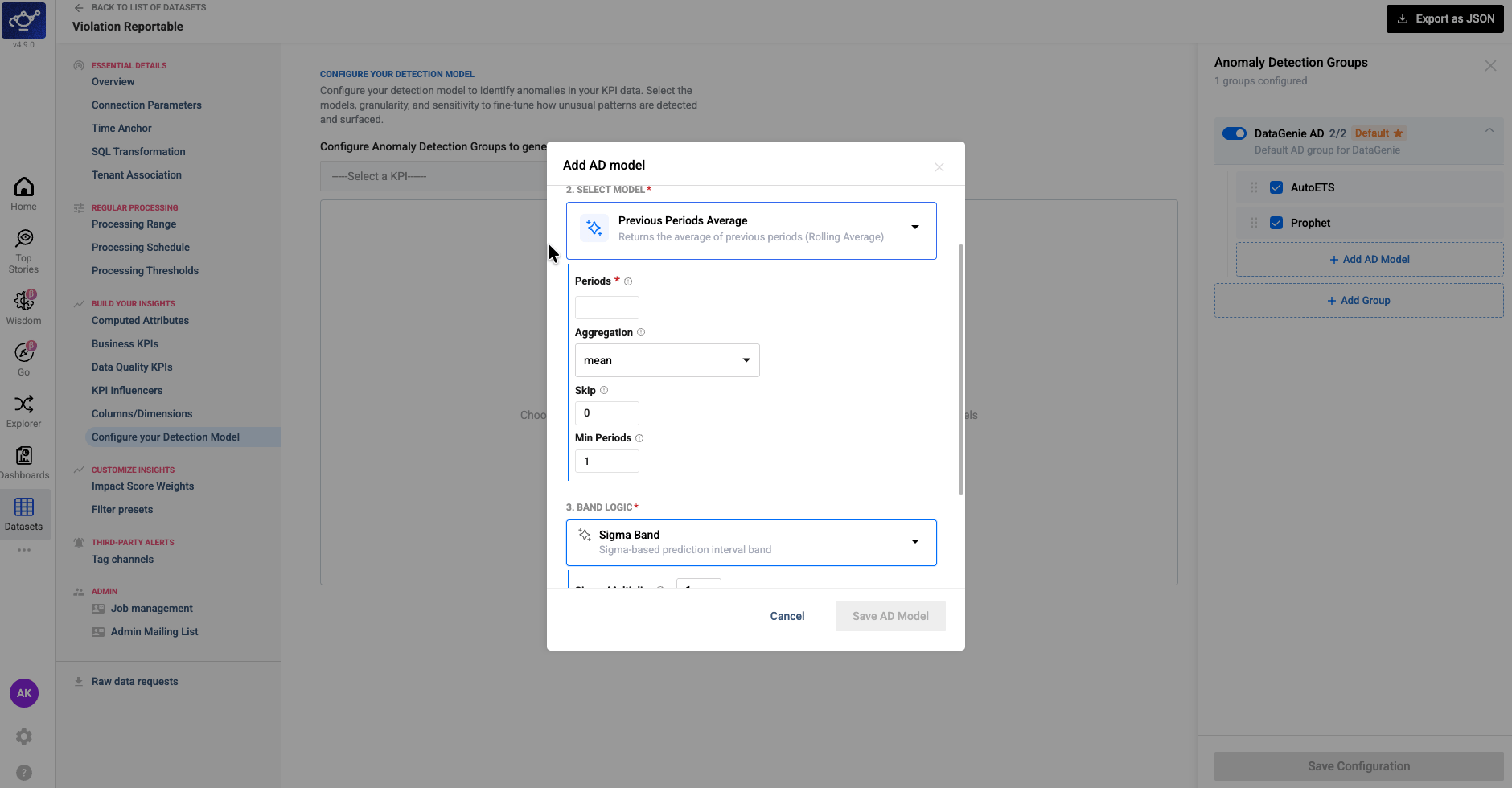
v4.13
WisdomKPI AttributionAnomaly DetectionFilter PresetsBusiness EventsDashboardsPerformance
April 29, 2026 · Dynamic Visualizations, KPI Attribution & Anomaly Detection Improvements
Dynamic Visualizations, KPI Attribution & Anomaly Detection Improvements
Release 4.13 delivers a more adaptive Wisdom experience with context-aware visualizations and direct dashboard publishing, a new waterfall view for KPI attribution, and more reliable anomaly detection for derived metrics — along with targeted improvements to Filter Presets, Business Events, and overall platform performance.Highlights
Wisdom Dynamic UI
Wisdom now surfaces context-aware visuals — scorecards, trends, comparisons — and lets users add them directly to dashboards.
KPI Attribution Waterfall
A new waterfall view breaks down which factors drove KPI movement, with positive and negative contributors separated clearly.
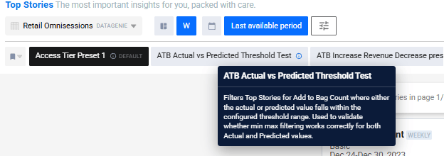
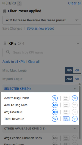
Filter Preset Thresholds
Filter Presets now support min/max thresholds against actual and predicted KPI values to surface more targeted anomalies.
Derived KPI Anomaly Detection
Strengthened validation at the component level produces more reliable anomaly signals for calculated business metrics.
Wisdom Dynamic UI and Add to Dashboard
Wisdom now adapts its visual output based on the user’s question, dataset context, and response result. Instead of a single fixed default chart, it can surface more suitable visuals — scorecards, comparison charts, trend charts, funnel views, and other analytical layouts — matched to the nature of the answer.Users can also add any generated visual directly to a dashboard, turning conversational insights into reusable dashboard components without leaving the Wisdom interface.- Dynamic Visualizations
- Add to Dashboard
Wisdom selects the most appropriate chart type based on the question asked, the structure of the dataset, and the shape of the result — rather than defaulting to a single view.
KPI Attribution Waterfall
KPI Attribution now includes a waterfall-style view that breaks down KPI movement by contributing factors. Positive and negative contributors are clearly separated, giving users a fast visual read on what drove a metric up or down. Attribution output is also surfaced in analysis flows where applicable.Positive Contributors
Factors that drove KPI growth are displayed above the baseline, sized by their relative contribution.
Negative Contributors
Factors that dragged performance are shown below the baseline, making trade-offs immediately visible.
Filter Preset Enhancements
- Actual & Predicted Thresholds
- Preset Descriptions
Filter Presets now support min/max threshold filtering against actual KPI performance, predicted baseline behavior, or both. Teams can reduce noisy Top Stories and focus on anomalies that better match their analytical intent.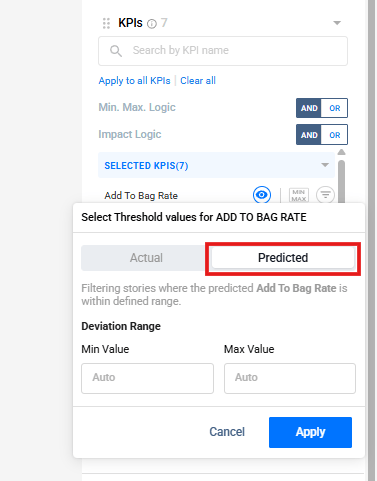
Improved Anomaly Detection for Derived KPIs
Anomaly Detection has been improved for Derived KPIs — rates, ratios, and percentage-based metrics calculated from multiple underlying component KPIs. Prediction quality for these metrics depends on both component-level forecasts and how those forecasts are combined.This release strengthens validation at the component level and across derived KPI outputs, producing more stable and trustworthy anomaly signals for calculated business metrics.KPI Min/Max Boundary Support
KPI configuration now supports optional minimum and maximum value boundaries. Users can define valid KPI ranges while setting up or editing a KPI, with presets such as unconstrained, positive values only, negative values only, and 0–1 ranges.This improves consistency for bounded KPIs such as rates, percentages, and ratios, and supports more reliable downstream analysis across stories, anomaly detection, and attribution views.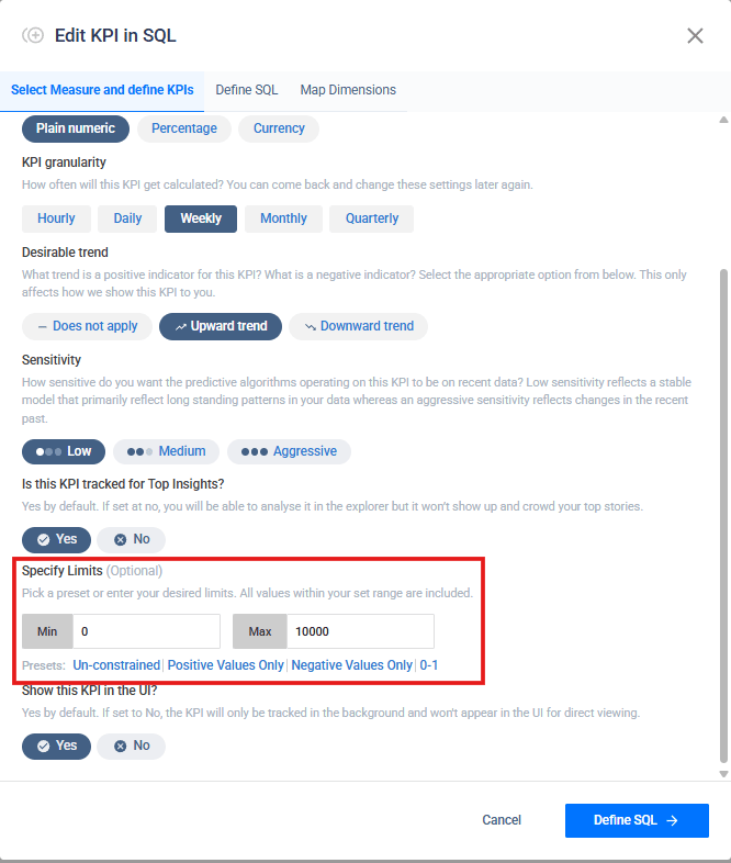
Business Events
Business Events has been updated with expanded configuration options and improved display. Users can document key events — campaigns, holidays, launches, operational milestones — with richer configuration and a cleaner presentation within the Knowledge Center.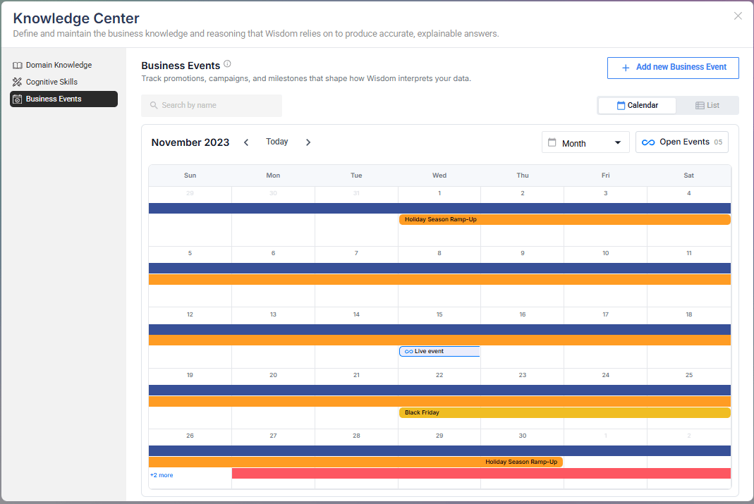
Explorer Enhancements
Minor usability and experience improvements across Explorer for a smoother KPI, dimension, and metric trend analysis workflow.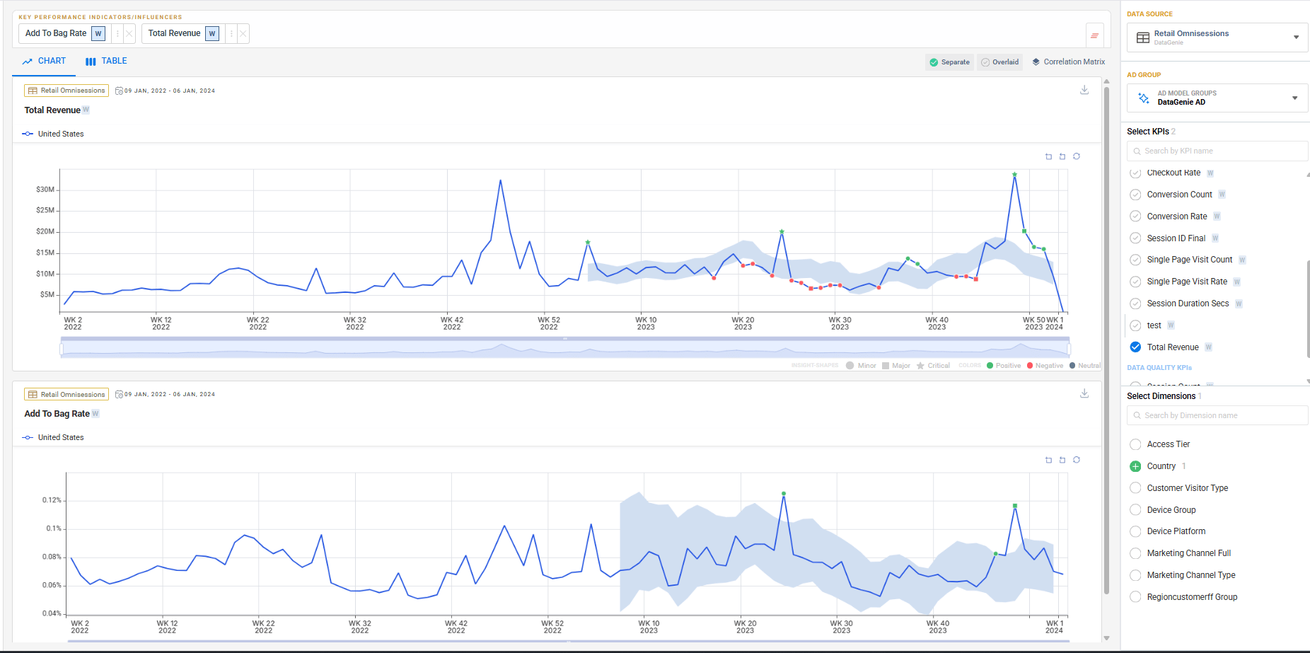
Bug fixes
Dashboard Fixes
Several dashboard stability and display issues have been resolved to improve reliability.
QuickLook Fixes
QuickLook behavior has been improved for a more consistent preview experience.
Under the Hood
We’ve optimized our MongoDB pipeline to significantly reduce memory utilization — you may notice snappier query performance, especially on large datasets.v4.12
WisdomDashboardsScenario PlanningBusiness EventsAnomaly DetectionIOE
April 13, 2026 · Dual Timezone, Fiscal Calendar & Platform Enhancements
Dual Timezone, Fiscal Calendar & Platform-Wide Enhancements
Release 4.12 brings dual-timezone support, native fiscal calendars, a meaningfully upgraded Dashboards experience, and powerful new Wisdom capabilities — Scenario Planning and Business Events — that make insight consumption richer and more contextual.Highlights
Dual Timezone Support
Decouple ingestion and business-reporting timezones for accurate, DST-safe metric processing.
Fiscal Calendar
Analyze metrics using fiscal periods and quarters (4-4-5, 4-5-4) aligned to financial reporting.
Scenario Planning
Simulate future outcomes by adjusting drivers and comparing against baseline forecasts.
Business Events
Capture real-world context so Wisdom explains anomalies with recorded causes — not invented ones.
Dual Timezone Support
DataGenie now supports configuring two separate timezones per dataset — one for how raw data is ingested, and one for how business metrics are reported.Previously, all data was processed in a single timezone, which could cause misalignment between when data arrives and how it maps to business reporting periods. With this update, teams can define an Ingestion Timezone (matching the source data) and an Aggregation Timezone (matching business reporting), ensuring metrics are always accurate regardless of where data originates.Ingestion Timezone
Defines the timezone of raw source data. Used for efficient filtering when reading data.
Aggregation Timezone
Defines the timezone used for business reporting. All metrics, stories, and KPIs are computed in this timezone.
Changing timezone settings on an existing dataset will trigger a full reprocessing of historical data to ensure consistency. Existing datasets default to UTC for both timezones with no change in behavior unless explicitly configured.
Fiscal Period & Quarter Support
DataGenie now supports fiscal calendars, enabling analysis aligned with business-defined reporting structures. Users can work with fiscal periods and fiscal quarters (such as 4-4-5 or 4-5-4), ensuring consistent comparisons and alignment with financial reporting across all views.Dashboard Improvements
The dashboard has been significantly improved with better stability, a more refined interface, and a smarter Quick Look experience.The Quick Look selector now automatically scrolls to the active dashboard, and switching dashboards no longer overrides your default — you can explicitly set or remove it via the selector popup. The same behavior applies to Top Stories filter presets. Dashboards currently set as Quick Look are protected from accidental deletion.General improvements include fixes to the time period display in the dashboard header, cleaner widget behavior, and a refreshed design across selector popups throughout the homepage and Top Stories.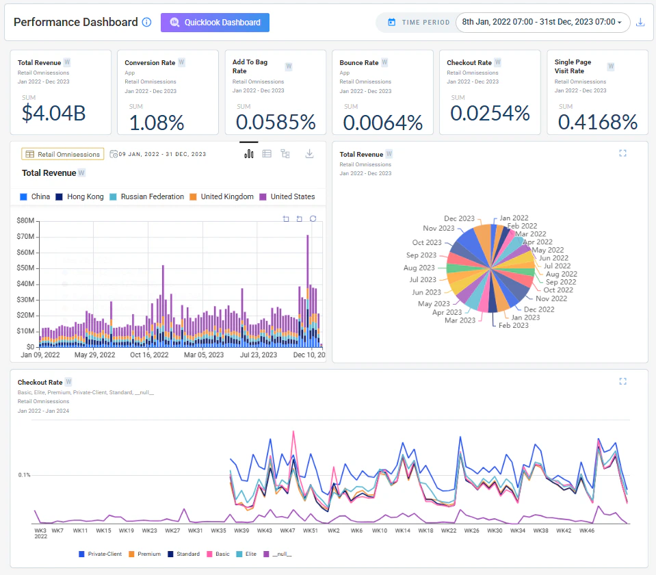
Scenario Planning (Forecast & Regression)
Scenario Planning lets users simulate future outcomes by adjusting key business drivers and instantly seeing their projected impact on KPIs.Instead of relying only on a baseline forecast, users can test what-if scenarios — such as changes in conversion rate, traffic, or bounce rate. Each scenario is recalculated in real time and compared against the baseline, helping teams evaluate trade-offs and identify the most effective levers before making decisions.Driver Adjustments
Adjust individual business drivers and instantly see their projected effect on target KPIs.
Baseline Comparison
Each scenario is overlaid against the baseline forecast for a clear before/after view.
Business Events
Business Events introduces a structured way to capture real-world context directly within the platform. Users can document key events — promotions, campaigns, operational disruptions, strategic changes — that may influence data trends.Events can be scoped to a specific dataset and viewed in either a calendar or list format. Each event captures a name, start and end date, and a description of the business context. Wisdom uses these events to better connect observed trends to real-world causes, improving the accuracy and relevance of its explanations.Create Events
Log promotions, campaigns, or disruptions with a name, date range, description, and optional dataset scope.
Calendar & List Views
Visualize events over time in a calendar view, or manage them in a structured list format.
IOE Delta Processing
Users can now control whether alerts surface only newly processed date periods or also include reprocessed historical dates.By default, alerts show only new delta periods, reducing noise and keeping focus on what is actually new. Additional improvements include timezone awareness and fiscal calendar support for subject date handling, along with a fix for a fallback plain-text message that was incorrectly appearing in alert emails.Multi AD — Import / Export Support
Users can now export AD Group configurations from an existing dataset and import them into a new or existing dataset. Anomaly detection models and configurations can be reused without manual setup, improving consistency and reducing onboarding effort across datasets.Wisdom Enhancements
- Fiscal Year Support
- Question UI & Chart Controls
Wisdom now understands fiscal calendars and allows users to ask questions and run forecasts aligned to fiscal periods. It automatically maps fiscal months, quarters, and years to the correct date ranges, ensuring analysis and projections match business reporting structures.
KPI Handling
- Bound Consistency
- Display Clarity
User-defined KPI limits (upper and lower bounds) are now consistently applied across Explorer, stories, and metric calculations. This ensures uniform behavior across all views and improves reliability of KPI interpretation.
Bug fixes
KPI Attribution Consistency
Fixed inconsistencies in contribution bars and value mapping to ensure accurate attribution representation across the tree view.
General Stability Fixes
Improvements across anomaly detection behavior and metric consistency to reduce edge-case failures.
Improved Root Story Depth Handling
Root story generation rules are now relaxed at lower depths. Previously, root stories were always restricted toConfigured Depth - 1. The -1 rule now applies only when the configured depth is strictly greater than 2.- Depths 1–2 — root stories generate up to the exact configured depth
- Depths 3+ — root stories generate up to
Configured Depth - 1
v4.11
Anomaly DetectionMulti YhatKPI AttributionNirvana
March 18, 2026 · Advanced Detection & Deeper Explainability
Advanced Detection & Deeper Explainability
Multi-baseline anomaly detection, tree-based attribution for derived KPIs, and reliability improvements that make detection more stable across long-horizon datasets.Highlights
Multi Yhat (Multi AD Groups)
Configure multiple detection groups per dataset, compare baselines, and surface insights independently per group.
KPI Attribution
Tree-based attribution for derived KPIs with actual, predicted, deviation values, and SQL visibility.
Seasonality Enhancements
Improved weekly, monthly, and quarterly detection plus better zero-value handling.
Nirvana Dataset Isolation
Dedicated Nirvana tab with inherited default AD Groups for consistent multi-source detection.
Multi Yhat (Multi AD Groups)
Multi Yhat introduces the ability to configure and manage multiple anomaly detection groups per dataset. This gives business users the flexibility to define their own baseline models alongside DataGenie’s built-in anomaly detection and surface insights separately for each group.Multiple AD Groups per Dataset
Configure and manage multiple AD groups with custom models and parameters per dataset.
Custom Default Models
Define any AD group as the default baseline used across Top Stories and Deep Dive.
Explorer Integration
Compare trends and predictions across multiple Yhat lines directly within Explorer.
Nirvana Support
Nirvana datasets automatically inherit default AD groups from their component datasets.
Configuring AD Groups
Users can configure AD groups both during dataset creation and when editing an existing dataset. The configuration screen lets you select or create a custom AD model, define its parameters, and mark one group as the default.Prediction Preview with ADAAS
ADAAS now supports group-based prediction, enabling prediction previews in the configuration screen for each Multi Yhat group.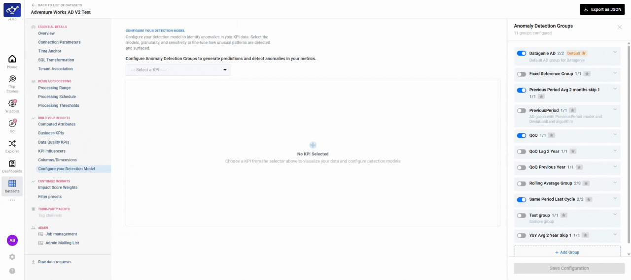
Insight Segmentation by AD Group
Insights are surfaced separately for each AD group across Top Stories, Deep Dive, and Explorer. Each group maintains its own prediction baseline, ensuring accurate anomaly detection and ranking.KPI Attribution
KPI Attribution introduces a visual and analytical workflow to understand how derived KPIs are constructed and what drives their movement.- Tree View
- SQL Expression
Any derived KPI can be expanded into a hierarchical tree showing all contributing metrics. Each node displays attribution value, attribution percentage, and severity, so you can see how each component KPI contributes to the overall change.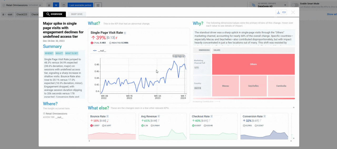
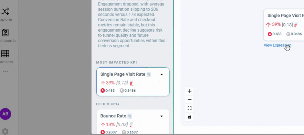
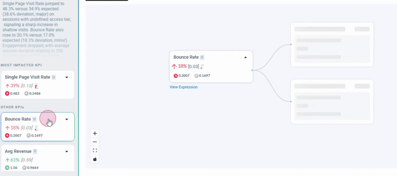
KPI Attribution remains synchronized with the selected KPI across all Deep Dive tabs, ensuring consistent attribution insights during analysis.
Seasonality & Zero Handling
Anomaly Detection models now include enhanced seasonality detection for higher granularities — weekly, monthly, and quarterly time series — increasing model stability and anomaly accuracy across long-horizon datasets.Improved zero-value handling ensures that AD models do not learn from structural zero values. This prevents distorted baselines and improves detection accuracy in datasets where zero values represent non-operational or inactive periods.Nirvana Dataset Experience
Nirvana datasets now appear exclusively under the Nirvana tab in the dataset listing page. This improves discoverability and ensures clearer dataset categorization for Nirvana-enabled workflows.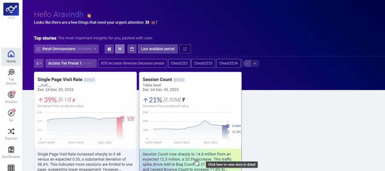
Bug fixes
Bounds for Data Quality KPIs
Data quality KPIs are now bounded by default. Count metrics have a lower bound of
0, and sub-population metrics are bounded between 0 and 100.Notebook Rerun Option
The rerun option is no longer shown for newly created notebooks, preventing unintended executions before the notebook has run.
Dataset Table Search Fix
Resolved an issue where search within the dataset listing table was not returning accurate results.
Nirvana Dataset Listing
Nirvana datasets now appear only under the Nirvana tab, ensuring accurate categorization across the dataset listing page.
Smarter Onboarding & Insight Precision
The biggest update yet to the onboarding and analysis engine — GO makes dataset onboarding conversational, Change Analysis gets sharper, and anomaly detection handles sparse and seasonal series better.Highlights
GO (Guided Onboarding)
Sample → context → blueprint, with image upload support.
Contributor Sorting
Sort by % deviation in addition to % contribution for Change Analysis.
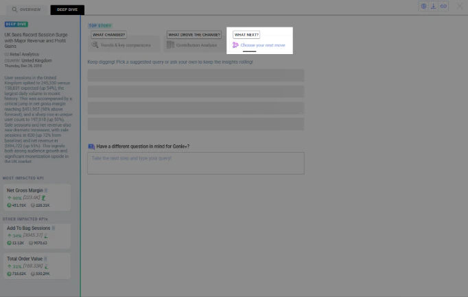
Deep Dive Extended History
Longer KPI history available in-place without leaving the story view.
AD Reliability
Monthly seasonality, stable runs, and fewer false anomalies on sparse series.
GO (Guided Onboarding)
GO is the fastest way to onboard a dataset into DataGenie. It removes the guesswork from onboarding and gets you to “insights-ready” significantly faster.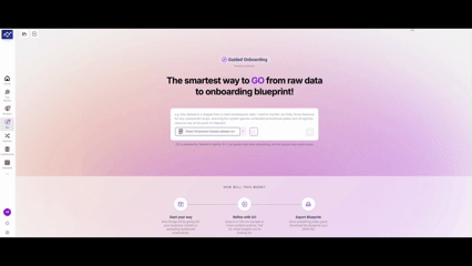
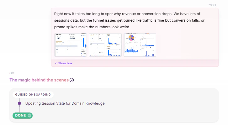
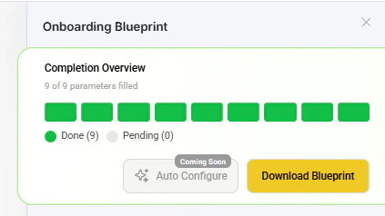
Image Upload Support
Users can upload images during GO to provide richer context for onboarding.
Improved Question Box UI
A cleaner, more guided input experience while interacting with the GO flow.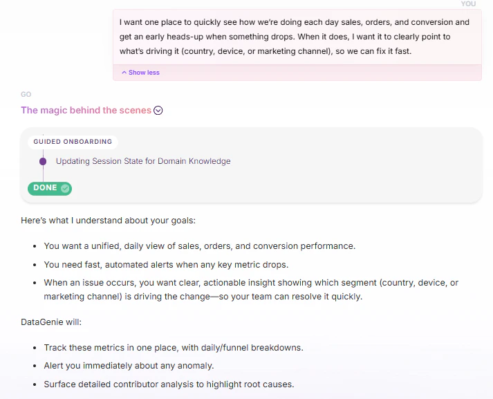
Enhancements
- Analytics
- Visualization
- Time & Axis
Contributor Sorting for Change Analysis — For non-rollable KPIs, contributors can now be sorted by % deviation in addition to % contribution, helping users prioritize contributors by the largest deviations first.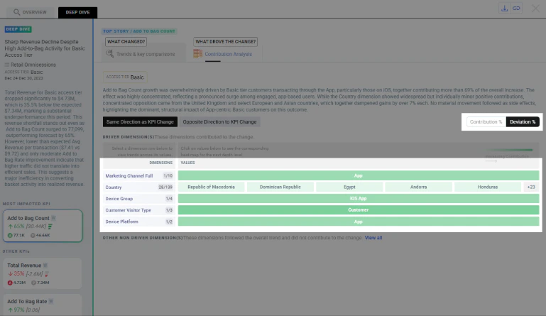
AD Reliability
- Monthly Seasonality — Trackers with clear monthly patterns are better handled so seasonality is captured more reliably. Better baseline fit and reduced missed pattern-driven behavior.
- Run Reliability — AD jobs are more robust in cases where predictions or sigma were intermittently null. Fixes a root cause that led to empty prediction patches.
- Sparse Series Handling — AD is now less sensitive to imputation side-effects on sparse trackers with occasional spikes, reducing false anomalies.
Fixes
Root Story Output
When no View Filter is applied, only impacted KPIs are shown and blank-value KPIs are excluded.
Derived KPI Metrics
Metrics fetching now returns correct results for derived KPIs across multiple granularities.
Weekly Alignment
Weekly start-day alignment is now consistent to prevent mismatched week periods in insights.
Dimension Edits
Display Name edits now persist correctly and no longer disappear during the configuration flow.
Dashboard Reliability — Dashboard deletion no longer fails due to backend exceptions or constraints.
Other changes
- Platform improvements — Improved caching and storage behavior for Airflow and insights reliability.
- Resource allocation — Increased resources for Insights and Metrics services to reduce failures under load.
- Stability — Improved Airflow pod restart stability and updated runtime components.
- Databricks support — Added support for configurable cluster allocation strategies for Databricks workloads.
Smarter Stories & Stronger Reliability
Sharper Top Stories relevance via Smart Mode, broader IOE controls, and reliability improvements that keep insights fresh and stable.Highlights
Smart Mode
Wisdom decides KPI ordering, highlights a Hero KPI, and groups Relevant vs Other KPIs for faster scanning.
IOE Upgrades
Alert toggle, authorized dataset selection, refreshed templates, batch mode, and a no-stories fallback.
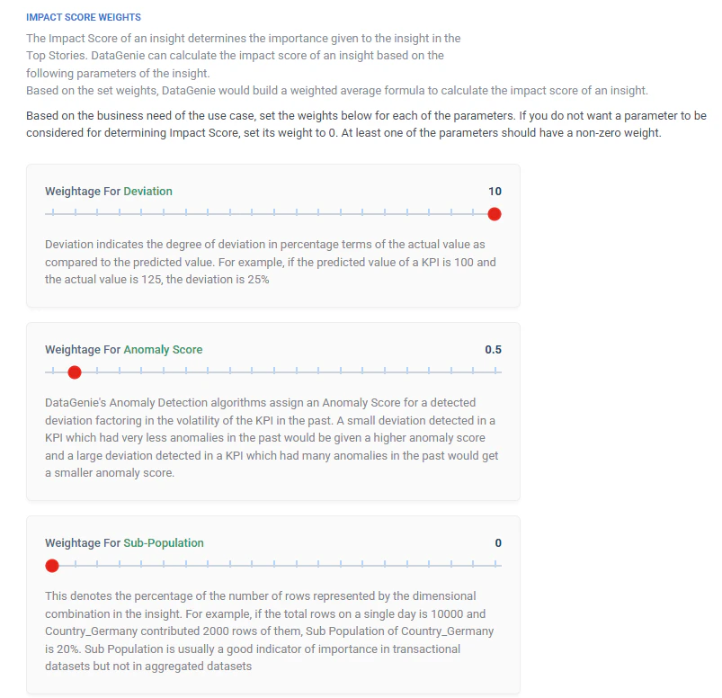
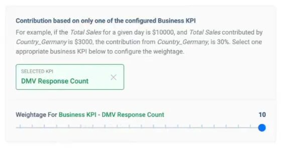
Impact Score Alignment
Ranking adapts to KPIs selected in View Filter; Business KPI weightage removed for simpler behavior.
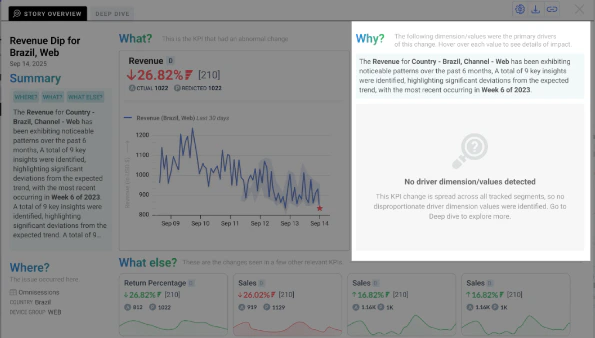
Clearer Explainability
Fallback when drivers are missing; richer contributor tooltips with deviation context.
Smart Mode (Wisdom) for Top Stories
Smart Mode changes how KPIs are presented inside each Top Story card so users can scan faster and focus on what matters first.- Smart Mode OFF — KPI ordering follows Impact Score ordering logic.
- Smart Mode ON — Wisdom decides KPI order using severity, business impact, and domain knowledge.
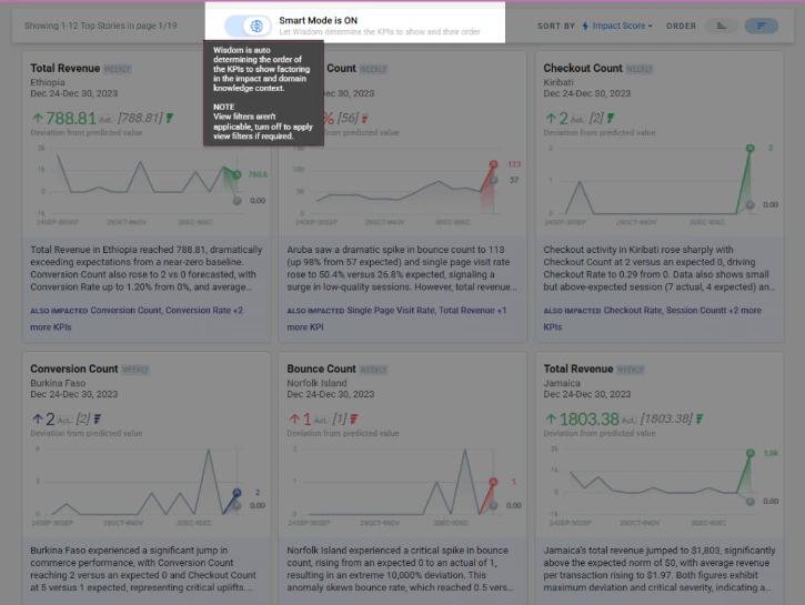
Hero KPI
The most important KPI becomes the Hero KPI.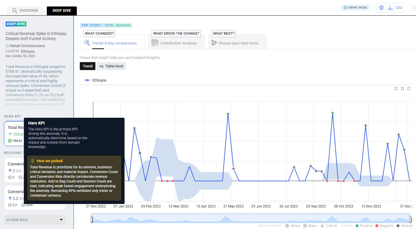
Relevant KPIs
KPIs strongly related to the Hero KPI appear under Relevant KPIs.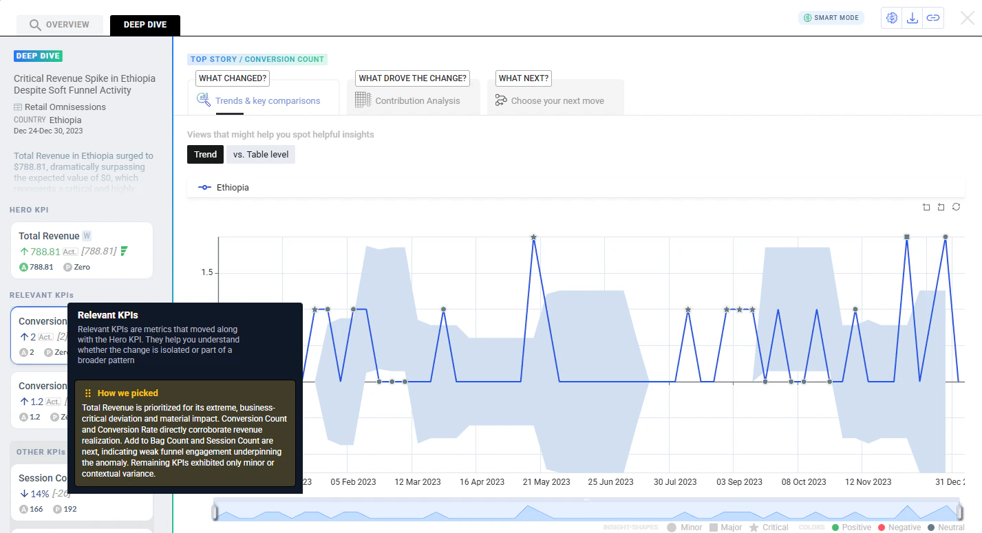
Other KPIs
Less significant or loosely related KPIs are grouped under Other KPIs.
Behavior change — In Smart Mode, story cards show all KPIs and the View Filter is not honored, because Smart Mode decides what to show and in what order.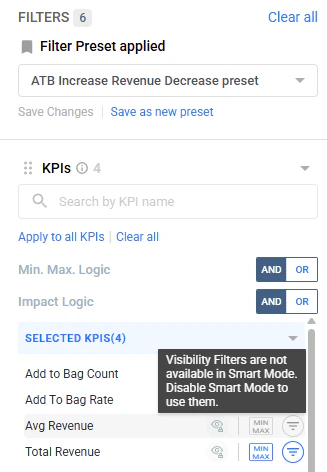
Enhancements
- IOE (Insights over Email)
- Top Stories and ranking
- Knowledge Base
- Filters and charts
- Deep Dive UX
Alert channel toggle UI — Alerts can be paused/resumed without deleting the alert.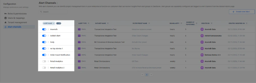
Bug fixes
Overview KPI persistence
Selecting a new metric in Deep Dive no longer changes the primary KPI in Overview. Overview stays locked to the original insight while exploration continues.
Last period ingestion fix
Time-filtering no longer excludes the final time bucket. Top Stories now processes the latest hour/day correctly.
Daily datasets: seasonality improvements
Better weekly seasonality detection for daily datasets.
Quarterly datasets: model and overfitting fix
Improved models for low-sample quarterly series and fixed tracker overfitting so anomalies aren’t missed.
IOE dataset permission enforcement
Users can no longer configure or view alerts for unauthorized datasets (enforced via dataset selector).
Stable screenshot capture
Email screenshots are captured only after the page fully renders, reducing blank or partial screenshots.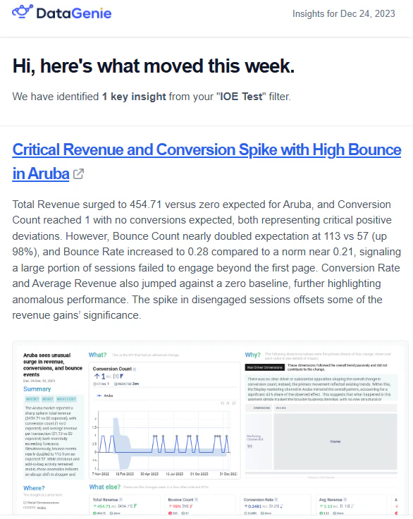
Other changes
- Automatic database patches (DGRM client) — DGRM client can auto-install required DB scripts/delta versions during releases to reduce manual patching.
- Ingress class name configurable — Previously defaulted to NGINX; now controlled via an environment variable to match the environment’s ingress class.
- Insights Service cache volume — Cache no longer resets on pod restarts/deployments, reducing warm-up after releases.
- Pipeline/Airflow — When older periods are recomputed and values change, the pipeline clears insights cache so stories refresh and reflect the latest values.