How to build a Dashboard
Open the Dashboard module
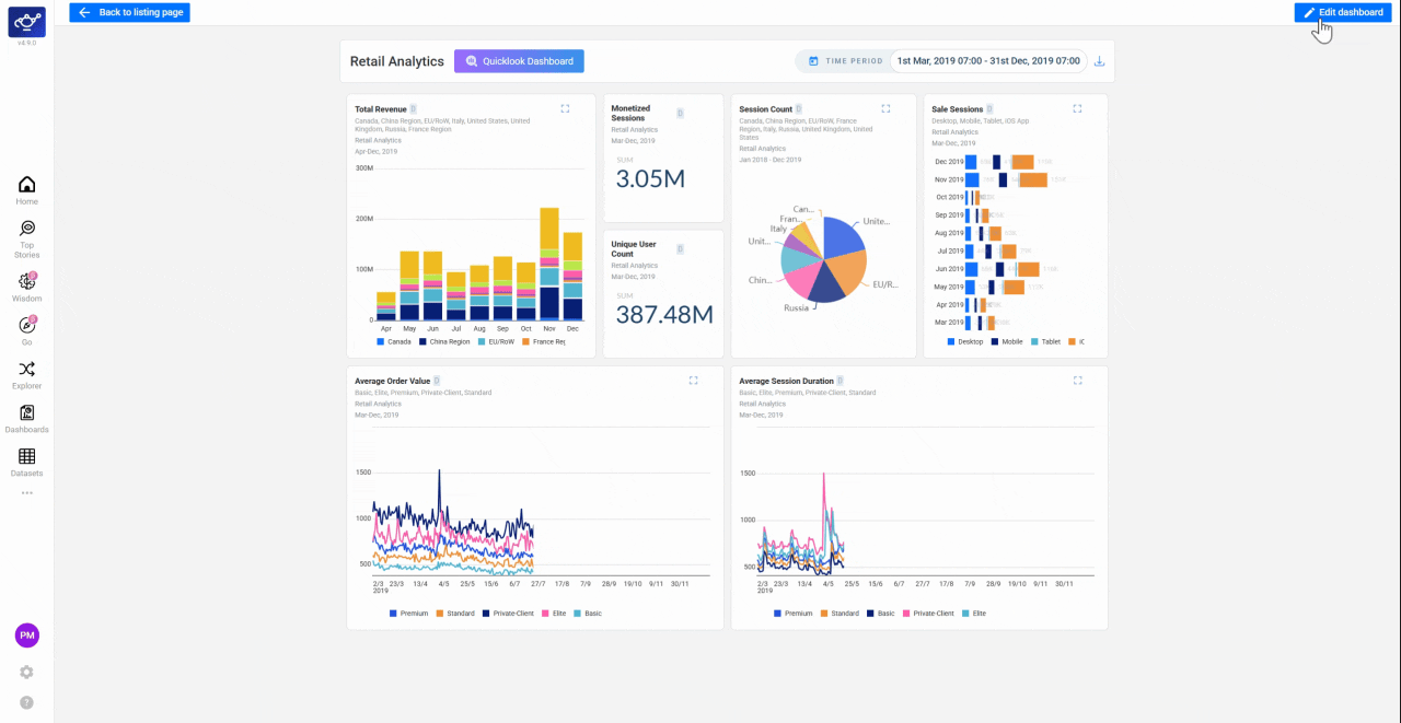
Launch Dashboards from the left sidebar to see your existing reports. This is the starting point for creating and managing all of your DataGenie dashboards.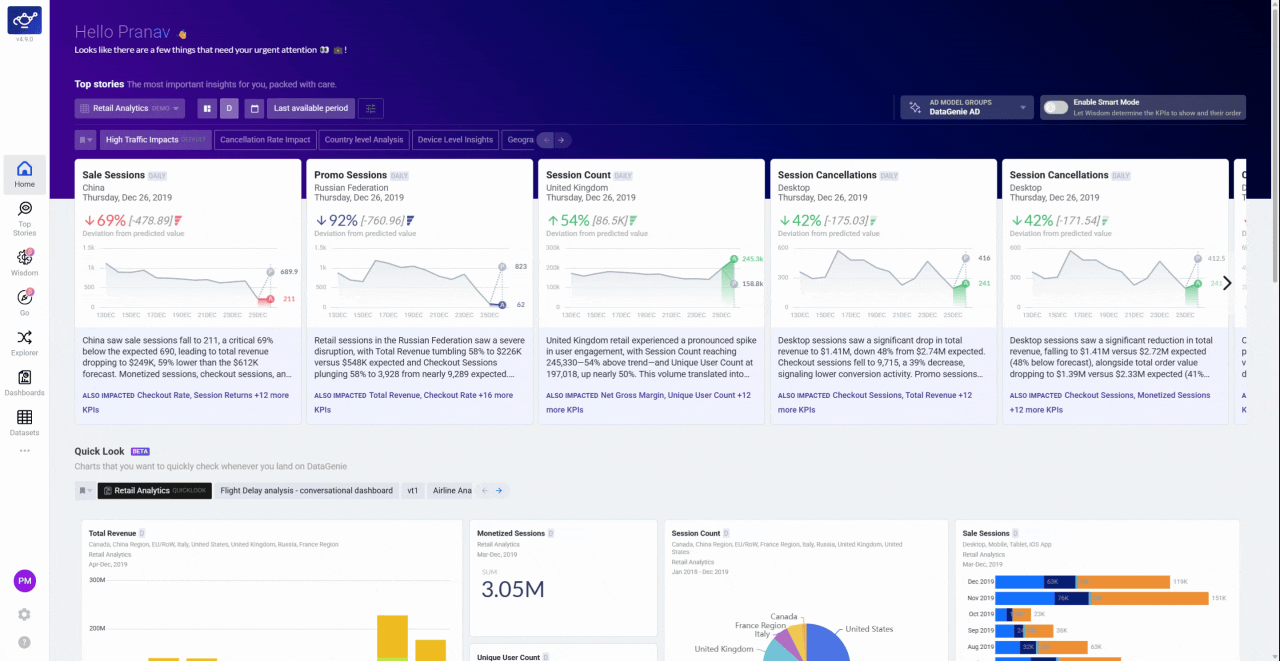
Create a new dashboard
Click Create New Dashboard to open a fresh canvas. Choose a prebuilt template for a quick start, or select a blank dashboard to design from scratch.
Add widgets from the left pane
Select widgets from the left pane and place them on the canvas — Scorecards for KPI snapshots, Bar charts and Pie charts for comparisons, Line plots for trend lines with forecast extensions, and Labels and Boxes for narrative callouts. Each widget type serves a different storytelling purpose.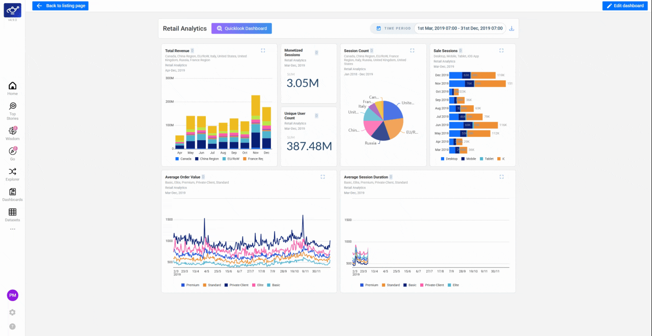
Arrange and align your layout
Use the Alignment and Re-Arrange tools to snap widgets into a clean grid. A well-structured layout makes the report easier to scan at a glance — especially for executive presentations.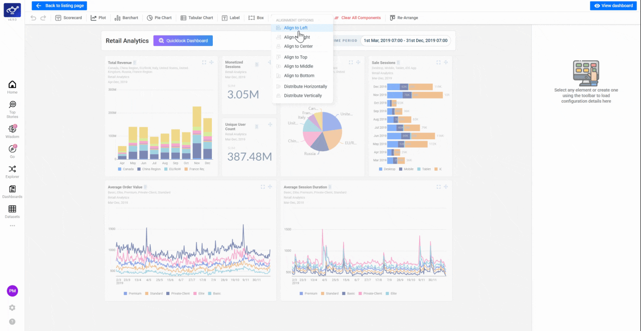
Configure each widget's dataset and filters
Click any widget to open its configuration panel. Select the Dataset and Variant, then choose Global filters (updates every widget at once) or Local filters (focuses a single tile on its own time period or segment).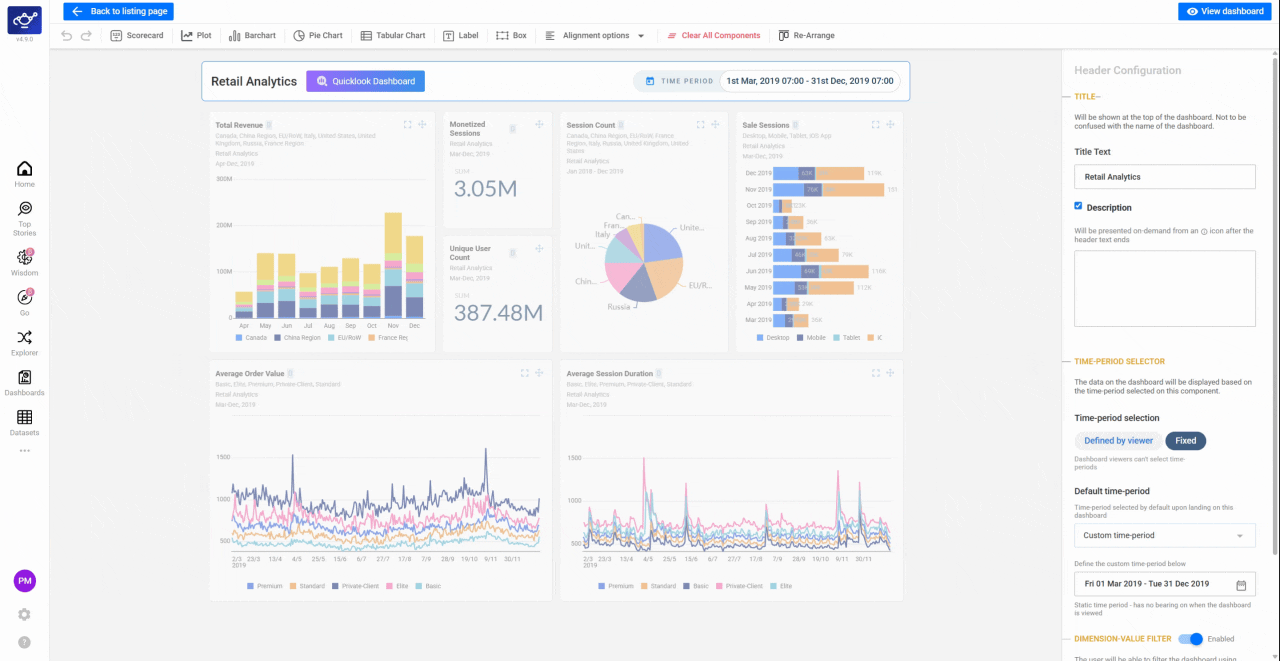
What’s next
QuickLooks
Pin any dashboard to the home screen.
Conversational Dashboards
Build a dashboard from Wisdom answers in natural language.
Data Playground
Test chart views before pinning them.