How to use Dimensional Analysis
Open Explorer and select a KPI
Open Explorer from the sidebar to see your full KPI list, then click the metric you want to analyze. The selection window opens showing three tabs — Custom, Top N, and Bottom N. Under the Custom tab you can pick specific dimension values to create side-by-side comparisons tailored to your needs.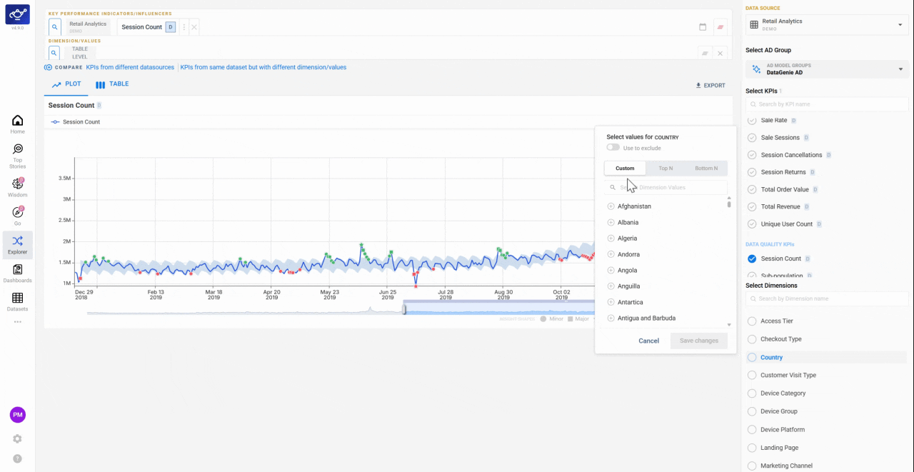
Switch to the Top N or Bottom N tab
Click the Top N or Bottom N tab to shift from manual selection to ranked results. Top N surfaces the dimension values with the highest contribution to the KPI; Bottom N surfaces the lowest-performing segments — useful for spotting underperforming channels, cohorts, or regions at a glance.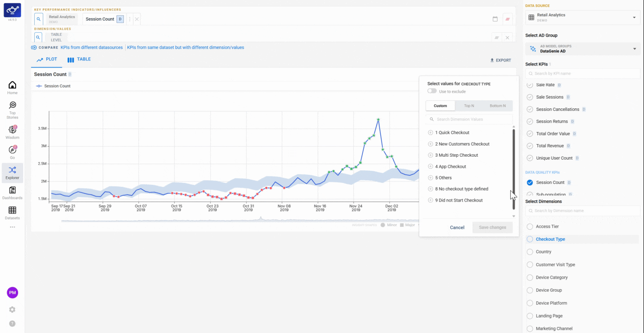
Enter a number to set your ranking cutoff
Type how many results you want — for example, 5 for the top or bottom 5 dimension values. Explorer immediately ranks the results by contribution to the selected KPI, so you can see exactly which segments are carrying the most weight or dragging performance down.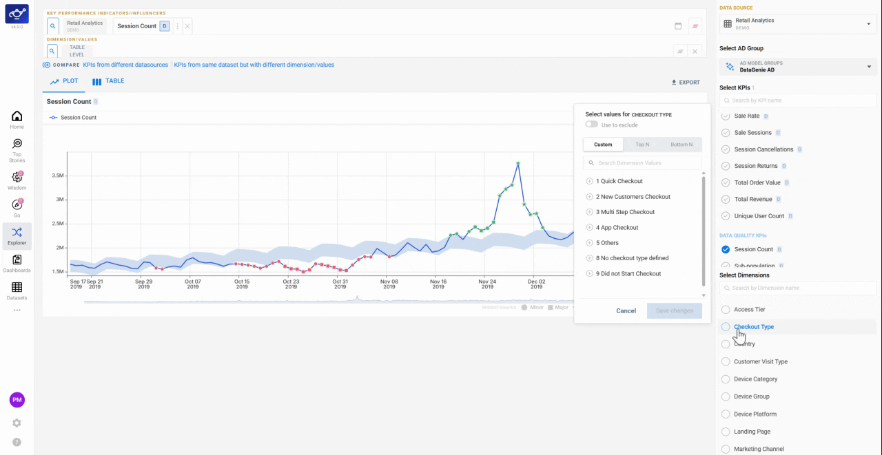
What’s next
Correlation Matrix
Understand which KPIs tend to move together before comparing dimensional slices.
Data Playground
Build custom views and freeform comparisons beyond the Top N/Bottom N structure.
KPI Attribution
See how dimensional contribution is used in story generation.