How to use Data Playground
Select your dataset
Click the Dataset dropdown in the upper right and choose the data source you want to analyze. This scopes the entire Playground to the KPIs and dimensions configured for that dataset.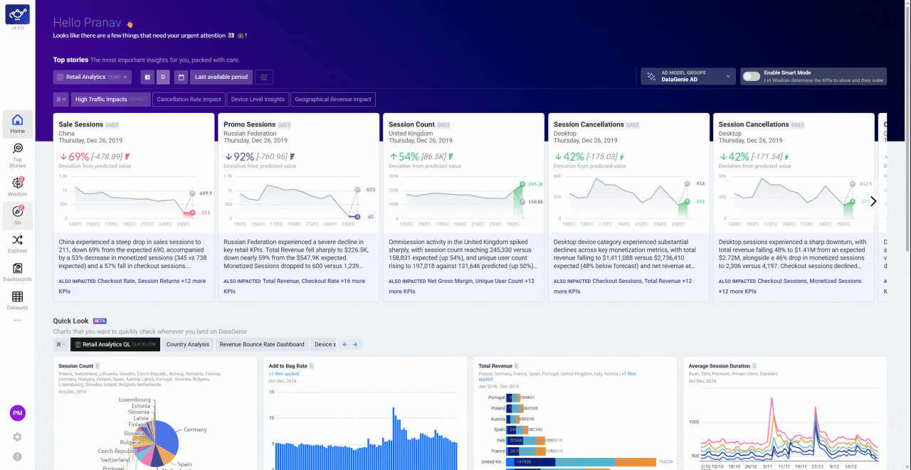
Pick a KPI from the selection panel
Use the KPI selection panel on the right to find and select the metric you want to track. The chart loads immediately with the KPI’s full timeseries across your dataset’s configured granularity.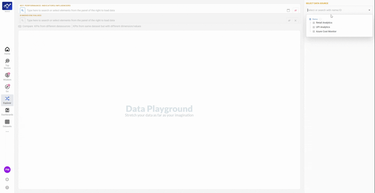
Add more KPIs to compare side by side
Select additional KPIs from the panel to overlay them on the same chart. Each metric appears as a separate series, letting you spot correlations or divergences across your business at a glance.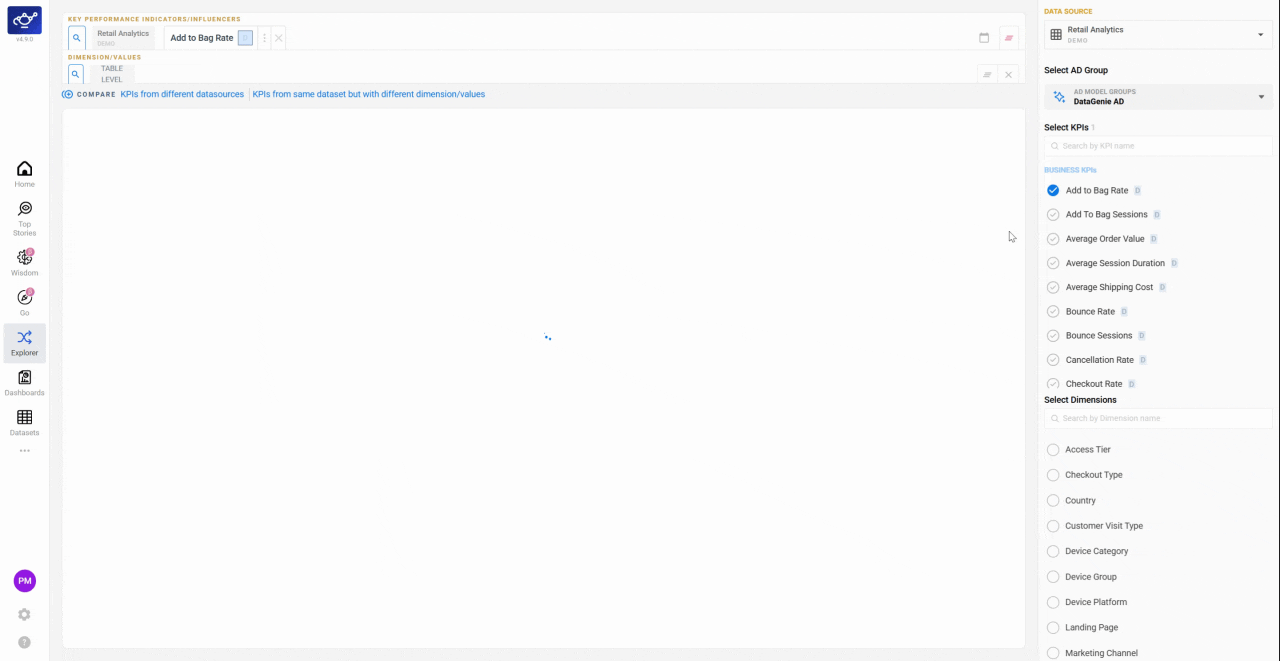
Toggle between Overlaid and Separate views
Use the toggles above the graph to switch between Overlaid (all KPIs on a shared axis) and Separate (each KPI on its own chart). Overlaid is useful when KPIs share the same scale; Separate prevents a large-scale metric from hiding smaller ones.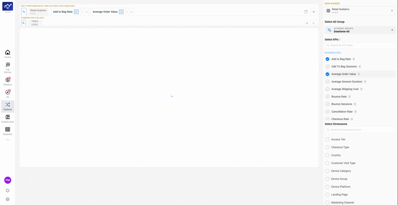
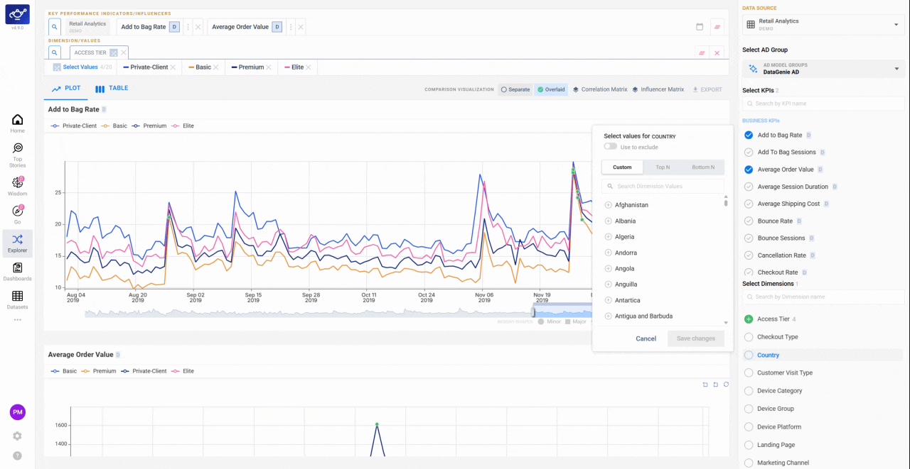
Select dimensions to filter your view
Pick one or more Dimensions from the list on the right to focus on the segments that matter most — a specific region, channel, or product category. The chart updates to reflect only those dimension values.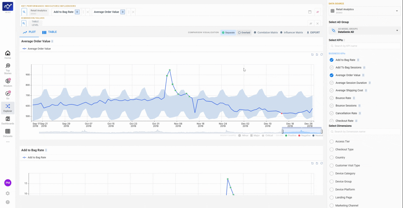
Hover for tooltips and adjust the time window
Hover over any point in the timeseries to see a tooltip with actual and predicted values for that period. Drag the time window slider below the chart to zoom in on a specific date range — useful for isolating a spike or comparing a campaign period against baseline.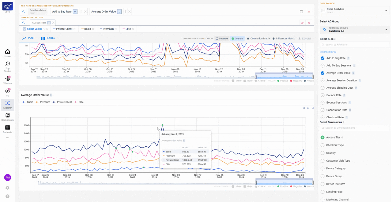
How to use Explorer
Data Playground is one of three ways to explore in Explorer — here’s where to start depending on the question you’re asking.| Situation | Start with |
|---|---|
| ”Which KPIs tend to move together?” | Correlation Matrix |
| ”Which regions / channels carry the most impact?” | Dimensional Analysis (Top N) |
| “Which segments are underperforming most?” | Dimensional Analysis (Bottom N) |
| “I want two KPIs on the same chart” | Data Playground |
| ”I need raw numbers for a specific period” | Data Playground → Table view |
| ”Compare this KPI for UK vs US” | Data Playground → Dimension filter |
What’s next
Correlation Matrix
See which KPIs tend to move together across the dataset.
Dimensional Analysis
Rank segments by Top N / Bottom N contribution.
Dashboards
Pin a Playground view as a shareable dashboard tile.
Top Stories
Start here — stories give you the what, Explorer gives you the why.
Filter Presets
Once you’ve found the right segments, save them as a Filter Preset.
Wisdom
Ask a follow-up question in plain English.
Autonomous Insights
Explorer is where you validate the why behind an autonomous insight.