

KPI Attribution
Understand which KPIs, contributors, opposers, and side effects are behind a Top Story movement.
What KPI Attribution is
KPI Attribution is the transparent view into why a Top Story moved. For any autonomous story, it surfaces three layers of evidence: the Contributors (dimension values that drove the change), the Opposers (segments that held up), and the Side Effects (related KPIs — often connected across sources by Nirvana — that moved alongside the primary metric). Every number comes from the same deterministic attribution engine that generates the stories, so the Why is auditable, not a guess.
How to use KPI Attribution
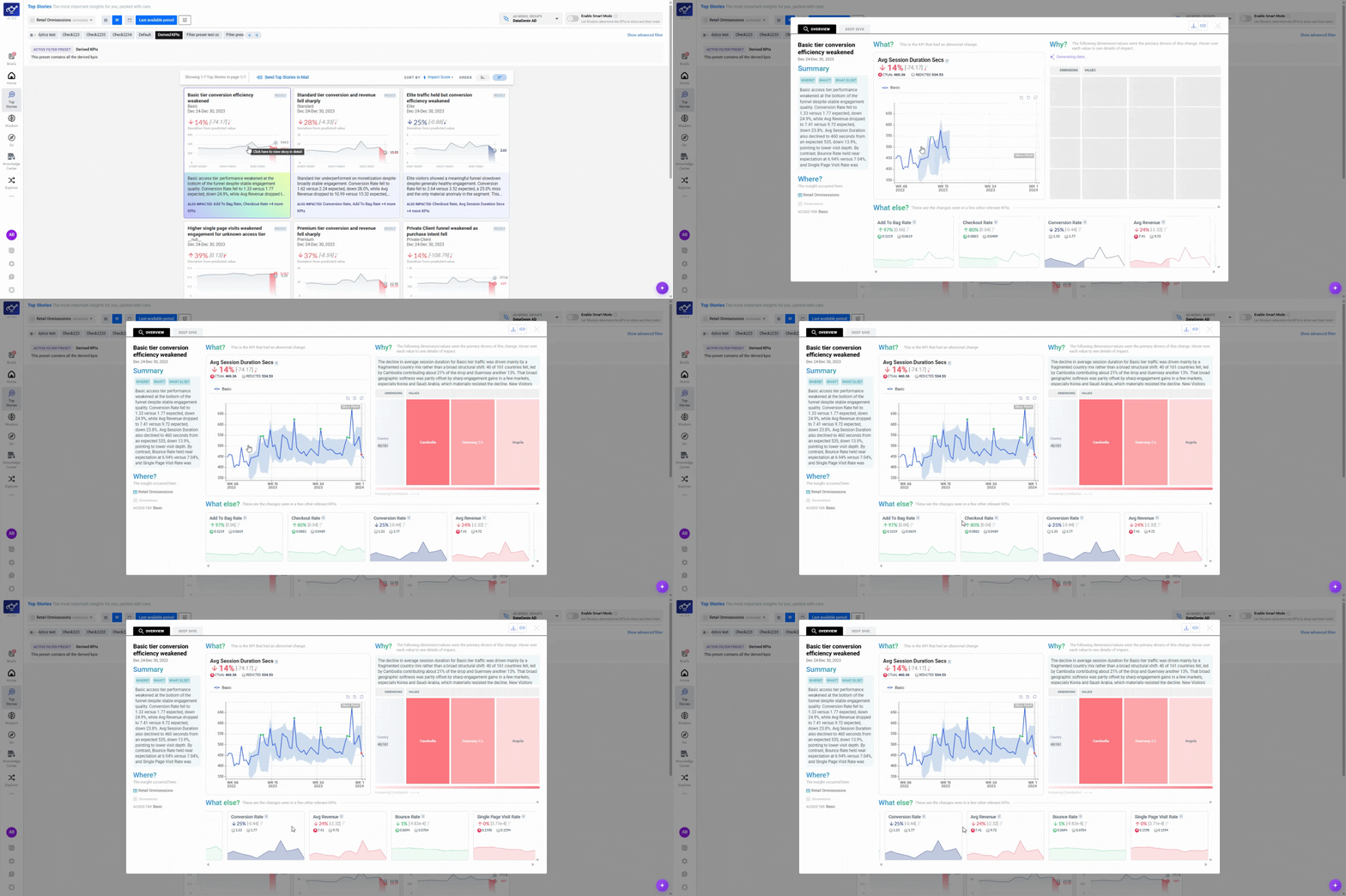
Open Top Stories and spot a moving metric
Open Top Stories from the sidebar and find a headline metric that has moved — this is your starting point for investigation.
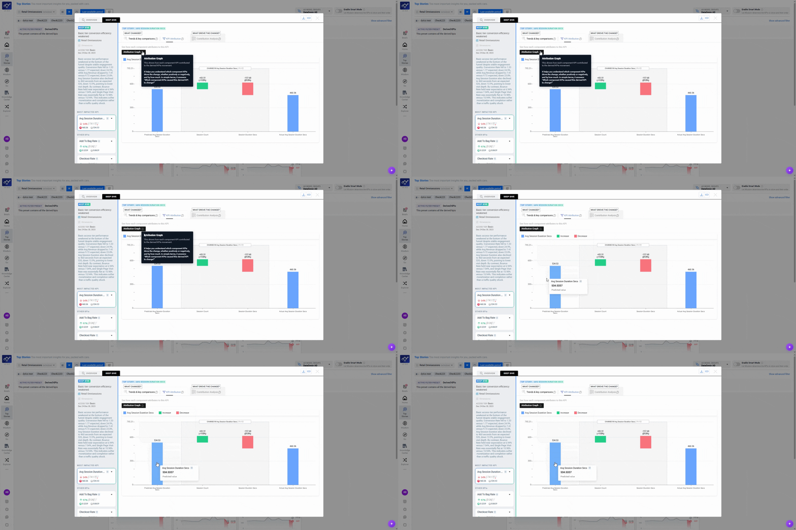
Open KPI Attribution and read the graph
Click KPI Attribution to break the metric into its components. The graph runs from the predicted value across to the actual — each bar shows how much a component pushed the metric up (green) or down (red). The tallest bar is the biggest driver.
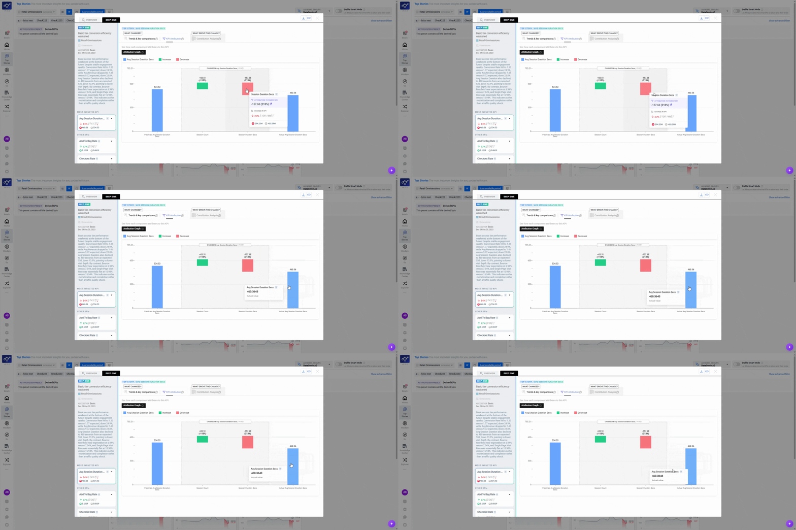
Interpret the movement direction
Check whether each bar pushed the metric in the right direction. Up isn't always good — what matters is whether the movement aligns with the KPI's own desirable trend. The graph shows direction; you supply the context.
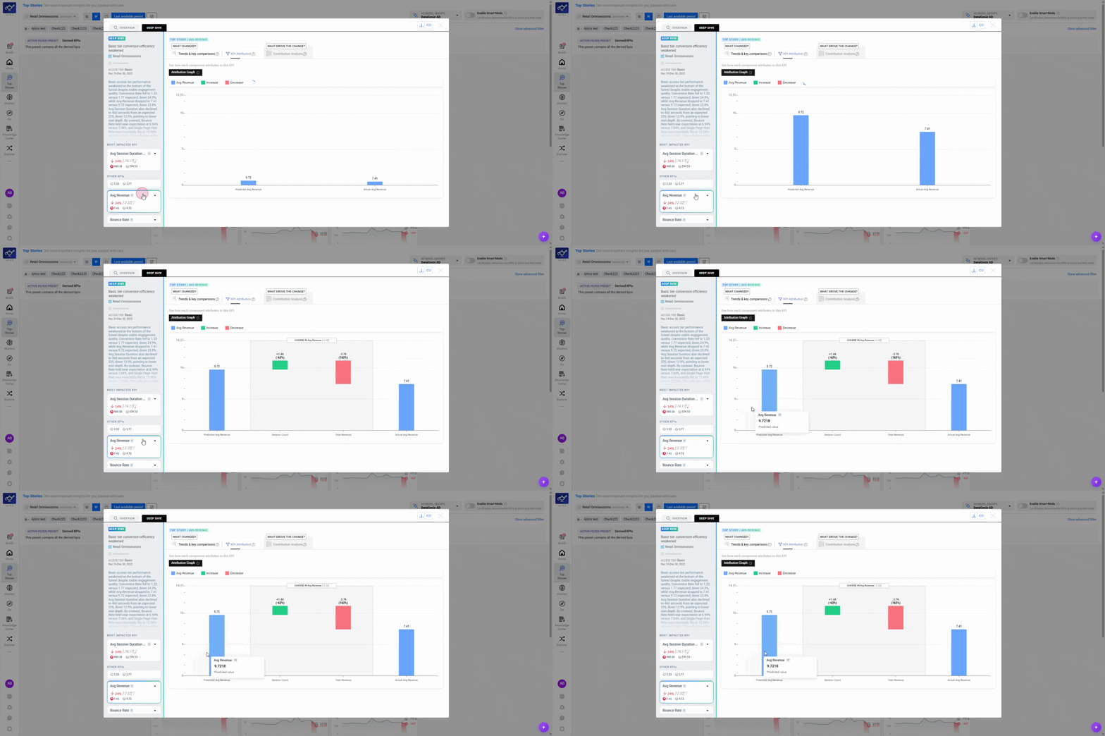
Switch KPIs from the side panel
Select another KPI from the side panel and the attribution updates instantly — a map of the levers behind each metric, on demand.
Typical workflows
- Scan Top Stories to identify the top change worth attention.
- Open one story and review the key slices to understand where the movement is concentrated.
- Use Wisdom to validate the pattern or check one breakdown quickly.
- If this is a KPI you track regularly, consider setting an alert for it.
- Use Top Stories to identify the top change and confirm the analysis window.
- Use Change Analysis to isolate the primary drivers and contributors.
- Use Deep Dive when you need longer history and more context before conclusions.
- Use Wisdom to run quick checks and comparisons without rebuilding charts.
The three components of attribution
Contributors
Dimension values that moved in the same direction as the KPI and are statistically responsible for the largest share of the change. Ranked by impact.
Opposers
Dimension values that moved in the opposite direction — partially canceling out the impact of contributors. Important for understanding the net effect.
Side Effects
Related KPIs that moved alongside the primary metric — often spanning multiple data sources via Nirvana. Signals whether the change is isolated or part of a broader cross-system pattern.
Tips for better results
Keep comparisons consistent. If you switch time windows or granularity, the shape and magnitude of movement can change.
When a story has many contributors with similar impact scores, the movement is likely broad and distributed — consider setting a Filter Preset to isolate the most important segment for ongoing monitoring.