How to use Trend Analysis
Click a Top Story to open its details
From the Top Stories feed, click any story card. The detail view opens showing two tabs at the top: Overview (the story summary — When, Where, What, What Else, and Why) and Deep Dive (historical trends and contribution breakdown). You land on Overview by default.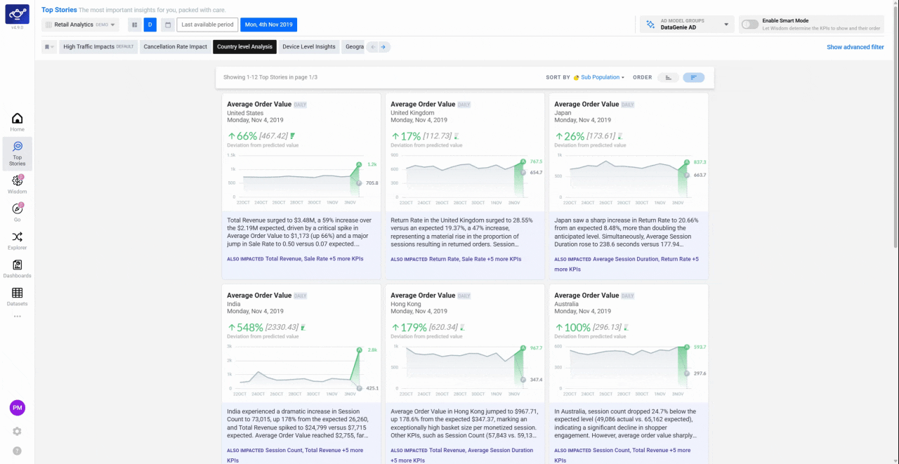
Select the Deep Dive tab
Click Deep Dive to switch to the historical trend view. The chart shows the metric’s actual value over time with the anomaly period highlighted — this immediately tells you whether the current change is a one-off spike or part of a longer pattern that has been building over weeks or months.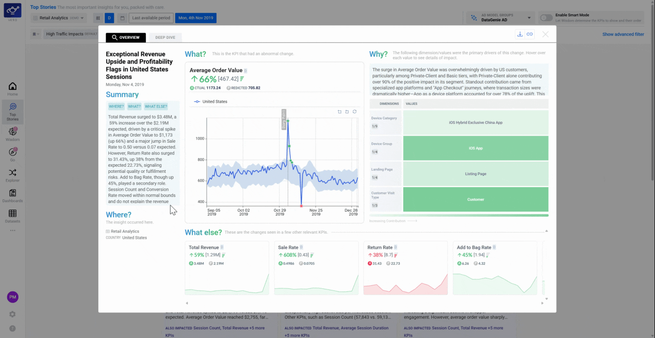
Open Contribution Analysis
Scroll down to the Contribution Analysis section. This breaks down which dimension families — such as Region, Device Type, or Channel — are responsible for the metric movement. Each family is shown with a contribution score; the higher the score, the more that family explains the anomaly.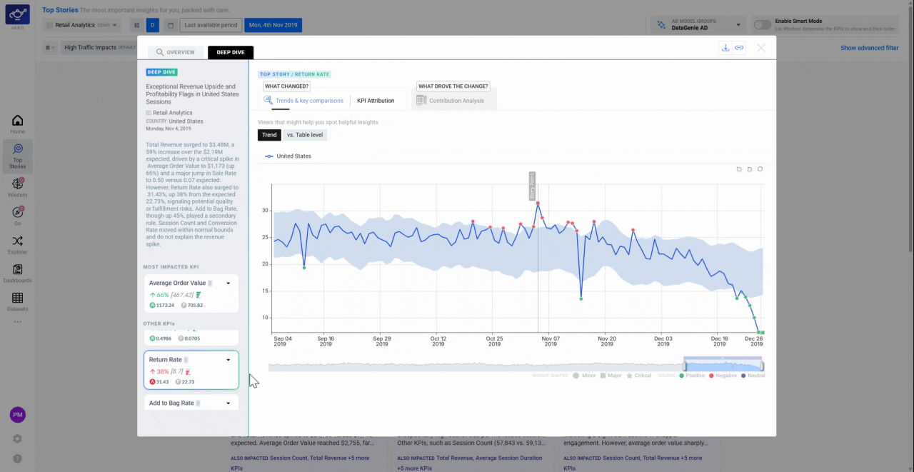
A dimension family is a category used to slice your data — for example, Country, Platform, or Product Category. Contribution Analysis scores every family by how much it accounts for the anomaly, so you know where to look first.
Click a Dimension Family to see its time-series
Click any Dimension Family name on the left panel. The chart updates to plot that family’s historical trend alongside the main metric — revealing not just what contributed this period, but how long it has been moving in this direction. A family that has been declining for months tells a very different story than one that spiked only this week.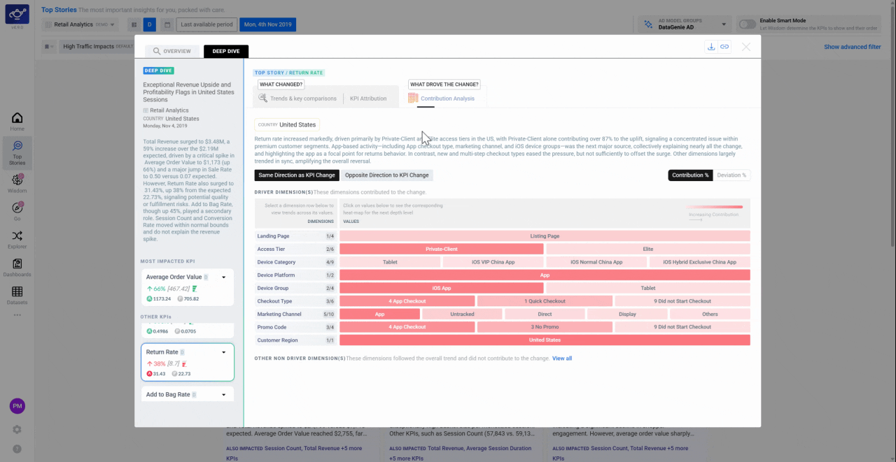
Click a dimension value to isolate a segment
Click a specific value within a dimension family — for example, United States within Country, or Mobile within Platform. The chart focuses entirely on that segment so you can confirm whether a single segment is the primary driver or whether the movement is broad-based across the whole family.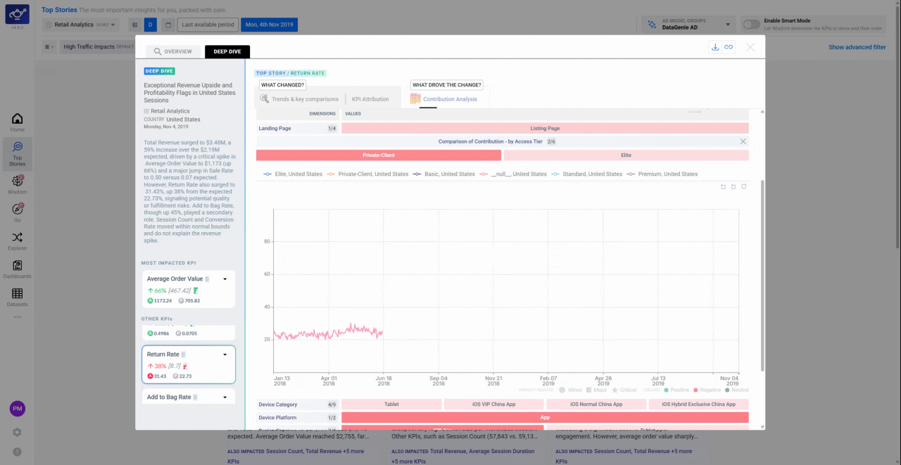
What’s next
KPI Attribution
Understand contributors, opposers, and side effects for a story.
Alerts Configuration
Set up alerts so you’re notified when a trend you care about triggers a story.
Explorer
Deep-dive into KPI correlations and dimensional analysis.